General Opera One Feedback Topic
-
teoshibin last edited by leocg
Opera One Feedback
Annoying Stuff
- sharpening is useless (what is the point of this, maybe AI upscale instead?)
- closing group of tabs doesn't exist
- window top padding making it hard to switch tabs with mouse everytime.
- the ability to add custom prompt for AI highlight context menu for selected text instead of showing the default few.
- tab navigation gives a long preview bar without left and right margin making it hard to see, a little bit of margin would be nice.
- unable to customize advance tabs navigation keybinds
Feature request
- maximize context pane similar to how Arc browser is handling this, more screen space in the webpage (not in full screen mode, think of linux window manager, zero crap on the side and the top), the ability to hide the entire top section (search bar, tabs, everything)
- Auto load sidebar extensions on start up (e.g. whatsapp should work on startup without me clicking into it and having it to load all the time, music player should start playing immediately, etc.)
- tabs search fuzzy search (ctrl + space)
- tab group navigation, instead of tab navigation
Extra
- Take a look at what Arc browser is doing, they are doing great stuff.
Review
Generally, 7 out of 10 browser in terms of features, usability, ease of transitioning from chrome, but still very unpolished, and not really innovative enough, we need more Arc browser features (9 out of 10 browser in my opinion, and chrome 5 out of 10) you guys are doing great but we want something greater.
-
namv22 last edited by
Extension can't detect and is not working well on the website of the activated tab
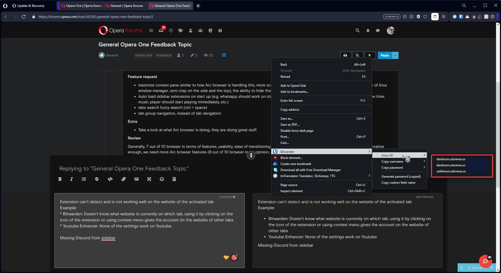
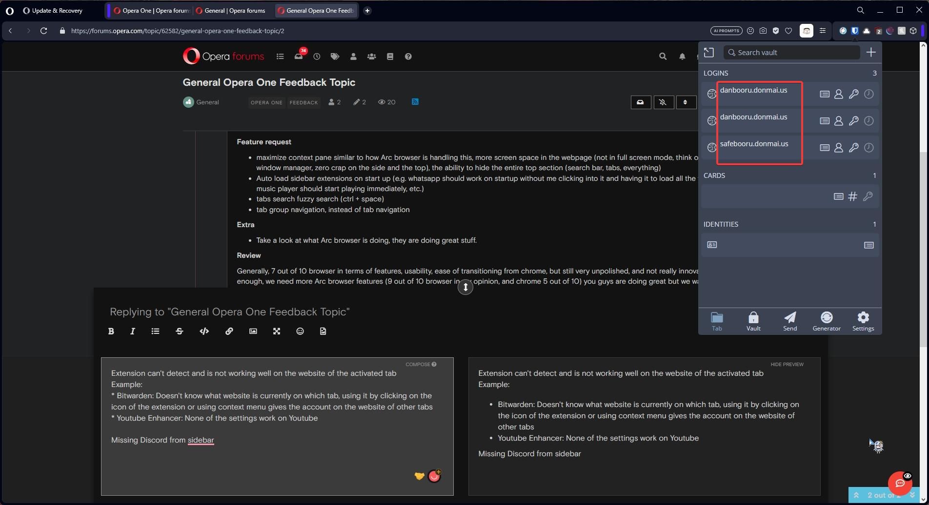
Example:- Bitwarden: Doesn't know what website is currently on which tab, using it by clicking on the icon of the extension or using context menu gives the account on the website of other tabs
I'm on Opera, but it gives accounts from Danbooru


Missing Discord from sidebar
- Bitwarden: Doesn't know what website is currently on which tab, using it by clicking on the icon of the extension or using context menu gives the account on the website of other tabs
-
Enmabytes last edited by
To me, the security/confidentiality of a browser is very important. In this case, I used https://coveryourtracks.eff.org to test the browser's security, and it didn't perform very well, which raises some questions for me:
What plans do they have to improve this aspect? Will it be part of the browser's roadmap, or will security be secondary for the development team?
-
leocg Moderator Volunteer last edited by
@enmabytes Got the same results in Opera, Chrome and Vivaldi: partial protection against trackers.
On Edge it said that there isn't any protection at all. Only in Firefox the test ended in a result of protection against trackers.
And I don't any relation to security on that test. Privacy, maybe.
-
mushin last edited by
The 1password extension doesn't work properly, in the snse that that it doesn't fill in the pw as it does in "ordinary" Opera.
-
Enmabytes last edited by
My honest and brief comments about the browser:
Operating System: Linux
Usage: Daily office work for 14 days as the default browser.Advantages:
-
The design of the browser is spectacular compared to my previous browser. It is very sleek, smooth, and visually appealing.
-
The sidebar, although I also used it in my current browser, has surprised me in Opera One with additional features like aria and automatic hiding, which I appreciate.
-
Furthermore, flow and player work very well and are quite useful.
I have been pleasantly surprised by other features that I hadn't seen in other browsers. For example, the music automatically pauses when another audio is activated, which is very convenient. The battery saving feature is perfect for me. The AI prompts are interesting, although they still need some refinement, and video calls appear as pop-ups when I switch tabs.
What I didn't like or missed from my previous browser:
-
Webapps. I don't usually install applications, so I like to use webapps. Unfortunately, this version doesn't offer that option.
-
The split view was a very useful feature in my previous browser, as I could have up to 4 windows split at the same time. I would have liked to have this functionality in Opera One to facilitate my work.
-
I also missed the ability to add the apps I need to the sidebar. In this version, there are only a few apps allowed in the sidebar. At least, having quick access to Slack or Notion was something I missed while using this browser.
-
Regarding video playback on Linux, it required some workarounds to be able to view videos, which was cumbersome for someone who is not familiar with systems. I struggled a lot with this aspect.
-
The lucid mode was terrible in my opinion, as it saturates images and videos with excessive brightness, making them look worse than the original version.
-
In terms of resource consumption, I noticed that Opera One consumes at least 20% more memory than my regular browser. However, I still consider it within acceptable limits compared to heavier browsers in the same category.
-
Privacy-wise, I couldn't find any references on https://privacytests.org, and if we consider the evaluations of its parent company (Opera), it doesn't fare well. I also tested it on https://coveryourtracks.eff.org, but it didn't perform well either. I hope privacy becomes a priority for the company in future updates.
-
Another topic not necessarily related to the program is the difficulty in receiving updates about the browser's status. I don't know what they are working on or when I will receive updates. Would it be possible to receive email notifications or have a forum thread to keep users informed? I think it would be very helpful.
In summary, Opera One is a promising browser. I will continue using it as a secondary browser and hope to update this review with improvements in the future. Congratulations to the team behind the project; they have something good in their hands, and the concept is solid, they just need to polish some details. I hope they keep progressing. Best regards.
-
-
terminatedprocess last edited by
@leocg
When you install Opera One, migrating from your prior version should result in Opera One with the same settings and look and feel. Speed dial should be populated. I synced my older version of opera (Version:99.0.4788.24) and in Opera One, signed in and enabled sync. So far nothing. I think maybe it did in bookmarks. But now what? I have to go through all the settings and install extensions, set my background, etc. Make it easy on your users who want to use your latest software but don't want to spend all this time doing setups. I look forward to seeing where this goes. I have used Opera since the start of my career in 95ish.. -
terminatedprocess last edited by
@leocg Itty bitty thing.. The icon for the Opera User account. Is it suppose to be a flashlight? There are a lot of icons in Opera around the edges. This icon should be recognizable as where your account can be accessed. The prior version of Opera has a person icon (background bluish). If you need it to be different, maybe use a different background color or something more recognizable. Thanks!
-
leocg Moderator Volunteer last edited by
@terminatedprocess When Opera One reaches stable channel, then upgrade from a previous version of Opere should keep all data.
-
aquafraternal last edited by
I updated to 101.0.4829.0 yesterday. It's now crashing quite a bit when I try to change workspaces, sometimes when I try to change tabs, and frequently when I try to drag a tab out of or into a window. Yesterday's update has made it very difficult to use, as it's crashing so very often. Please let me know if there's any additional information I can provide on this.
-
mushin last edited by
After copy pasting an URL from the "old" opera to the new one I notice that it interprets any google related page (mail account, "keep" etc.) as a search query. So instead of opening the https.... link it shows the google search page. The link shows on top, so making it easy.
-
OMNIKHALASI last edited by leocg
I want Opera One to have all Opera GX features, i would use opera one if it had opera gx features because opera one is so sleek and it has more features
Opera One would be for everyone if it had opera gx features
-
mryanmarkryan2 last edited by
I think it would also be cool if workspaces had unique speed dials. I have a hard time tracking which workspace I'm in. But if I had specific speed dials per workspace, then I could assign saved speed dials based on the workspace's purpose (maybe a specific project, or personal, etc). I don't think the speed dial is being leveraged as much as it could be. Opera invented this concept and it's still the best I've seen out there. It's also a big part of why I've stayed with Opera.
Have you fscked your local propeller head today?
-
namero999 last edited by
Animations. I regret updating because of the pointless animation when switching workspaces. It takes half a second before I can aim the tab where I want to go. Please give an option to disable this. Why fix what is not broken?

-
lavanyadeepak 0 last edited by
The Opera One Browser seems to be really good and appealing.
During the first launch the startup gives a nice music. Is there a way we can have it to play the same on every launch?