New UI Problem
-
jackob11 last edited by
Everytime Opera developers made some useless st with every new release update and yet claims it to be the best.
Whatever, there's headroom for a lot of improvements, a lot of bug-fixing but instead of those fixing; developers used to always make some UI changing st.
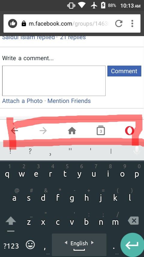
On Android If I click on a box to write down something then a touchscreen keyboard interface is appear which interface takes almost half of the screen size and any text on the following screen is barely seen. And 'Adding salt to the injury' new Opera Mini's useless UI seems to add an extra annoying useless bar on the top of the touchscreen keyboard interface which takes some more space. That's totally useless, totally annoying, totally dumb. Please, instead of UI changing crap, please pay attention to the bugs, the problems.
Using Opera Mini beta 48.0.2254.147676 on Android 6.0 with wifi connection.
Snapshot attached below, take a look.
-
jackob11 last edited by
An worse decision to change the Interface.
I don't like fullscreen browsing. While browsing I need to keep an eye about my internet connectivity icon, about what time is it now, how much battery percentage I've remaining. Because depends on those my browsing habits varies.And with this new problematic interface; without the fullscreen option & while file downloading I can't able to rename any file in download dialogue box appear. The writing space is totally hidden behind the bar.