Easy access to share button.
-
A Former User last edited by
I am offering a suggestion regarding the compete button.
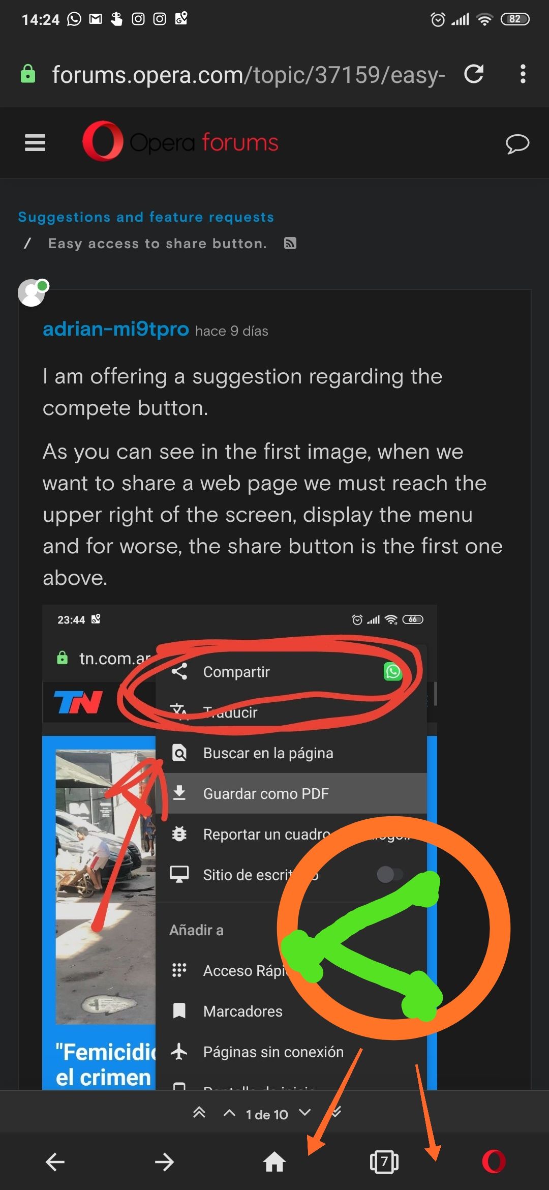
As you can see in the first image, when we want to share a web page we must reach the upper right of the screen, display the menu and for worse, the share button is the first one above.
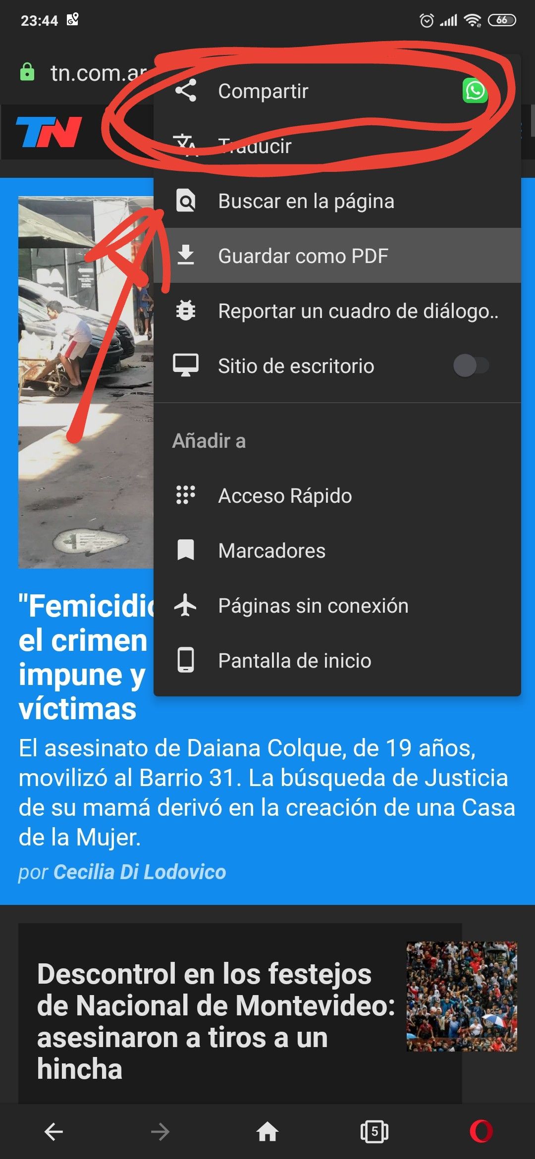
This is very inaccessible for large screen phones and slow by the steps to reach it.
I propose that you consider placing the button directly on the lower toolbar or in the option, within the pop-up menu in the lower right. I make reference in the next photo.
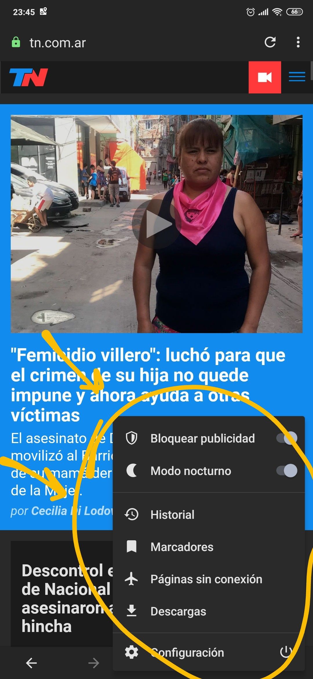
Details, I use Opera beta version 55, on a Xiaomi MI9T PRO phone with MIUI 11 and Android 10
I await your comments to see what you think about this change. Regards.
-
A Former User last edited by
I agree; too many steps for sharing.
Why not just add a share function to the navigation button at the bottom of the page? It’s already there for easy access to tabs etc, why not also use this for sharing? This is the biggest dealbreaker for Opera on iOS; that and ads still showing even with them “blocked”.
Also, why not ad a “send to Flow” from the share function in iOS? If I want to save a url from i.e. Reddit, I first have to send the url to Opera and then send it to Flow; should be easy to implement, but I’m sure selling “acceptable” ads takes priority over UI improvements...
-
zalex108 last edited by zalex108
+1
Currently,
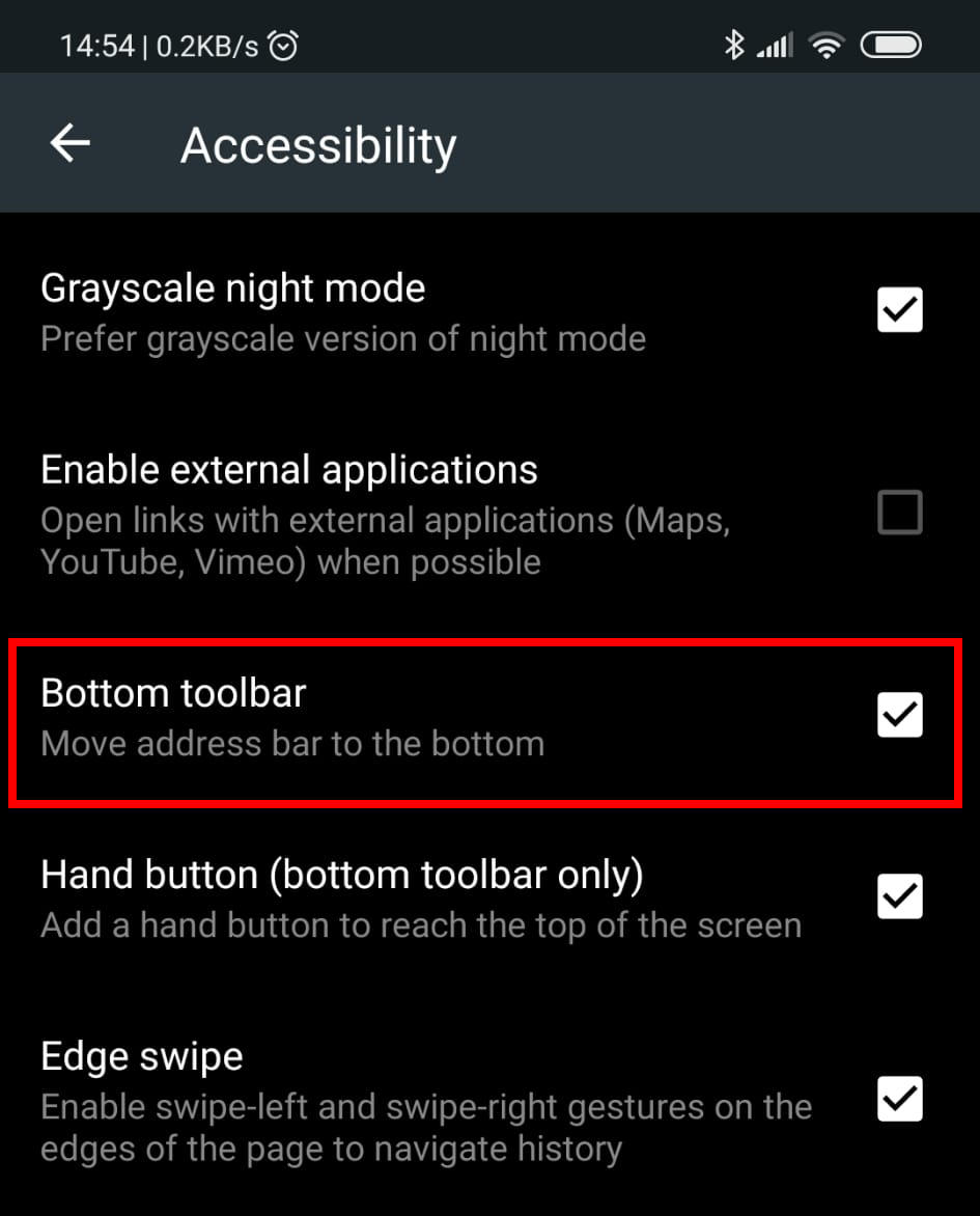
All SmartPhones has a big Screen, so place things at the bottom is the best thing.At least the option to choose where do you want to place it.
Kiwi allows to choose it:
"You cannot know the meaning of your life until you are connected to the power that created you". · Shri Mataji Nirmala Devi
-
A Former User last edited by
Yes. I see no reason for why it shouldn’t be placed there. Add it as a downward action; that spot is empty as well;
Pull the circle down, and the circle moves up and reveals customisable slots for i.e. share to snapchat, send with e-mail and one to open Apples share choices
-
A Former User last edited by
@victor27 I think it's a good option! For me, a dedicated button on the lower bar would be better, it would be ideal.
But the proposal of @ victor27 doesn't seem bad to me.
I just hope that the developers attend this question, because for me it is very important in the use of the application.
Happy Holidays. Regards!.
-
zalex108 last edited by
Actually the function exist.
Keep "New Tab" button pressed.
"You cannot know the meaning of your life until you are connected to the power that created you". · Shri Mataji Nirmala Devi
-
A Former User last edited by
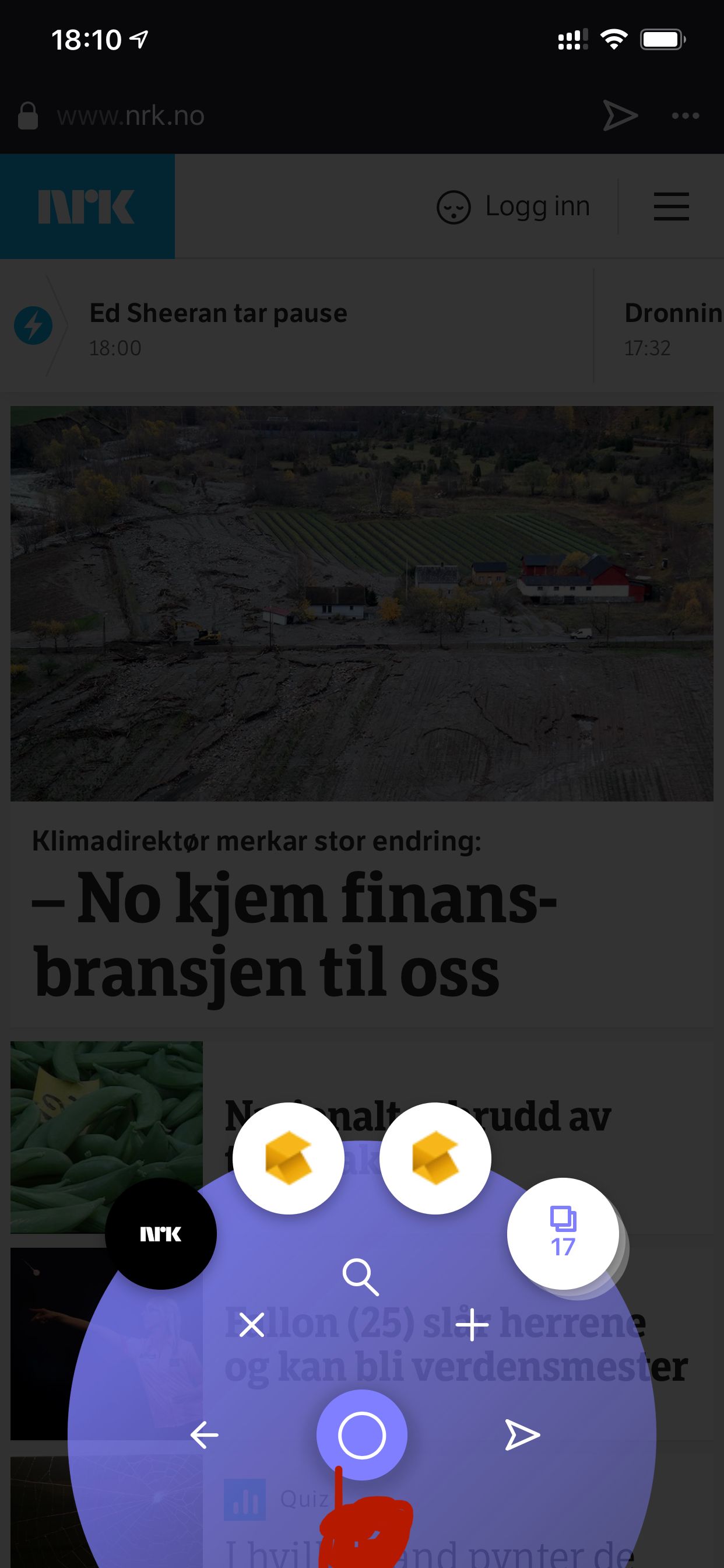
Well, no thank you. On Opera Touch for iOS we have the shortcut button, either utilise that button or make a dedicated share button for easy access, not long press any home button or anything. The way it is now takes to long/many pushes. I would like to have a share button placed where the red dot is placed
-
A Former User last edited by
@zalex108 I think you have not understood. If you keep the New tab button beautiful, a new tab will open. What we need is a dedicated share button or thinking of some other button The idea is that it is easily accessible. Greetings.
-
A Former User last edited by
@Gnibb Exactly, in Opera touch it happens the same. The share button is in the top menu. You should go to the bottom menu, how do you propose. In my case, Touch is excellent, but I don't use it because I don't have support for push notifications.
-
zalex108 last edited by
@adrian-mi9tpro
I did.
But referring to @victor27 (Long press option), just said that the function exist (comes from Chromium I think) and is used on New Tab.
Despite that,
Since many Opera versions, more options would be needed."You cannot know the meaning of your life until you are connected to the power that created you". · Shri Mataji Nirmala Devi
-
A Former User last edited by
@zalex108 Yes, exactly. I agree with you. I mean this


PS: Sorry my photo editing, it was very bad.
Then I believe that it is not much more. * Customizable dark mode. * Page translator * support push notifications * Advertising block.
It's excellent.
-
zalex108 last edited by
@adrian-mi9tpro
Well,
Dedicated on easy access as you indicates like Apple's one would be the best option.
"You cannot know the meaning of your life until you are connected to the power that created you". · Shri Mataji Nirmala Devi
-
zalex108 last edited by
Gesture sharing on Tablets would be good too.
"You cannot know the meaning of your life until you are connected to the power that created you". · Shri Mataji Nirmala Devi
-
A Former User last edited by
@zalex108 I really do not know how to apply it on Apple, but any option that is in the bottom bar, whether dedicated or long touch is the solution for me.
I insist, hopefully soon you can consider it and implement it .
-
A Former User last edited by
Anyone know if developers observe these issues If there really is the possibility that this function is improved ?. It is so important to me this feature!
-
A Former User last edited by
today update opera Android to the version 56.0.
Something strange happened while browsing a web page, without wanting to, I think I made a long touch on the opera button, located in the lower right margin. Then, from that margin, a menu similar to the one that opens in the upper right margin when pressing the 3 points appeared. for a moment it made me happy because I thought they had heard my suggestion regarding the share button. I arrive I tried to perform this action again and it was never repeated. I think it was a bug or an optical illusion of mine!
-
A Former User last edited by
Guys came the last update and what they did was give the user the option to select the shortcut icon at the top, Next to the address bar.
I really don't understand this. While the good thing is that there is a bear less happens to reach the share icon, if we select this for the shortcut, Still up! This theme is created with the intention that this access is at the bottom, so as not to have to go so high.
Can you improve it?
I await your response, regards.
-
Locked by
 leocg
leocg