Spacing above Tabs
-
robula last edited by
Even without the spacing above the tabs, there is spacing between the "New Tab" button and the "Tab Menu" button that I could use if I wanted to drag my window. I understand this is a "design feature" for your everyday user but it would still be nice to have the option.
This is achievable even in your younger brother "Vivaldi" using simple CSS (#tabs-container.top{padding-top:0px !important;}), I understand the technology is different but heck what a nice feature!

-
robula last edited by
Even without the spacing above the tabs, there is spacing between the "New Tab" button and the "Tab Menu" button that I could use if I wanted to drag my window
What if you have lots of tabs opened?
There is still always a space between New Tab and Tab Menu buttons, try it yourself.

Example: http://imgur.com/a/ZGH9U
-
zalex108 last edited by
There is still always a space between New Tab and Tab Menu buttons, try it yourself
What is not convenient as the space on the top.I prefer to avoid the top space in tabs, easly to switch between tabs.
"You cannot know the meaning of your life until you are connected to the power that created you". · Shri Mataji Nirmala Devi
-
robula last edited by
I prefer to avoid the top space in tabs, easly to switch between tabs.
Another valid reason, I often miss-click the wasted space when attempting to switch tabs.
-
zalex108 last edited by
I prefer to avoid the top space in tabs, easly to switch between tabs.
You can use Opera maximized.

:doh:
You are talking about "restore" :s :whistle: :rolleyes:Hummm...
Wait! Rereading is talking about title the window... :sherlock:
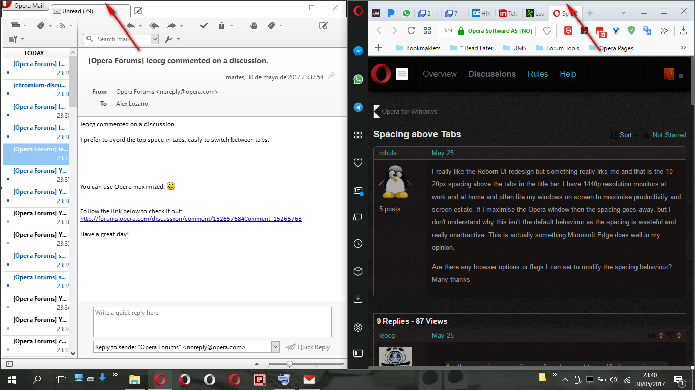
Even happens with Opera Mail too

Then I prefer to avoid the top space in tabs, easly to switch between tabs.
Didn't realized but it's true, that space isn't comfortable.
"You cannot know the meaning of your life until you are connected to the power that created you". · Shri Mataji Nirmala Devi
-
robula last edited by
I prefer to avoid the top space in tabs, easly to switch between tabs.
You can use Opera maximized.

I could, but using Opera maximized on anything above a 1080p resolution is completely wasted, most websites don't utilise the space. This forum is a good example; the content width is only 900 pixels, why would I maximise my browser when 1660 pixels could be used for other windows? (I use 2560x1400 resolution btw). This is a problem that only gets worse the higher your resolution is.
As I said in my original post, I tile my windows to maximise the effective space. I'll have Opera snapped to the right of the screen and on the left I'll have a code editor, a terminal window and sometimes Spotify. When I tile like this often using Windows Key + Directional Arrows, then the wasted space above the tabs in my browser are really noticeable.
-
robula last edited by
Most browsers annoyingly add spacing above the tabs when not maximised, it actually wasn't until I used Edge for a few weeks that I realised how much I dislike the spacing. Though it has become more noticeable since I neither use a 1080p monitor at home or at work.
Times are changing, and Edge may look better aesthetically than Opera, Chrome and Firefox but it doesn't compete when it comes to and features and more importantly customisation which is why I believe that users should have a choice about how their browser looks and feels.
-
zalex108 last edited by
Can't understand how Edge is as bad as IE...
Is windows even worse every day passing?
Just makeup in each version+...(Opera also has its incomprehensible things)
"You cannot know the meaning of your life until you are connected to the power that created you". · Shri Mataji Nirmala Devi