Speed Dial New Transparent Site Backgrounds
-
linknetrvh last edited by linknetrvh
These new transparent Speed Dial site backgrounds are absolutely awful. I don't know who could possibly think that this was a good idea. I've had to revert to a temporary dark background to be able to differentiate between sites. Please can we have the option to revert back to the previous opaque backgrounds.

-

-
Moved from Opera for Windows by leocg
-
-
linknetrvh last edited by
@leocg
It's a new feature, not a fault, so the transparency exists exactly the same in all of the themes necessitating the selection of a dark background to make everything readable. -
leocg Moderator Volunteer last edited by
@linknetrvh What if you change the thumbnail of the speed dial?
-
linknetrvh last edited by linknetrvh
@leocg
Why should I need to do that for around 50 sites on my Speed Dial in order to make this latest update usable, and that still wouldn't reduce the transparency on the groups of sites. I prefer to use the icons generated from each site rather than having to create my own.This just needs the option to revert back to the previous situation.
I've reverted to the previous version of Opera One and disabled auto-update until this is either fixed or I use another browser.
-
 nkgrzegorzewicz Opera last edited by
Hi @linknetrvh! We are sorry for making trouble with this change. Our team is currently working on improving the visibility of Speed Dials. The fix should be available soon!
-
linknetrvh last edited by linknetrvh
Thanks very much for the feedback and very pleased that this is being looked at.
-
nkgrzegorzewicz Opera last edited by
@linknetrvh Hi! Part of the speed dial fixes is already available. Please update your browser and let us know if your problem is resolved. We really appreciate your feedback!
-
linknetrvh last edited by linknetrvh
@nkgrzegorzewicz
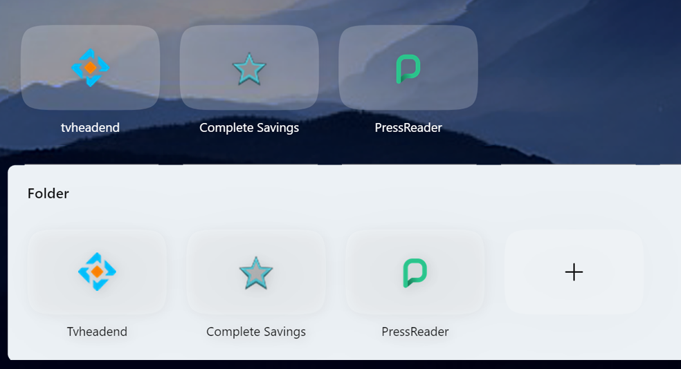
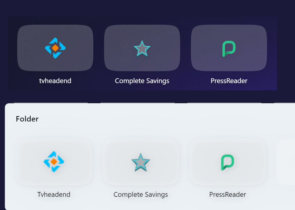
That's certainly an improvement and works well for light backgrounds but for medium and dark backgrounds the group folder views could be improved.Also on the medium background I think that there is still too much transparency and this could be reduced to improve visibility.
Medium Background:
Dark Background:
-
pyoro-2 last edited by
Can't we just have a transparency slider?
imo it's awful now (v.116.0.5366.127) - way too white, like a bunch of square flashbangs on the background. But obviously any change will just annoy someone else ...
-
nkgrzegorzewicz Opera last edited by
@pyoro-2 Hi! Thank you for sharing your thoughts. We are currently working on improvements in this area, and your feedback is truly appreciated!