[Duplicated]in private mode in dark design, the bright input line is disturbing
-
tsml last edited by leocg
first a hello to all

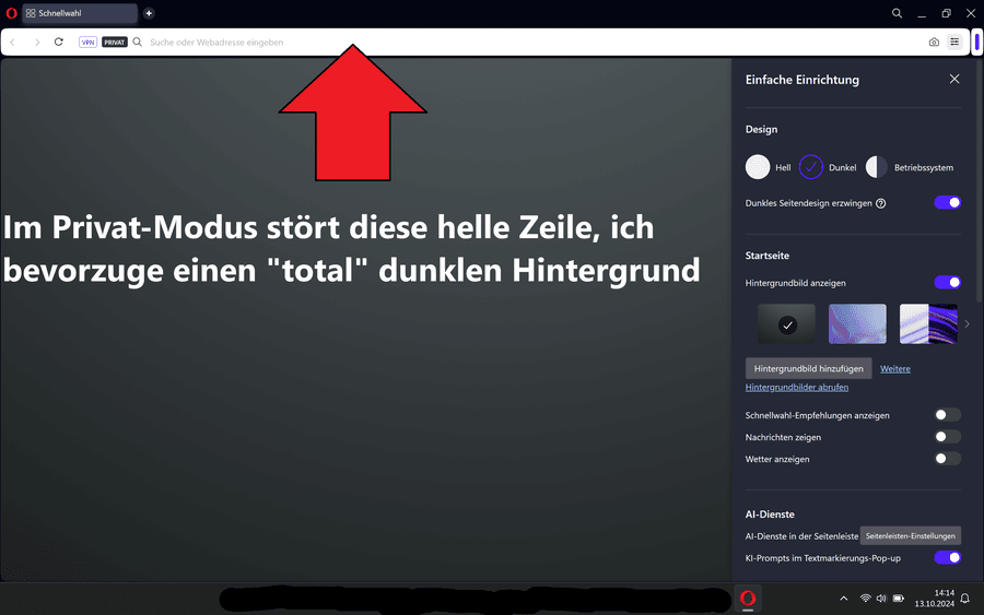
In Opera in private mode (in the dark theme), the light input line (across the entire width) bothers me.
I have not found a way to change the color of this line:

I use Win11 Pro with Opera and Opera GX in the portable versions, each with a dark design and few features.
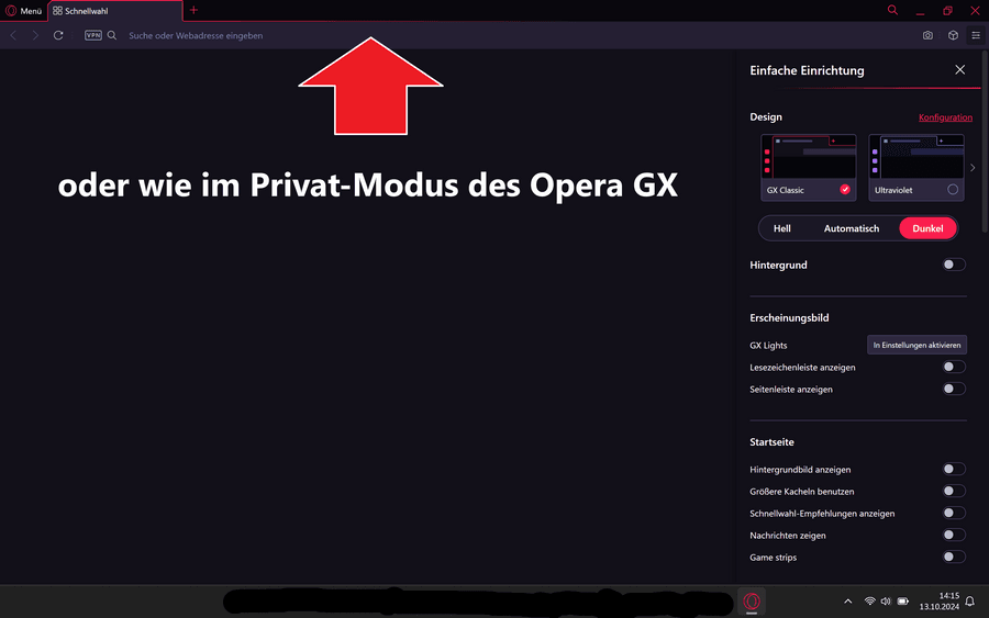
In the private mode of GX you don't have the problem, everything is dark there:

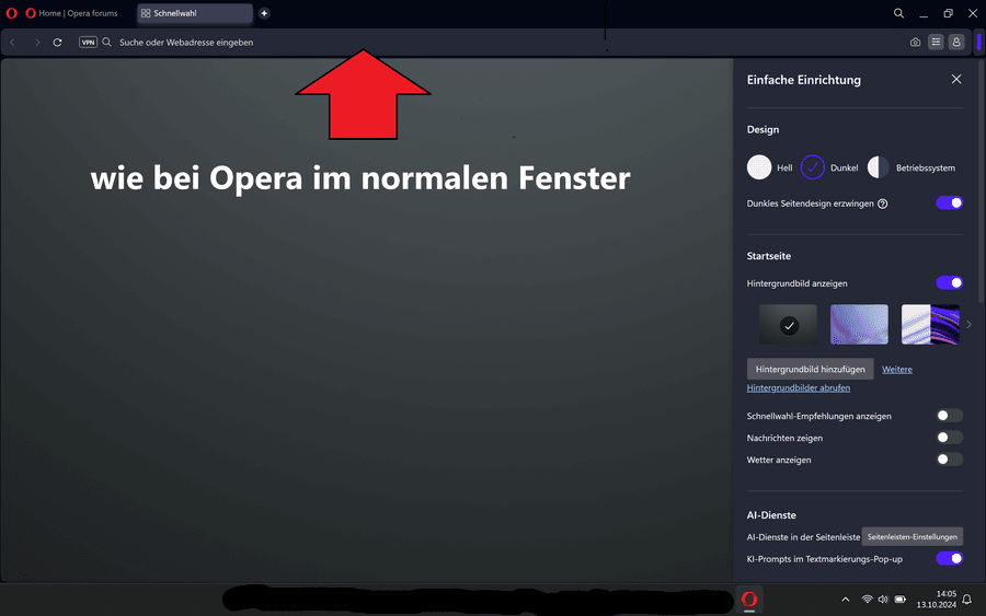
or in the normal tab of Opera:

This is only the case with Opera in private mode (probably for better differentiation). It's just annoying for me.
I haven't found anything about this in the forum and hope that someone can help me.
Greetings Tsml -
Moved from Opera for Windows by
 leocg
leocg
-
tsml last edited by
Thanks for the answer, I don't have to look any further and try to change it.
Greetings Tsml -
tsml last edited by
 Incidentally, the opposite is the case in the private mode of Opera GX, where the normal tab and the private tab are almost identical.
It is then difficult to be sure that it is really the private mode.But please don't introduce a white address bar in the private mode of Opera GX...please,
 please don't
Best regards Tsml
-
whisperer last edited by
This is a long standing issue, see this thread which has 17k views at this moment. Apparently this is by design and the developers haven't been willing to change it, although it is clearly not a good design.
-
Locked by
 leocg
leocg