[Solved][Duplicated]Active tab is not clearly visible (especially in dark theme)
-
RickGotTaken last edited by
@plindroo It's easy enough to see, I mean the whole line bends just to show you that, "Hey, this is the tab you're using!". Making the tab lighter is something reserved for hovering.

-
plindroo last edited by
@rickgottaken Hi Rick, are you answering with the tone and voice of a company that actually produces the software or just someone throwing out a quick "I think I know it better" type of comment? I would not bother even to comment anything to someone like that but here I can clearly see that there is some broader misunderstanding on this case since this issue is still present although someone brought it out already earlier, so here we go
- Your copy paste doesn't look "clear enough" to me at all
- Your copy paste did not have "tab groups" mixed in, which are also highlighted with a slightly lighter color than the active one.
- Your copy paste has only 2 clear tabs, where most professional or heavy users may have tens of tabs open at once which makes them smaller than yours, mixed with "tab groups" and and a lot of text stuff that all makes it messy and harder to find. After all, I see these functionalities as a competitive advantage of Opera over others.
- Some people have 4K monitors and/or they may look at smaller fonts/tabs than you because they want more stuff on the screen than you with your OOB example.
- Also, different people have different monitors, thus the colors are slightly different, I have 100% sRGB capable screen
- When looking at a white or bright web page against the dark theme the colors are not as easily distinguishable and sure there may be other situations also.
- When you have a lot of tabs and you have to "hunt"/"scan" for the active one, it is not as easy as in your 2 tabs example, da!
- And yeah, different people see colors differently, especially older people see less contrast I would think.
Perhaps giving the active tab a color if it can't be made lighter? Perhaps the color could be adjustable?
Also Rick, I would appreciate if you wouldn't anymore take part in this conversation, please, thanks!
-
RickGotTaken last edited by
@plindroo Actually, I think I'll continue.
Now regarding your points;- I didn't say "clear enough", no need for quotes.
- Not once have I heard of a "tab group" in my years of using Opera.
- I only showed 2 tabs as to not show my tabs, I like my privacy. But my point still stands, you can just look for the line and you'll know. I don't even see a need for knowing the active tab, but I digress.
- I have a 1080p monitor which may not be as big as 4K, but I can still see the active tab clearly, so I imagine 4K users would only have slightly more trouble.
- This goes both ways, making it lighter may not help on different monitors with different colours.
- I'm not sure how this matters, the topbar is separate from the webpage. Just look up?
- I can easily spot the active tab with more than 2 tabs open, I didn't have just 2 tabs open in the example either, I only showed 2. (Why stated above.)
- Yes, different people do see different colours differently. The colours of Opera can be changed to help people with that already.
-
plindroo last edited by
@rickgottaken Hi again Dick, unfortunately I'm not interested in arguing with a random person about what they think they know or think they said and what not, that kind of bickering is for different forums, I would appreciate if you wouldn't spam this forum with worthless comments and nose wisdoms, thanks. Instead, I would like to know if there are any professional developers or UX people that could comment on my findings?
-
RickGotTaken last edited by
@plindroo You got my name wrong, I am Rick. You have not made a single typographical error except this one, the chances of these being an intentional insult is high, and I don't know the rules but I don't think calling people dicks is accepted. Anyways, I know what I know and I know what I say, no one is more correct on recalling what I have said than myself, it's basic logic. Also, why would you waste any professional developer's time with a non-existent problem?
-
A Former User last edited by A Former User
@rickgottaken you are correct in that being able to set things like colours etc should be in operas options, like a lot of things, but on my version 105.0.4970.21 the active tab , I don't use tab groups or tab islands etc so don't know what happens there. my active tab is always way brighter than other tabs.

Dick has been a shortened form of Rick/Richard for like hundreds of years you must have heard it said before, I dont think offence was intended but what do i know it is 2023 so anything is possible. -
plindroo last edited by plindroo
@rickgottaken Sorry for that Rick, I just remembered it wrong, anyway, if you were professional, you would had used you time to ask questions and try to understand the problem, perhaps telling me some advices on how to represent my problem so that you can understand it better, that Rick, is how professionals work rather than start to question the actual issue people are talking about, not certainly a pro way/or a good way in general to approach anyone, you have much to learn there yet, talking to people like that and you will soon find out that what goes around, comes around. I'm actually offering you a kind helping hand by using my time to even write this to you as 99% of people wouldn't bother, they just walk away and avoid you after that, also, since you (and ceedee) don't even know about "tab groups" (= tab island) or whatever they are called, neither of you should had actually even have tried to answer anything.
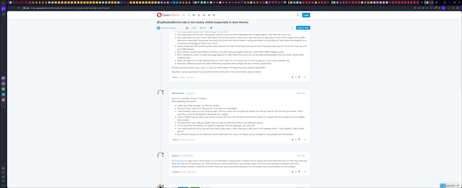
Anyway, since no-one else cares and reads posts here, here we go, a random realistic example with "tab groups":

Now, above you can see what is selected because the url bar gives a hint, yes, here we have only 20 or so tabs open but there could be many more which would make it more difficult, I need to find the active bar "immediately" to be able to browse quickly, here it is difficult to locate or at least it could be done easier (easily!). And for the additional reasons I laid out earlier those certain circumstances might make it even more difficult. And why do I need to find it quickly, because in those tab groups I need to flip between them as I work with certain group in certain case so I would like to click the next, and next and somethimes arrange them or so, nevertheless I need to be able to locate it better in many cases.. also if the active tab is not in a group, you will mix it with a group.
-
DepresseMode last edited by
Same problem. Don't have as much tabs as the guy above, but again, same problem. Can't see the active tab. Are there any plugins or perhaps custom settings to highlight it for us?
-
plindroo last edited by
In Opera version 105 and above the active tab is highlighted much more than it had in 104.xx versions, also looks like the tab islands are less highlighted than in earlier versions.
To manually ensure update: Click on the Opera logo in top left and select Update & Recovery... from the menu, then wait for the new version download and for the button to change to Relaunch Now, click it and off you go!
-
DepresseMode last edited by DepresseMode
@plindroo Thanks, this looks better now. I can actually see my tab.
In 104.xx I couldn't see the highlight you mentioned. I could only see "X" that always goes over another tab. In short, if you have too many tabs in 104.xx, the working tab would overlap the tab to the left of it. Both would disappear and the only way you could tell where you were was by trying to spot an "X" mark that closes it.
This fixes it now.
-
Badawythe1stOpera last edited by
@rickgottaken No, it is not clearly visible. And I have been a million year wondering why the design can be such stupid when we should simply be able to control it.
Something like a white tab amid black ones is that hard to understand?By the way, looking at the pc with a slightest angel will also cause all tabs look the same when its close in color tone.
For example in the picture here the tab looks gray but in reality they look all the same when I move just 1 inch up or down.
Why we an not just spot the tab quickly without having to look well on the screen to find it.

-
Badawythe1stOpera last edited by
@leocg What public forums has to do with being thoughtful and respectful to the question or request.
The man asked a clear question and clearly need help, he needs a response that help not spammed with discussing the opinions on what he think.lets be to the point, instead of spamming someone's need/question with a discussion.
Wouldn't it be more respectable just to help with a professional answer to the point instead of a discussion off-topic?
I have the same problem as the author of the question and came here to find an answer but was disappointed with such behavior.
-
Locked by
 leocg
leocg

 image url)