General Opera One Appearance Feedback Topic
-
Hesminewho last edited by
@marinadze i think he's just a fanboy troll who can't/will not deal with constructive criticism at all.
-
A Former User last edited by A Former User
I could be mistaken, but this topic is about appearance feedback concerning Opera One ? So why is Himmelsheriff attacking forums members, by calling them strange ,who are leaving feedback, insinuating that they are "false users" or that their criticism lacks any value ? It seems counter productive for the moderators to allow such a toxic environment to continue to build just to have one voice that is both supporting the new appearance, while also trying to push users out of the Opera community towards Vivaldi because they do not meet his purity test requirements. As someone who has been a fan of Opera since around 2003, I hope Opera and their forum moderators will hear the suggestions and criticism to improve Opera One to what would make their base happy while allowing the potential for testing and growth of new features for those who would be inclined to use them.
PS. Himmelsheriff, deleting your reply is an interesting way to send me a message though it lacks a certain something. None the less you said no one has given you a convincing reason for the "new" forum users. So I have to ask you, what makes your approval give validity to their criticism, or perceptions ? As well why do you think anyone should be inclined to spend the time to convince you.? Convincing you might have value if you are the lead developer, CEO, President, or what have you, Baring you being a member of the development team, part of the corporate structure, or a monied backer your approval, or disapproval lacks any merit to the discussion at hand, Equal to that however what have you done to convince the new members or the old ones that you are arguing in good faith ?
-
A Former User last edited by A Former User
@nightmaresoul Opera will certainly not value, what you and others in this forum say. They‘ll see, if user numbers will rise or lower. They‘ll do, what brings the most profit to their shareholders.
But can you give me convincing reasons for people registering only yesterday and their one and only post about Opera being so bad? And especially After they’re switched to another browser? Anyone can claim, he‘s been a user for 20 years.
There are valid criticisms from people who have used Opera for a longer time, but I am suspicious about people who have only joined yesterday.
That’s not fanboyism, but common sense .
It’s fanboyism to come here from Vivaldi and complain how bad Opera is.
I‘ve thougt this user forum was smarter. -
Zukikama last edited by Zukikama
@himmelsheriff Hello I am new here. Yes I registered yesterday. Yesterday Opera changed the design for me. In terms of design I can survive that. But the first time I saw that I cannot scroll down I immediately thought it is a bug. So I googled "opera new design bug solution" and the first link led me here. Now it seems that it works when I click on the scroll bar with some little space further from the edges but why would anyone sane "improve" the design like this for worse? I cannot understand. Anyways I hope they will fix this, it is hard to use it this way and I still have not relearned that as I am doing it automatically every few minutes.
-
Locked by
 leocg
leocg
-
leocg Moderator Volunteer last edited by
@himmelsheriff Opera takes all feedback in consideration, specially those that may show issues and user cases that they couldn't see before.
When there is a major change in an app, it's common to see lots of people joining the community to give their thoughts and complaints if they don't like the changes.
-
Unlocked by
 leocg
leocg
-
CUL8R last edited by
@marinadze
Every Opera update makes things worse. This colour makes me uninstall it until they make it changeable.
There are so many better browsers out there, but I still kept it as I grew up with it back in the old days when the browser had unique features that make sense.
They try to pack in features but fail at it. And when they change the GUI, there is not even a choice to revert to the old behaviour like before. -
CUL8R last edited by
@himmelsheriff said in General Opera One Appearance Feedback Topic:
@dragonfever01 I see. You’re probably better off investing some time and change to Vivaldi which you can customize in a way that it resembles former Opera with all the features enabled you like.
Absolutely, use Vivaldi and you're all set!
-
A Former User last edited by
@cul8r As much as I liked Vivaldi when I used it, their updates always brought new bugs. Versions 5... were hardly usable at all.
Still when you reopen Vivaldi on a MacBook it doesn't remember the window size.
And they added stuff I didn't need, like a mail client. And every time you complain they answer that their team is too small so they have their priorities.
But the last straw for me was the inclusion of the mail client. This is too anachronistic in 2023. -
A Former User last edited by A Former User
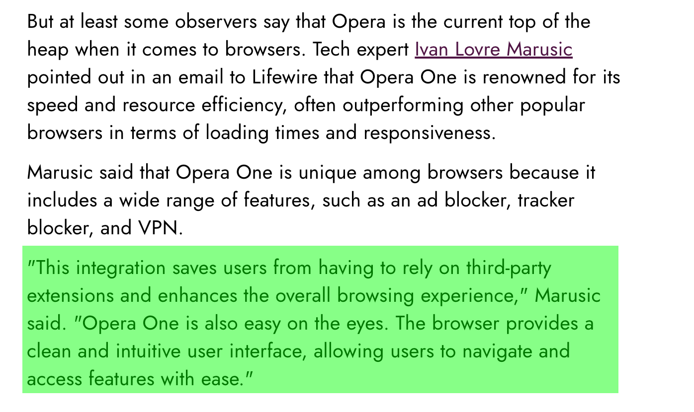
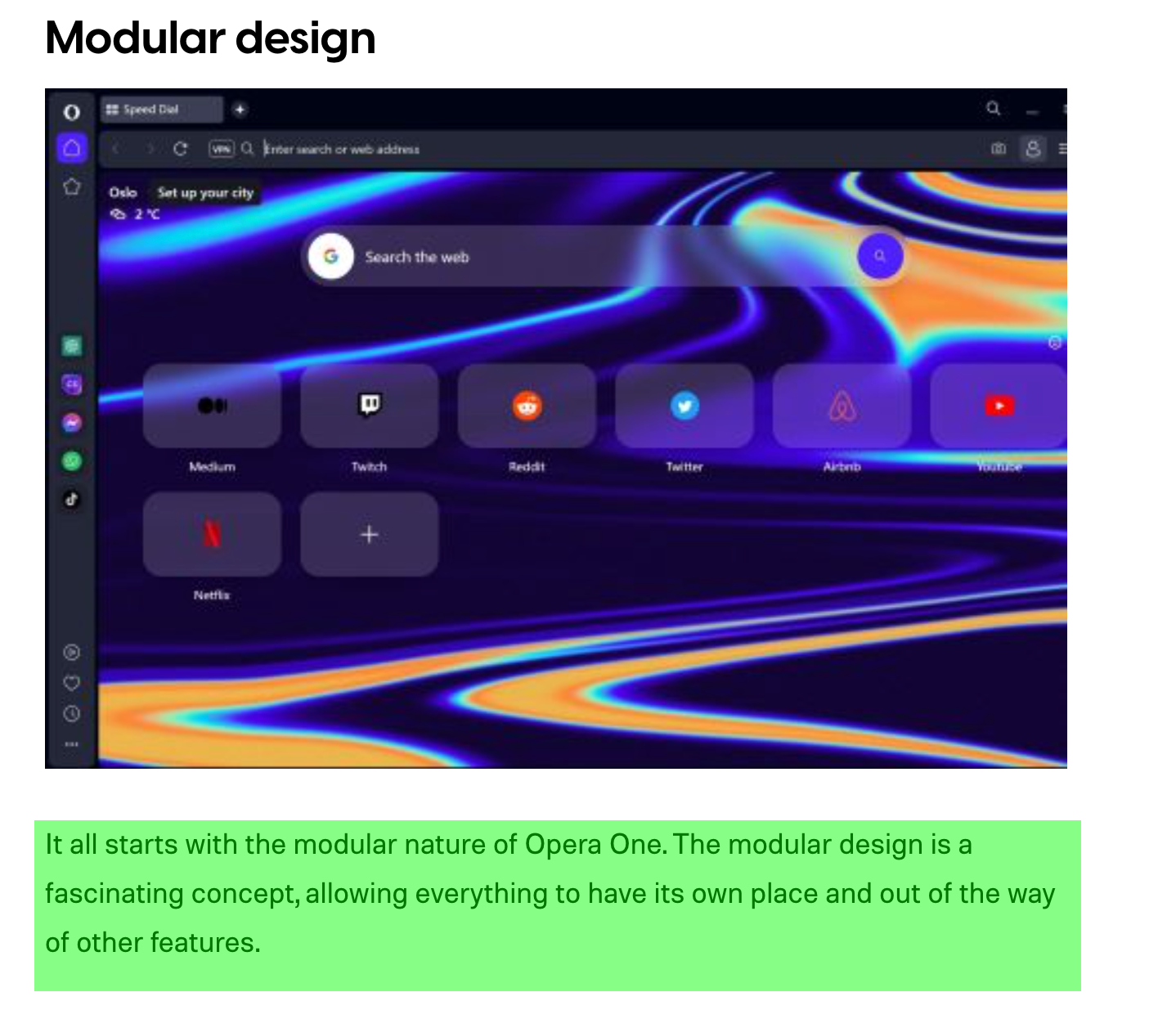
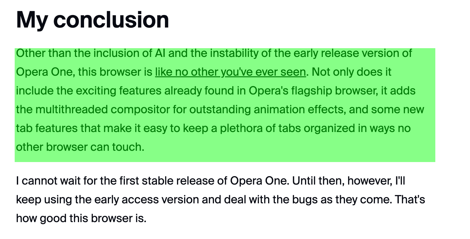
I've found, what the experts say about the new Opera and its design:

Lifewire

Digital Trends

ZDNET

IT Magazine CH
Why do these reviews come to a totally different conclusion about the new design then? Just saying.
-
gustavomolina last edited by
@himmelsheriff What the "experts" say, in this case the expert, in general I don't care because it is the particular vision of a person. By the way, I don't know how influenced he is by the brand. Here what really matters is the opinion of the users, who is the one to whom the product is directed. If you don't like it, you don't like it; and there is no possible discussion on this point or expert assessment.
The most serious mistake that Ópera made is that it made a drastic change in the interface, it made a forced update, without warning the user. Marketing people should know that sudden changes never go down well, especially if you have ergonomics and functionality issues. And unfortunately Ópera survives thanks to a minimum user quota, most of which are old users, and it is from these that Opera is usually recommended. This change not only brings problems to the loyal user, but also to the user who was recommended the browser; and ultimately receiving the complaints of the latter.
Most of those who come to this forum to present their dissatisfaction with the new Opera are the faithful users of a lifetime, and I dare say that they are 99%. And those who have only recently been using this browser have not the slightest idea of the existence of these forums.
And echoing my hypothesis, from word of mouth, I don't think this drastic change will bring new users, in fact I think it will be the opposite. For my part, in this current state of the Opera One browser, I have no intention of recommending it, in fact to anyone who asks me about it, I would suggest any other browser. For now, I'm starting the migration to Vivaldi.
-
CUL8R last edited by
@gustavomolina
Agreed. A long time ago I was suggesting Opera to any PC user around. And I am really guiding many people out there with computer topics.
Nowadays unfortunately I cannot recommend it anymore. Even Edge has gotten better than Opera. A thing I would never have thought of. But Microsoft also is on the way to destroy it with KI, same as Opera does.
So I am working on Vivaldi 95% of all things, followed by Opera with like 3%, Edge 1%, Firefox 1%. The latter just for testing or specific tasks.
And every browser has so many functionality built in right now, but none of them really convinced me as I do not need most of them. Honestly, who really needs the AI and Messenger, Wallet and Shopping things in the sidebar?
I would like to have other things built in correctly. Like editable mouse gestures, a thing that really made the first Opera great.
And IMHO they should stop to release all the different styles of browsers and concentrate and focus on one. Opera GX, Opera Mini, Opera Crypto? WTH? -
A Former User last edited by
@gustavomolina said in General Opera One Appearance Feedback Topic:
And echoing my hypothesis, from word of mouth, I don't think this drastic change will bring new users, in fact I think it will be the opposite. For my part, in this current state of the Opera One browser, I have no intention of recommending it, in fact to anyone who asks me about it, I would suggest any other browser. For now, I'm starting the migration to Vivaldi.
So, I think, that's ok. When Vivaldi was started there were a whole bunch of former Opera users who went there. Now they have 2.4 Mio users. Its founder said that Vivaldi needed to have 5 Mio users to become profitable. So even after eight years of existence it's not half way there.
I used Vivaldi between 2018 and 2022 almost exclusively. It's a decent browser. But it has become bloated with modules likes mail and calendar built in. UI-changes were introduced in 2023 as well, But of course different to Opera, you can change the UI to whatever you like. That's great, but may keep you from working with the browser, because you're occupied with arranging the browser itself.So of course it's important what the users themselves say. But I also like to know, what tech magazines say and how something is received from a rather distant standpoint. There are mostly positive reviews on Opera One, except for those who reject using Opera generally (because of its Chinese ownership e.g.).
Nevertheless, happy browsing with Vivaldi!
-
A Former User last edited by
@cul8r said in General Opera One Appearance Feedback Topic:
@gustavomolina
Agreed. A long time ago I was suggesting Opera to any PC user around. And I am really guiding many people out there with computer topics.
Nowadays unfortunately I cannot recommend it anymore. Even Edge has gotten better than Opera. A thing I would never have thought of. But Microsoft also is on the way to destroy it with KI, same as Opera does.
So I am working on Vivaldi 95% of all things, followed by Opera with like 3%, Edge 1%, Firefox 1%. The latter just for testing or specific tasks.
And every browser has so many functionality built in right now, but none of them really convinced me as I do not need most of them. Honestly, who really needs the AI and Messenger, Wallet and Shopping things in the sidebar?
I would like to have other things built in correctly. Like editable mouse gestures, a thing that really made the first Opera great.
And IMHO they should stop to release all the different styles of browsers and concentrate and focus on one. Opera GX, Opera Mini, Opera Crypto? WTH?I've found Vivaldi becoming buggy with each and every update. They were inserting feature after feature instead of healing old bugs. And in my opinion they had wrong priorities with adding a mail client or a calendar. To nerdy in my book.
-
canadagoose4everreturns last edited by
@himmelsheriff I have to admit to trying Vivaldi out briefly but deciding that it was just not for me. I know the user can turn "off" what he/she doesn't want or thinks he won't use but I didn't want to spend a lot of time tweaking this browser endlessly (or so it seemed) and yes, I also did not want nor need an integrated mail/calendar although I admit that many do want this. Different strokes for different folks, I guess. And a brief view of the forum there is indicative of the "issues" that Vivaldi is experiencing (i.e. it's not perfect by a long shot). For me, I want simple and I want the browser to essentially get out of the way once I've logged into it. So far I've been relatively unimpressed with Opera One since I see many of the changes for the sake of simply making changes. I'm hopeful that the older version will remain and continue to be updated with security fixes.
-
Firair last edited by
The only thing I want to know is if the developers are planning to bring back the interface as it was before, that is, without rounded corners. They are absolutely useless, taking up space and making navigation more difficult because of them. When you place the mouse in the corner to read, you can no longer scroll up or down because it activates the gray section. It's very frustrating. It's also harder to hit the buttons precisely due to the reduced space, causing delays and anxiety. Who came up with this idea, and why did others approve it? I have been using Opera for over 15 years, and for me, this is a decisive factor to consider switching to another browser. To me, this "update" was degrading and brought no useful features. It only took away space and grouped tabs, which is of no benefit to me. I just want to know if they are planning to remove these annoying rounded corners soon. If not, it might be better to start migrating everything.
-
gustavomolina last edited by
@himmelsheriff I perceive a hint of irrational fanaticism regarding Opera. Vivaldi is my second browser, and the truth is that I have found practically no problems or errors. As for Vivaldi's additions, his initial idea is to return to the concept of an Internet suite, as Opera was initially. Those additions (productivity tools) seem excellent to me, because they help a lot when it comes to having to manage emails and calendars, that is one of the main reasons why it is my second browser. Opera is my main browser purely for nostalgia. It is true that in the Vivaldi forums there are many more complaints, but you have to understand that Vivaldi is aimed at a different audience, mainly old Opera users (like me) who are, by far, much more picky and passionate than Opera users.
-
A Former User last edited by
@gustavomolina I stumbled upon many smaller and bigger bugs in Vivaldi. It‘s fantastic in a way, but lot of things are only half baked.
I prefer their ownership more than Opera‘s by far. But I don‘t think it‘s sustainable in the long run. User numbers are stagnating, actually.