• Login
    • Search
    • Categories
    • Recent
    • Tags
    • Users
    • Groups
    • Rules
    • Help

    Do more on the web, with a fast and secure browser!

    Download Opera browser with:

    • built-in ad blocker
    • battery saver
    • free VPN
    Download Opera

    Very small tabs and element spacings

    Tab Islands, Tabs and Workspaces
    3
    6
    3318
    Loading More Posts
    • Oldest to Newest
    • Newest to Oldest
    • Most Votes
    Reply
    • Reply as topic
    Log in to reply
    This topic has been deleted. Only users with topic management privileges can see it.
    • kolyapeno
      kolyapeno last edited by

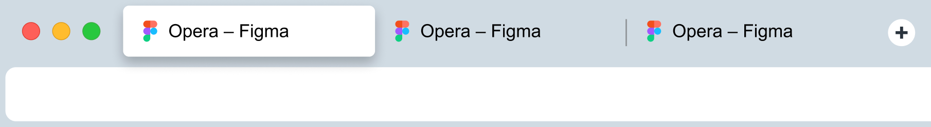
      I think it's not very pretty and it's not practical because it's hard to get in quickly. You have to aim to hit a button or click on a tab. It would be cool if the regular tab was as tall as the tab in the island. It would also be nice to make the tabs a little longer and add more space between elements.

      SCR-20230504-qkij.png

      SCR-20230504-qsmb.png

      Reply Quote 1
        A Former User 1 Reply Last reply
      • A Former User
        A Former User @kolyapeno last edited by A Former User

        As in efficiently using screen real estate available for the browser and not wasting space?

        That is on a level and pay grade above the design team at Opera.

        Reply Quote 1
          kolyapeno 1 Reply Last reply
        • kolyapeno
          kolyapeno @Guest last edited by

          @vegelund There is no point in efficiency if it is inconvenient to use. Now the interface looks like one big line: the window control buttons go to a tab icon, then immediately the text, the next tab, and so on. There is no air and no feeling that these are different elements

          Reply Quote 0
            1 Reply Last reply
          • kolyapeno
            kolyapeno last edited by

            So I would go something like this

            SCR-20230504-rrys.png

            Reply Quote 0
              1 Reply Last reply
            • andrew84
              andrew84 last edited by andrew84

              And my opinion is that the new tab button should look 'flat' like previously (square highlighted box on hover).
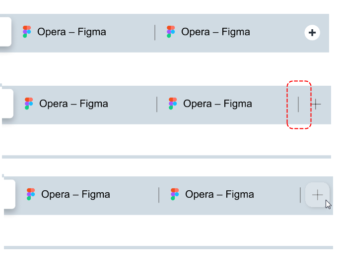
              And it's not clear why in current design there's no separator line between new tab button and background tab.
              2023-05-08_130353.png
              Currently the bold cross inside the small white circle looks like medical cross.

              Reply Quote 1
                kolyapeno 1 Reply Last reply
              • kolyapeno
                kolyapeno @andrew84 last edited by

                @andrew84 Good suggestions!

                Reply Quote 0
                  1 Reply Last reply
                • Locked by  leocg leocg 
                • First post
                  Last post

                Computer browsers

                • Opera for Windows
                • Opera for Mac
                • Opera for Linux
                • Opera beta version
                • Opera USB

                Mobile browsers

                • Opera for Android
                • Opera Mini
                • Opera Touch
                • Opera for basic phones

                • Add-ons
                • Opera account
                • Wallpapers
                • Opera Ads

                • Help & support
                • Opera blogs
                • Opera forums
                • Dev.Opera

                • Security
                • Privacy
                • Cookies Policy
                • EULA
                • Terms of Service

                • About Opera
                • Press info
                • Jobs
                • Investors
                • Become a partner
                • Contact us

                Follow Opera

                • Opera - Facebook
                • Opera - Twitter
                • Opera - YouTube
                • Opera - LinkedIn
                • Opera - Instagram

                © Opera Software 1995-