[Solved]Bring back the "Recently closed" button on the top bar on the right
-
A Former User last edited by A Former User
@nicinu001 It is possible but you have to dowdgrade to older version and disable updates. You can do it like this:
- Download offline installation of opera version 69 (69 is the last version that have recently closed tabs that you can activate through flags https://ftp.opera.com/ftp/pub/opera/desktop/
- Close your current opera version and reinstall it with older version that you downloaded
- After installation you have to be very quick and close Opera before it starts to update
- To disable updates you have to open your opera installation directory and there should be folder with name of version you installed so open this folder and rename file opera_autoupdate.exe to something like opera_autoupdate.old.exe
- Now you should have older version but if not try something below
- Close opera and delete all folders with versions names in root installation folder. It should be names like 69.0.3686.95 etc and then install your desired version again and continue from number 3.
- If you still dont have older version try to open opera from installation directory with version name you installed
- If its still not working try to reinstall opera completely and continue from number 3.
EDIT: Also after some time opera menu will turn red
 and inform you that you have old version and you should update but dont worry untill you manually force install with downloaded installator, opera will not update even if you start update from opera menu. It will just make some error or open opera website to download new version.
Also some features will eventually stopped working (mostly on porpouse) to force you to update so be prepared for that. It could take a long time or it could happen with next new version. -
andrew84 last edited by
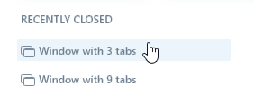
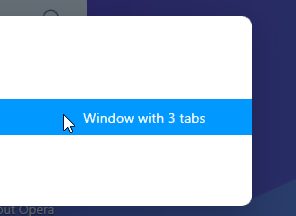
Step by step they are closer to the TabMenu, in the latest Dev build there's a 'Window with x tabs' feature for recently closed.


-
A Former User last edited by
@andrew84 Kind of but still Im not interested in search and openned tabs list and its still not possible to disable/hide that features. I also want to have recently closed tabs permanently expanded not just have only 3 all the time. Only last 3 tabs is mostly useless.
-
andrew84 last edited by andrew84
@airforce25228 If they continue working on it, there are chances that they'll add the expand/collapse possibility (with remembered state) in future.
But almost no chances they'll revert something back in near future, I think. They've added someDNA-88580 Implement search_in_tabs telemetry benchmark(maybe to rate the popularity of the Search In Tabs popup, I don't know does it mean). So if the rating will be low, then they make some global changes. -
A Former User last edited by A Former User
@andrew84 Well I still dont get it why lots of developers do this kind of things. Broke something up on purpose, upset lots od users and then they will fixing it for months until it is usable again but with less convenient result then was before.
-
andrew84 last edited by andrew84
@airforce25228 Maybe in order to provide work for developers and to regularly present 'new' improvements and features (for example, in the latest Dev build's blog post they announced closing buttons on the Search Tabs popup for open tabs(Of course, the TabMenu had it as well). https://blogs.opera.com/desktop/2020/09/opera-73-0-3825-0-developer-update/)
-
avmon last edited by
@andrew84 Sorry but I think they have to take too many steps to achieve the same functionality. For example, before you could collapse the list of opened tabs or even the list of recently closed. Now, if I have a lot of tabs opened, it shows a huge list of them when I just want to see the recently closed ones.
They could have added a search box in the previous tab menu and thus have also satisfied those who wanted to search in tabs. But they preferred the complicated and annoying way.
-
A Former User last edited by
@andrew84 Close button in search tabs... why... why would you even want that feature? Sorry but I must be from another universe but I really don't get it. Just more and more features makes no sense to me.
-
andrew84 last edited by
@airforce25228 said in [Solved]Bring back the "Recently closed" button on the top bar on the right:
why would you even want that feature?
I don't know, I just saying that the previous Tab Menu had this functionality as well.
Tab menu was implemented for better tabs management, so
most probably because of if there are enough opened tabs the closing cross 'x' is not visible anymore.@avmon said in [Solved]Bring back the "Recently closed" button on the top bar on the right:
They could have added a search box in the previous tab menu and thus have also satisfied those who wanted to search in tabs
Reasonable suggestion.
I was suggesting the same since the time when the Search in tabs feature was first quietly and without explanation introduced in one of the Dev builds. -
andrew84 last edited by
In the recent Dev update(73.0.3834.0) the 'Show more' button remembers its state,
-
A Former User last edited by
@andrew84 Can you also permanently collapse/delete/disable/hide list of openned tabs? This feature is annoying (list of openned tabs).
-
andrew84 last edited by
@airforce25228 said in [Solved]Bring back the "Recently closed" button on the top bar on the right:
permanently collapse/delete/disable/hide list of openned tabs?
No. But if I leave the 'show more' expanded and I have enough recently closed tabs (15-20), the open tabs are just not visible (need to scroll down)
-
sgrandin last edited by
With Opera 70, the reduction of closed tabs to 3 items is a real loss. Search for closed tabs is inadequate since how many remember the specifics of all their recently closed tabs? The point of the longer list is to help bring back what one remembers and to help facilitate recalling others. This is all the more important since for a large part of the population short-term memory declines with age.
-
A Former User last edited by
Click on the 'show more,' and you will have to get the recently closed tabs about 15 to 20, the open tabs are just not visible, and you need to scroll down to see them.
-
sgrandin last edited by
@naheed Thanks! Strangely, just the other day with the previous build, the Opera developer said they weren't using it in favor of just having 3 showing plus search. Maybe I missed it then or maybe they responded to my argument for expanding the list.
-
Thrashinuva last edited by
Strange hill to die on. This change which balks at the face of its users seems representative to me that those who operate this browser have decided not to make this browser function for its users, but for themselves.
I'm not sure what the catalyst was that changed Opera from being a user friendly browser to something that actively suppresses feedback.
Personally, I'm going to try Vivaldi. It seems that not only does it have this feature, but some other features I've been thinking about. It's frustrating as I thought this was going to be a browser I could use for a long time, but I guess it just didn't pan out that way.