Some details on UI/UX
-
A Former User last edited by A Former User
Hi,
We have perceived basically 2 bugs on UI (v 60.0.3255.59):
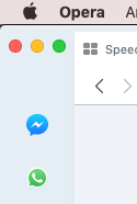
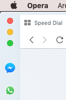
1- Using Opera with dark background (image attached), when relauched, the light background comes...

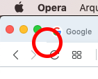
2- On topbar, a displaced pixel.

Thanks!
-
andrew84 last edited by
@kempeli If possible, could you check how do address bar icons highlighting look on Mac?
I have this on Windows

-
andrew84 last edited by
@xiamenese ok, Thanks.
Another thing I heard is that there is a 'Narrower sidebar' or similar option in sidebar settings in Opera on Mac. I don't have that option on Windows. -
A Former User last edited by
Hi @andrew84,
On Mac it doesn't work like on Windows. Clicking on icons, all bar is highlighted.


-
andrew84 last edited by
@kempeli Thank you for the info and screenshots.
On windows all bar is also highilghted(on hover) but address bar icons have a separate highlighting in addition(on hover and on click). It just looks weird and differs significantly from their reborn 3 presenation video. https://www.youtube.com/watch?v=ybXChhOPYXQ (at 0:04 there is address bar icons highilghting is shown) -
A Former User last edited by
@andrew84, on macOS the icons haven't additional highlight hovering the mouse or clicking. Maybe in the next updates

-
andrew84 last edited by
@kempeli So it's a fake video partially(edited) because icons highlighting looks a way different here on Windows than in video.
-
A Former User last edited by
In addiction, after closed, the tab area remains highlighted.
Version: 60.0.3255.109


