Hi, I've downloaded the latest Opera cause they label it as battery saving.
Thus, running it on a (Windows) 10 inches tablet.
However, I've been totally disappointed:
Say, a children-garden boy would find it a marvel cause it is totally new to him.
But, what about university professors? Should they start learning it as if they would have never seen any browser in their lives before? Well, functions may differ, OK.
But, at least some 50% or so in its design should be a priori understandable.
In other words: Intuitively accessible! - One can't even find out what version it is! - Where is the traditional "About" section, please?!
Well, these developers would be the ones coming from stars and not thinking like people from this planet, may be. Just like covering the 12 digit places while entering the Opera site. - Even financial banks have been satisfied with only 6 digits! 
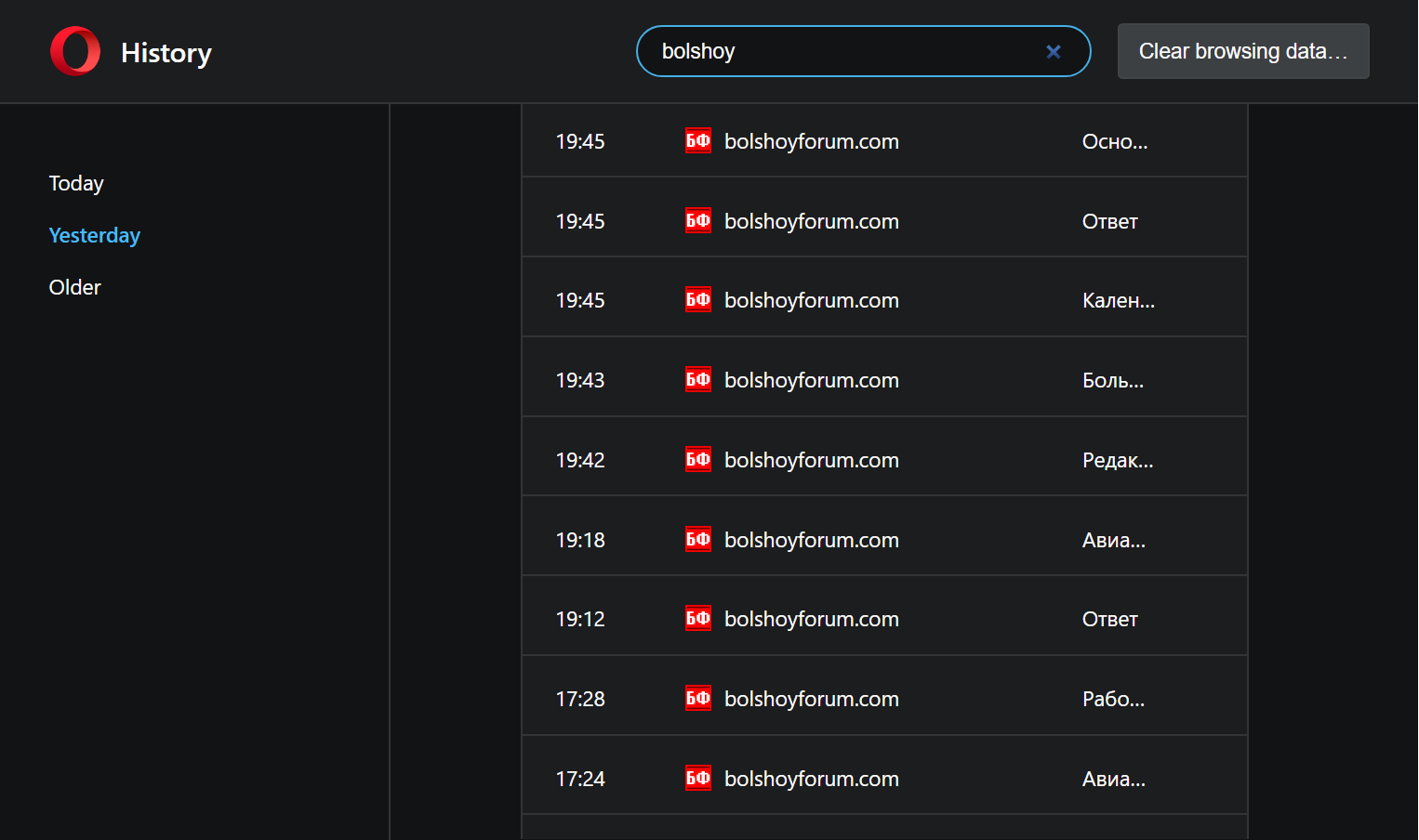
But, I cannot do anything with this interface on a 10 inches tablet, say, in History section: How should I even in bright all the columns? Today / Yesterday /Older section takes much more space than any Site Title (5 letters allowed only). I cannot move the column boundaries on a 10 inches tablet indeed, at least in Windows 10! How should I proceed then? What should I do? - The History section is this way totally non-informative! - The interface should be somewhat traditional for the most people and therefore intuitive, too. Alas. Am I mistaken?