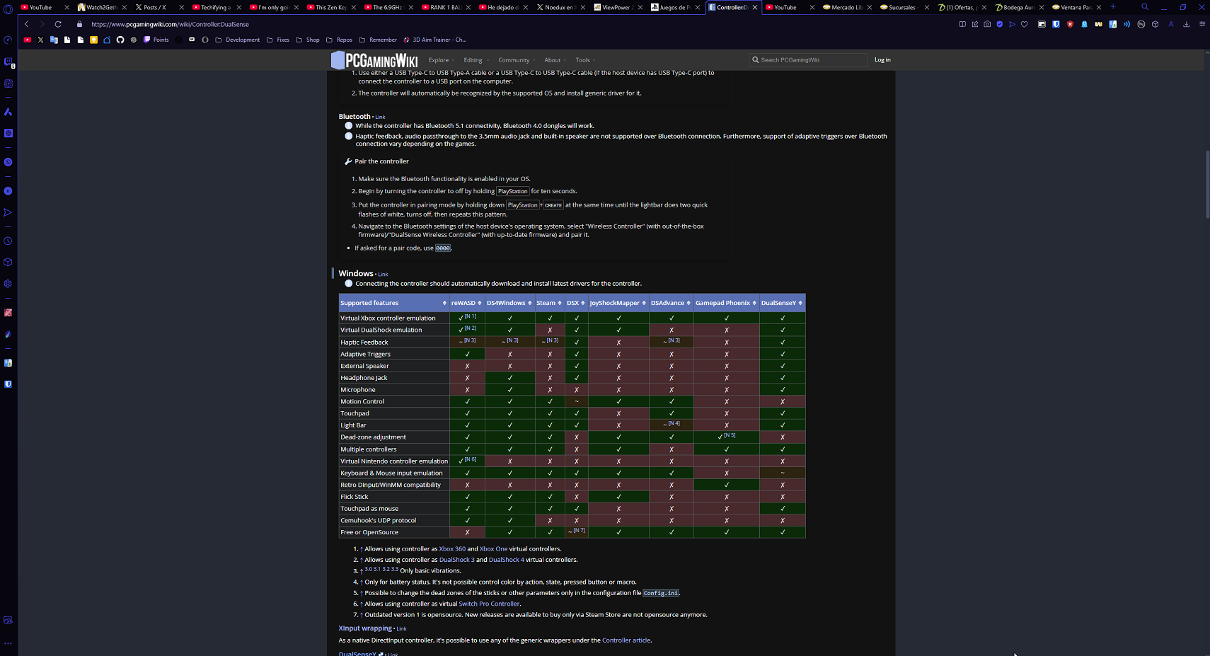
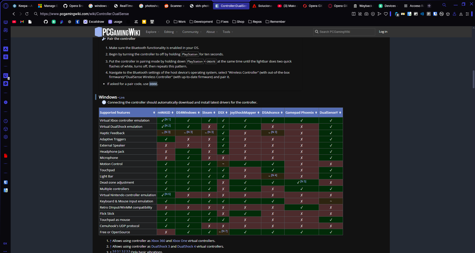
@Naser007 It is still not fixed on normal Opera
Best posts made by saidtorres3
-
RE: Dark mode settings are not working for websites and dev toolsGeneral
-
RE: Dark mode settings are not working for websites and dev toolsGeneral
@metana Lol, that's true. I think they confused DEC 28 with NOV 28.
-
RE: Unclickable Top 40px in Extension Popups on Opera – BUG-906Opera for Windows
@burnout426 said in Unclickable Top 40px in Extension Popups on Opera – BUG-906:
DNA-119560 Top area of extension popup window page doesn’t respond to clicks
That indeed fixed the bug, thanks for you hep!
-
[Request]Adjust the Outline Border to Inside the Browser, Not the WindowOpera GX
In the latest version of OperaGX (114.0.5282.218), the outline border has been moved to the outer edge of the window, instead of the edge of the website. In the legacy design, this border was positioned below the tabs, creating a clear visual separation between the tabs and the website content.
This change has introduced a few usability issues:
- Reduced Tab Clickability: With the border no longer separating the tabs from the rest of the interface, it’s harder to distinguish and click on tabs.
- Tab Size Increase: In the new design, the active tab enlarges when selected. This resizing can cause accidental closures of adjacent tabs, especially when toggling between tabs quickly with the mouse. While that is out of the scope of this request, it's worth mentioning to share more context why the new design is bad.
While I understand there’s an "Elements Background" setting to create a visual separation between the tabs and their background, it feels unpolished and visually unappealing.
Also, the outline being on the window boders, give me a feeling that I am on streaming platform like AnyDesk and it give me a feeling like its not in full screen, when it is. It a very strange feeling.
Here are images illustrating the difference:
Legacy:

New degisn:

Suggestion: Please consider restoring the legacy behavior where the border was positioned below the tabs, or provide a cleaner, more visually cohesive way to separate tabs from the rest of the interface. This would improve usability and address the accidental tab closures caused by the current design.
Additional Feedback: Having the outline on the window borders gives the impression that I’m using a streaming platform like AnyDesk, rather than a browser. It creates the sensation that the browser isn’t in full-screen mode, even when it is. This disjointed experience feels quite strange and detracts from the immersive browsing experience.
-
RE: [Request]Adjust the Outline Border to Inside the Browser, Not the WindowOpera GX
@ricardob Totally agree
-
RE: Ctrl + Enter search not workingOpera GX
Ctrl + Enter search not working
This issue is replicable in normal Opera One(versión: 122.0.5643.92) btw
-
RE: Ctrl + Enter search not workingOpera GX
@leocg It should also submit it automatically, however, it doesn't and it used to do it before. Compare to chrome behaviour to experience the diff.
Latest posts made by saidtorres3
- Opera GX
- Opera GX
-
RE: Ctrl + Enter search not workingOpera GX
Update: It actually works again (I don't know since when) in Opera Developer 126.0.5748.0 as before.
-
RE: Ctrl + Enter search not workingOpera GX
@saidtorres3 said in Ctrl + Enter search not working:
Good news, it seems to be fixed in Opera One 123.0.5669.47, right now we are in OperaGX 123.0.5669.43, so it shouldn't take so long to get an update with the fix.
Actually, it’s not good news — it’s bad news. I hadn’t noticed at first, but after testing it again, I realized they basically removed that functionality. Now, pressing Ctrl + Enter works exactly the same as just pressing Enter.
You can briefly see the browser append “www.” and “.com” for a few milliseconds, but then it’s immediately replaced by a normal Google search query.
That happens in Opera One 123.0.5669.47 and also in Opera Developer 125.0.5707.0.
-
RE: [Duplicated]Ctrl+Enter not working anymore since last updateOpera GX
@VidalsVerse An imminent fix appears to be incoming: https://forums.opera.com/topic/86380/ctrl-enter-search-not-working/14
-
RE: Ctrl + Enter search not workingOpera GX
Good news, it seems to be fixed in Opera One 123.0.5669.47, right now we are in OperaGX 123.0.5669.43, so it shouldn't take so long to get an update with the fix.
- Opera GX
-
RE: Ctrl + Enter search not workingOpera GX
@leocg It should also submit it automatically, however, it doesn't and it used to do it before. Compare to chrome behaviour to experience the diff.
-
RE: Ctrl + Enter search not workingOpera GX
Ctrl + Enter search not working
This issue is replicable in normal Opera One(versión: 122.0.5643.92) btw
- Opera GX