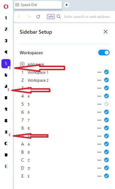
visual indicator to quickly identify empty workspaces.
-
hosseintest1 last edited by leocg

Dear Opera Team,I'd like to extend my appreciation for incorporating the workspace feature into your software—it has proven incredibly valuable for managing various projects.
However, I've encountered a minor challenge: with over 15 workspaces in use, it becomes cumbersome to locate an available workspace for a new project. To address this, I suggest implementing a visual indicator to quickly identify empty workspaces. Adding a small "E" next to empty workspaces would significantly enhance usability and efficiency.
Please take a moment to review the attached screenshot for further clarification.
On a related note, would it be possible to improve the visibility of fonts on the symbols for workspaces? Currently, I've designated them as numbers 1 to 9 and letters A to E. However, numbers 8, 7, 9, and the letter A are not very legible.
Thank you for considering these enhancements.
-
Locked by
 leocg
leocg