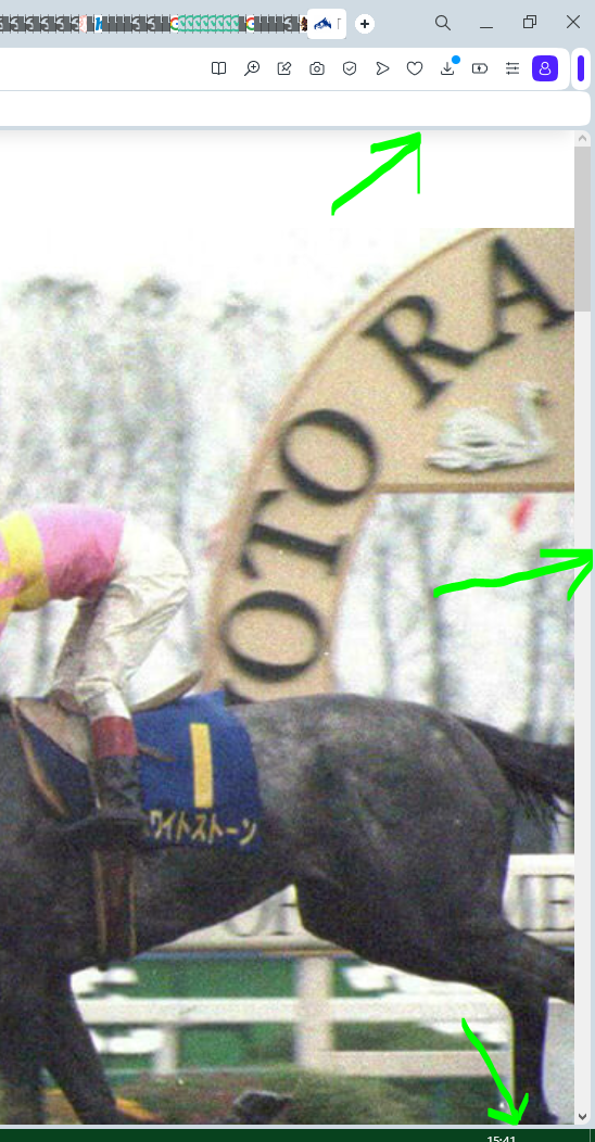
Border around viewport in new design
-
cheerd last edited by
In the new design there is a border around the viewport. Is it possible to remove it somewhere in settings? If no, please add such setting.

-
Moved from Opera for Windows by
 leocg
leocg
-
csongor242 last edited by
@cheerd This is once again an incredibly irritating and dumb change they made. Not only does it look irritating that part of the screen goes unused, but it hinders the use of the browser itself. If you bring your cursor all the way to the right, it actually goes beyond the scroll bar, and you must bring the cursor back if you want to click on the scrollbar. It's super dumb because you can't use that few pixels for anything and I’m probably not the only one who has a muscle memory to simply move the mouse until it hits the border and click if you want to scroll, you know, since that how it works in every other program.
I'm still hoping that they'll remove this dumb border very soon, because Opera has a track record of screwing up something and giving us an option of switching back in a few updates. So please, if anyone at Opera reads this, find a way to remove this stupid border.
-
noszone last edited by
Agreed with others, its a dumb update with rerards to interface. The borders looking ugly. Please devs, remove these borders.
-
Locked by
 leocg
leocg