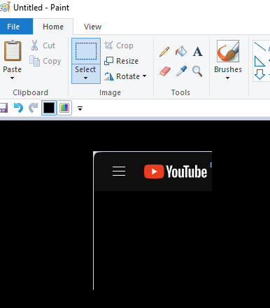
[Suggestion]Please take out the edges surrounding inside the browser
-
Meand last edited by
Yes! I have to admit , the new version is faster, which is nice. But the user experience is pure hell. Especially opening new tabs and switching between tabs. Rounded borders, unnecessary shadows and floating effect create a chaotic and visually overloaded environment. The opera may be faster, but I'm slower now. Trying to find the right icon in this mess.
-
KNK2008 last edited by
@geebooboo I have the latest version of Opera and it fixed the edge problem for me, so the suffering probably ended
-
shagratt last edited by
@tkrojam I just reported this a bug cause its a not how it should be working (and was not how it worked in the past or in fullscreen mode). Its really making me want to switch browser if they keep ignoring all they userbase with these unwanted changes with no option to switch them off.
-
shagratt last edited by shagratt
@leocg Well, in previous versions (when this new theme appeared) they got 1px border on top and that prevented users from switching tabs clicking on topmost pixels. Guess what? They fixed it! Now is exactly the same, but with the side pixel. There should be no borders on the side on the screen. (Or eventually they should capture the mouse functionality and leave the visual as it is)
-
faciuscardan last edited by
Indeed, that border surrounding the browser window is not needed at all and it makes it more difficult for those who, like me, use the scroll bar on the right.
Furthermore, after reaching the end of the scroll bar the window gets minimized and, after maximizing again, the scrolling inside that tab becomes locked, forcing me to close it and reopen it again. -
atillaakin last edited by
I want to know the person who came up with this bright idea! Apparently, software development is not the best thing he can do.
-
Locked by
leocg

