Speed Dial boxes color change
-
carpet last edited by leocg
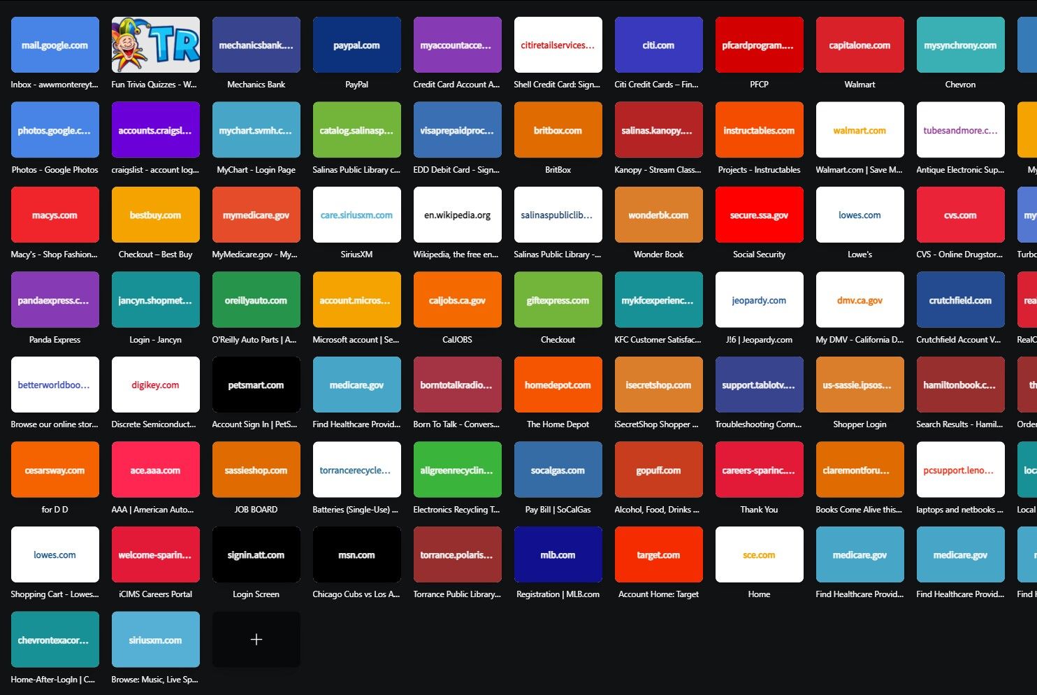
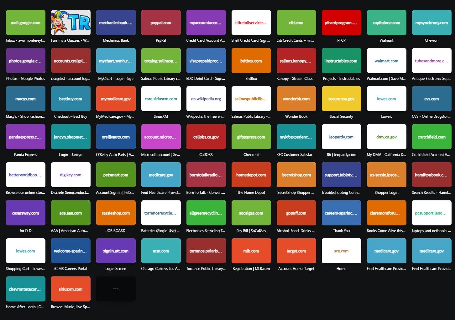
Speed dial boxes change color after first use, started several months ago.
Want them to stay the same as in first view - upper left blue not puke green


-
Bakaonline last edited by
I have the same problem for 1+ month. All boxes inverted their color, annoying AF.
-
A Former User last edited by
Off-topic, but you do know we have folders and customizable thumbnails?

-
burnout426 Volunteer last edited by
With Opera 100 and newer, speed dials without an actual thumbnail image set are no longer colored and no longer have the domain text in the middle of them. They either show a small favicon in the center or a small blank document icon if no favicon is available on the site's server.
So, this issue is gone now due to the start page changes.
-
gudguy1a last edited by
@carpet Yessss....!!!!!
This is rather pathetic. That opera makes these changes believing that all of us will like them.
And without giving us an option to modify them to what we like.
I saw one person state to you "did you know we have customizable icons" - but when I tried to research and figure out how to modify the icons, I came up dry - no success.
My speed dial icons for web pages are all dark backgrounds. As it is, I personally despise dark theme pages and always opt for light themes.
This is why I continue to go firefox and chrome so often.
a) stupid dark, unmodifiable icons
b) stupid, crappy, annoying update/relaunch opera splash page with loud music even though your speakers are set to low (I listen to music while working but now have to remove my ear buds whenever this crappy opera updates... -
gudguy1a last edited by gudguy1a
@bakaonline Of course - yes indeed....!!!
VERY pathetic - opera making these changes believing WE ALL want them.
Without an option to modify them to what we prefer or return to default.
My speed dial icons are all dark backgrounds.
This is why I return to firefox and chrome so often.
a) stupid dark, unmodifiable icons -
Locked by
 leocg
leocg