General Opera One Feedback Topic
-
diagonal last edited by
@darkwind23 https://forums.opera.com/topic/63404/duplicated-how-can-i-go-back-to-the-old-look (return to the old 99 version)
-
A Former User last edited by A Former User
So where to begin its so many of it!
- Startup sound is very annoying and useless.
- Changing workspaces animation is very annoying. Disable it or make and option to not be visible. It is also very laggy and makes it feel that Opera have some performance issue
- New GUI is waste of space and "modular" design have no use because you cant move GUI elements anyway so what exactly is modular? Spaces between GUI elemens is also waste of space and have no use.
- The neon colors of GUI elements should be changed/deleted and not be so agresive. just make it more smooth. It kind of burning in the eyes mostly with dark theme.
- Whole dark theme is colored to some strange dark bluis color. It makes no sence in combination of dark theme. It should be so kind of warm color or the best case just neutral shades of gray will be best like normal Opera.
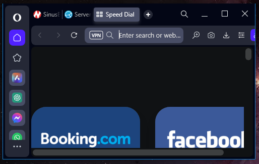
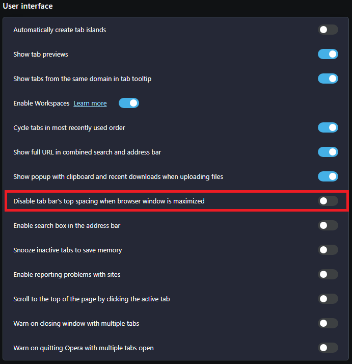
- The "O" button is not reachable in upper left corner with maximalized windows. Before you just move the mouse to upper left corner of he screen and click. Now it is not possible
- Missing speed dial icon at left side of main adress bar
- Speed dial icons are very small. make the option to make them bigger
- Active tab have no vissible X (close) icon (noly visible one mouse hower) to close tab right away even from non-focus window state. You have to gues blindly that is kind of ridiculous.
- The design about tab island AKA tabs stacks (call it right please) has many major flaws in design and functionality and should have probalby its own forum. Example of issues:
Very non intuitive creating stacks so it will be much better just place one tab over another and to add more tabs to stack just move over existing stack
collapse and open stack is not coherent sometimes there is stack icon on the left of stack sometimes there is stack size of tab and sometimes there is only some stupid color bar - no icon, no text, nothing. Just make it the size of one tab with text and icon all the time. Also let the stack icon on the right side of the stack visible all the time so you can always collapse or show all tabs in stack. This will make it more consisten in controls os stacks
you cant move tabs to collapsed stack that have only collapsed color bar. The solution is righ above. Just let stacks always size of one tab no matter what.
Moving tabs in/out stack have issues lots of unpredicted behavior caused by changing size of stacks from regular tab size to color bar and vice versa. It cause sometimes crash of whole browser or freeze the tabs in odd possitions. Also moving tabs/stacks sometimes move in strange ways and end up in unpredicted possition - this is really inconsisten and depends of configuration and mutual position of tabs, stacks and its states (colapsed/expanded, focused/non-focused)
Movin tabs in general mostly because of stacks moving issue or in general. Stack open in full size by its own just by moving it. Moving tabs and stack aroud each others cause browser to stuck sometimes and sometimes strange choppy movements
Opening/closing stacks are sometimes not responding or very choppy or delayed. You have some major issue with animations. It will be better just remove animations. Probably this is caused by changin focus/expading state of tabs/stack in various ways.I will update this if I find something more.
-
tuneout last edited by
Before we had the issue of not being able to remove snapshot, yes it is off in settings. Now we also got my flow on the top right corner. And again, it is off in the settings. Would like a fix where you could remove them.
-
Zlotowinfo 0 last edited by leocg
Massive crap with opera one in extensions
opera://extensions/
Aliexpress observer
Amazon Assistant Promotion
Aria
Background worker
Cashback Web Monitor
Chromium PDF Viewer
Gaming Landing Page
Google Hangouts
News feed handler
Opera Touch Background
Opera Wallet
opera-intro
Rich Hints Agent
User CSS
Video handler
Zakładki -
sydneycondra last edited by leocg
Sorry, but the 'new' Opera One . . . sucks.
How can I go back to what we had?? -
leocg Moderator Volunteer last edited by
@sydneycondra Install a previous version and block automatic updates.
-
Dracael last edited by
My issues so far (4K Resolution; Windows 11):
Tab Button Size in Tab Islands
The grouped tabs/tabs in a tab island now have a smaller "hitbox"/area to click on than the other tabs. So if I quickly move my mouse cursor all the way up to the border of the screen and click (as it worked before), nothing happens. I'm so used to doing this in my workflow and now it's really annoying. My solution so far was deactivating/not using the tab island feature. I like the idea of that feature, but in its current state it drives my crazy.Weird border around the browser window
As another user has posted, the whole browser window now has a border, which imo is not necessary and looks not great on some websites depending on its colour.Speed Dial icons can look ugly
Maybe it's just me, but I don't like how the Speed Dial looks now. Fields with small icons depending on the website? Some icons are not made for this and are stretched (I guess the fault of the website), other icons don't look great in general, etc. It imo looks just terrible. I have also some dials to different branches of a bigger website "conglomerate" and they all have the same icon and colour. As a result the dial fields all look the same and my first visual impression opening the speed dial page leaves me searching for a moment. How it was done in the old version or in Opera GX works much better for me. -
NotVeryHappy last edited by
@tuneout I got an update today and flow button has vanished for me, most of other bugs are still there though
-
tuneout last edited by
@notveryhappy Thanks for telling me. Just got the update myself and flow is gone too. Now I just wish Snapshot was the same, but at least it's one button less
-
A Former User last edited by A Former User
Why does have Opera some strange 1px blue line aroud the window from left, right and down side?

-
angelzx7 last edited by
@leocg said in General Opera One Feedback Topic:
There isn't.
Well, it's time to say goodbye to opera...
What a pity -
A Former User last edited by
@leocg I wonder if there is some sort of feedback for users. I mean we give feedback to developers and what about feedback to us users? Something like... yeah we will change that or this will be fixed or no planning to change that etc.
Do you have something like that? -
A Former User last edited by
@airforce25228 said
Something like... yeah we will change that or this will be fixed or no planning to change that etc.
If you are on Stable, you can look into the future and see coming versions/change logs via Beta and Developer.
-
tuneout last edited by
With the new update some streams on twitch lags.. does not occur on other browsers
