Do the Opera Account dialog more tidy
-
flaviu2 last edited by
I am using the latest Opera version, 89.0.4447.51, where I have the new Opera Account dialog. Can you do it more tidy ?
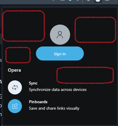
I mean, there is a lot of unused spaces (with red).
I always liked the tidy aspect of this excellent browser, compared with others, but this new added dialog looks unkempt.
-
Moved from Opera for Windows by
 leocg
leocg -
Locked by leocg