New tab opened pop-up placement
-
A Former User last edited by leocg
In Opera Beta, the Switch to New Tab is placed in left below corner, which is almost unreachable at Tablets. At mobile phones it would work though. Is it possible to either bring back it at Tablets in the middle and not in the bottom? Tablet usage is entirely different than mobile. Another solution would be to in the popup menu after pressing a link show 2 options.
1 Open tab in background
2 Open tab in foregroundLatest solution would mean 1 entry more in the hyperlink press popup menu, but if this makes it to final Opera, it is practically unusable at my tablet. And at Samsung phones it's already known Samsung has put a frame rate limiter on browsers which are not Samsung.
That would be sad, since the tablet non beta is only left, since Samsung doesn't do frame rate cap at tablets for non Samsung browsers.
-
A Former User last edited by
@leocg am in tablet mode. At my tablet usage is acceptable with just opened tab in background as long as the Switch To popup is somewhat in the middle of the screen to prevent RSI. You might say I could enable always directly switch to new tab. But that's not fun. I would like actually to have in the hyperlink popup menu to have the choice.
1 Open tab in background
2 open tab in foreground.It's only 1 extra entry in the hyperlink popup menu.
But since opera has only that Switch To popup every time, in tablet mode in opera beta now it's bottom left. Difficult to reach.
-
A Former User last edited by A Former User
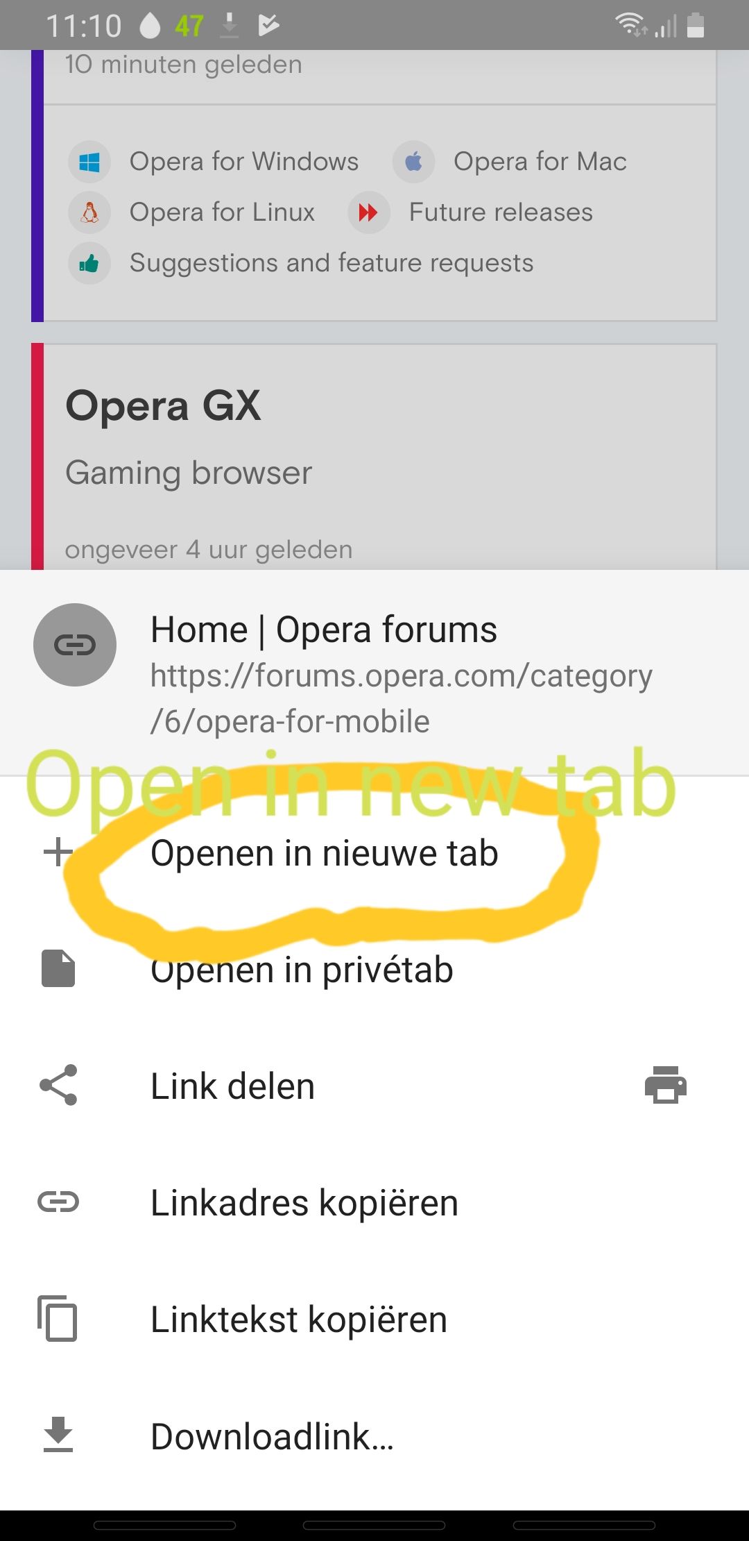
@leocg Picture of the pop-up menu when holding a hyperlink, now at mobile phone. Am not at tablet this moment.

'Openen in nieuwe tab' in English means Open in New Tab.
It could become
1 'Open in foreground'
2 'Open in background'Translation in Dutch
1 Openen in voorgrond
2 Openen in achtergrondAdding the choice in the pop-up saves a lot of extra user input considering people can easily see this pop-up menu hundreds of times a day, like me

Since Opera is translated into many languages it obviously can be misinterpreted by me when translation occurs to point out a specific menu or action which inherently is named different sometimes.
-
A Former User last edited by A Former User
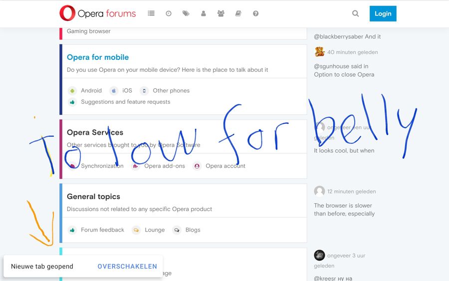
@leocg at my tablet in latest opera beta with 10 inch screen the picture hopefully makes it more obvious what's the difference between mobile in the hand and tablet at the belly. I am not obese but also not skinny. The problem arised in latest opera beta where the arrow pointed area is barely reachable for not skinny people holding tablet. With mobile phone this is not an issue. Also current placement of normal opera is in middle of screen and is working.

I can with my mobile phone upload a photo of practice which is different than theory. In theory it is perfect, but in practice it will not work for tablet, but as mentioned with mobile it works fine.
The arrow shows the almost unreachable part when using the tablet to switch over to a just opened tab. Don't have a better translation. Can upload photo of me holding tablet.
-
Locked by
leocg