Right-click menu improvement
-
A Former User last edited by
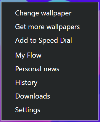
I think you can improve the right-click menu for the dark theme by putting the same color on the menu contents and the border. Because the contrast between the menu contents and the border is very high and it hurts my eyes.

Thanks for considering
 .
. -
A Former User last edited by
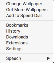
I just noticed that the context menu from the Speed Dial is easy to read. Why could the developers not make the text in the toolbars and tabs that same colour?

