What happened to discover
-
ohioscott last edited by
I don't like the updates either, the Discover page is seriously less usable now. The side bar takes up so much room its hard to see the articles in the feed. Almost as frustrating is the new tiny scroll bar button which makes me jump way down the page.
-
james438 last edited by
I'm not sure I understand. I can see more stories than before not less and the sidebar makes it easier to sort stories. It only takes up about 10% or the window width.
I can understand the desire for a different scrollbar, but it doesn't really bother me as I don't use the scrollbar when using Discover.
You can always download an older version of Opera. Opera has not moved away from making Opera customizable. Quite the opposite. Many more customization options for users are coming.
-
lando242 last edited by
On my screen its 3 or 4 stories wide, depending. Are you using a small display and/or screen resolution? Can you post that information here?
-
A Former User last edited by
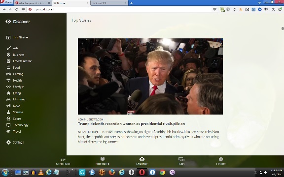
I do not know how to post screen shots on this forum. I do not think they allow it anymore. At 100%, I get one story, abd a side bar that takes up 25% of the screen.
-
A Former User last edited by
RESOLUTION IS 1440 X 900 Scaling is 125%.
I am not sure why this is relevant. These were the same settings before Opera updated and everything was fine.
-
james438 last edited by
Here is your version of 1440x900 at 125% scaling.

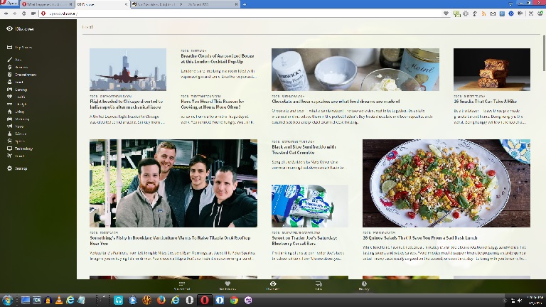
Here is mine at 1920x1080 at 100% scaling.

With the previous version of Opera I could see 1 or 2 stories side by side. With the new version of Opera I could see between 3 and 4 and once in a while 5 stories side by side. Resolutions and scaling stayed the same. I could post a screenshot of my previous discover page, but I didn't want to download and install Opera 30, take a screenshot, etc.
Syntax for images is: 
An exclamation mark: !;
followed by a set of square brackets, containing the alt attribute text for the image;
followed by a set of parentheses, containing the URL or path to the image, and an optional title attribute enclosed in double or single quotes. http://daringfireball.net/projects/markdown/syntax#img
-
A Former User last edited by
WOW that is an improvement. Unfortunately, the highest resolution on my version of windows is 1440 X 900. I did change the scaling to 100%, and this got me one extra story per row, sometimes three stories per row. Too bad you cannot reduce the width of the sidebar or uncheck it.
-
fibojoly last edited by
Mmh, this appears to be dpi dependant.
I run a 1920x1080 screen, but with 150% scaling and I get the one story per page crap. If I go to 100%, I get the full shebang.But no matter what, that left bar is almost constantly empty. Just look at it! 50% of it is just blank space. What a waste. And of course we can't just resize it... sigh
Whatever happened to Opera where you could change and customize everything T_T
-
james438 last edited by
Whatever happened to Opera where you could change and customize everything T_T
Presto became impractical to work with, so Opera made the hard decision to stop work on it and move over to the Chromium engine. Opera had to redesign the browser from the ground up. It has taken a great deal of work, but Opera returning more and more of the features that were lost during the move to a new engine. The core philosophy of Opera is still the same.
But no matter what, that left bar is almost constantly empty. Just look at it! 50% of it is just blank space. What a waste. And of course we can't just resize it... sigh
Work is still being done with Discover. In Developer 32 the extra space has been reduced somewhat. Hopefully it will be reduced further. I do like the idea of making the Discover sidebar adjustable.
-
A Former User last edited by
"Opera returning more and more of the features that were lost during the move to a new engine. The core philosophy of Opera is still the same."
I would like to see a list of those features that have been restored. I have been using Opera since the mid 90's, and I see nothing in the chromium opera that resembles presto opera. I only use Opera for discover now when I want a different random selection of articles, and for the speed dial, but now I mostly use Chrome. I was using stash, which I started to like, but they discontinued it. Opera and Chrome are so similar that sometimes I forget which one I am using.
-
james438 last edited by
http://www.opera.com/docs/history/
http://www.opera.com/docs/changelogs/windows/
There are some features that Opera has not/ will not implement because they have developed something better. Sadly, a few examples do not come to mind. Chromium and Presto do not resemble each other because they are completely different.
Here is an analogy describing working on the Presto engine and them moving on to the new Chromium engine: It is like making a beautiful sculpture and then learning that the foundations have started to crumble. You now have to start all over again, but with a completely different building material. After working with clay for so long you are used to that material as opposed to the new material you are learning, however, you know what it is you are trying to create and where you were going with your creation. For some info on why the change was made see here: http://www.operasoftware.com/press/releases/general/opera-gears-up-at-300-million-users other info is derived from comments made by the developers that I remember reading.
If you prefer Chromium, that is fine. The engines are nearly the same if not exactly so (I need to look into that more). The philosophies are and directions are different. I think the best things that I like about Opera is that they feel everyone is different and try to make the browser adjustable for each user and they are against spyware. http://www.operasoftware.com/company/vision
If anyone wants to correct me on any of the above feel free.
-
A Former User last edited by
I understand that developing a new Browser is challenging, and I hope they will develop a chromium browser as feature rich as Opera 12, but right now there is no clear reason to choose Opera over Chrome because the surfacing experience is pretty much identical except for google apps with are pretty convenient.
-
lando242 last edited by
I like Opera's speed dial better. I like its extension sidebar better. I like its bookmarks manager better. That said, the only thing about Chrome I like better is its editable search engines. While I have kept an eye on Vivaldi its nowhere near ready for prime time. Firefox is really not my bag. We don't even need to talk about IE. But, different strokes for different folks.
-
jamesconstance last edited by
I agree that it looked better without the sidebar. The sidebar adds a big chunk of distracting information that takes focus from the stories.
-
lando242 last edited by
I believe it was done to unify the theme with the bookmarks page. To me the discover page and the bookmarks page looks basically the same.
-
james438 last edited by
The Discover feature has been updated to look and feel like the bookmark manager. Opera 31 Changelogs
-
bbildman last edited by
You can go back to the full screen Discover::
opera://flags#standalone-discover-page