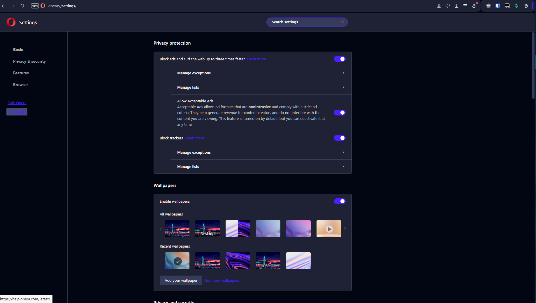
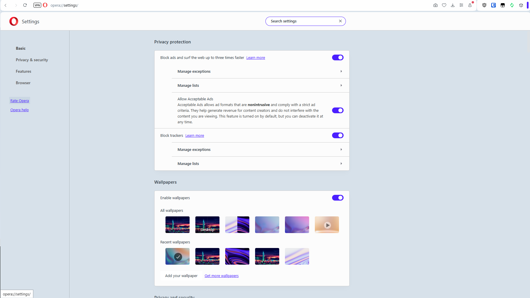
[Windows]Classic Theme purple URLs hard to read on Dark Mode
-
corylbea last edited by
Windows 10 Home 64-bit
Opera One version: 115.0.5322.77I've just updated to the version with Themes, and the Classic's dark mode with purple URLs (the default option) is hard to read.

The URL hover in particular, on the left sidebar, has horrible contrast.
Here it is on Light Mode, hovering over the same link in the left sidebar, which is fine to look at (except that it's light mode and hurts my eyes in different ways).

I don't think these colours were optimized for dark mode. This grey background is particularly bad. I can't read the URL text.

I'll be adjusting my themes to find something that works (very happy to have this option!), but because this is the default "dark mode" option, I believe it warrants tweaking for contrast and accessibility in those UI/settings URLs.
-
Locked by
 leocg
leocg