Use custom color scheme for workspaces
-
adrian2k7 last edited by
Hello,
I like the idea of workspaces. But as of now it is quite confusing,as the there is no real differentiation between workspaces (beside the small icon) (I'm using Opera GX)
It would be nice, if I could choose a different color scheme per workspace, or if the color scheme is automagically generated from the name.
-
conan99 last edited by conan99
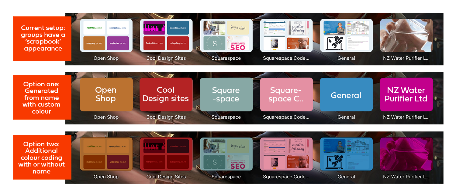
@adrian2k7 So keen to see this happen! My workspaces work great but the messy header appearance makes it very hard to identify them. I am asking that the group headers be similar to the options for individual site links. Maybe a generic, pre-generated one (see attachment) with a customisable colour and name or additional colour coding. Its just for easy spotting.
Perhaps the group name (currently under) could be optional whether it's under the group, or on top, or removed completely.

The other obvious option is to add a custom image (any kind) to define a group. -
conan99 last edited by
@leocg Yes, each workspace should be able to be customised so they look a little different from the one next to it! At the moment, these workspaces are represented by a graphic of four speed dials, which doesn't help to differentiate them from each other (at a glance).
For example, if I have a workspace containing links that refer to piano playing, then I can personal how that group appears say with a plain colour and the word 'Piano', or have a picture of a piano.
I'm not sure what you mean by someone who doesn't use speed dials, this is simply adding options for those that do - And have so many they need to group them into subjects!
-
leocg Moderator Volunteer last edited by
@conan99 Since you can't see more than one workspace at a time (meaning it's content) and that they all share the same speed dials, how the different layouts would help to know in which workspace you are?
Wouldn't be more easier to use, for example, a piano or other music related icon/emoji for that workspace with the piano playing related tabs?
-
conan99 last edited by leocg
@leocg I think I'm getting confused by the labels here.
I thought a folder on my speed dial was called a 'workspace' but its not.My request only relates to the folders in speed dial. They currently are made from screen shots of a few speed-dials within and they have no options for customising their look like the individual links do.
My current workspace has about 300 individual links of which 280 are kept in groups of similar areas. The individual links are easy to find, I can colour them, select different images etc, but the folders are quite similar in appearance, and at first glance, hard to tell one apart from another. If I could customise their appearance I could tell straight away which group is for Piano, or Web design, or Building etc.
As I said, this is pretty much the same options you already have for selecting how an individual link appears on your speed dial.If you need another picture to explain more clearly what I mean, let me know.
-
leocg Moderator Volunteer last edited by
@conan99 This topic is about Opera's workspaces (https://help.opera.com/en/latest/features/#workspaces)
What you are talking about are Speed Dials. Therefore, it has nothing to do with this topic and you have to create a new one for your request (or find an existing one about the same thing you are suggesting, if you prefer).
-
benelaci last edited by
@adrian2k7 I totally agree. A lot of time I don't think to look at the small icon, which is in a whole different place than the tabs, and a minor but annoying confusion ensues.
-
aether22 last edited by
Re: Use custom color scheme for workspaces
Hi, this was suggested earlier but that was a few years ago, the workspace feature is potentially very useful but even just using it for a few seconds I can see how maddening it is going to be.
I have the side panel which lets me know which workspace I am in minimized and as such there is no way of knowing at a glance which workspace I am in.
If the colour scheme of workspace 2 was different, say maybe red, then 3 could be orange and so on, this would be hugely useful, the colours could potentially be customized but even a default similar to mentioned would be really beneficial as an option and I am surpised no such feature exists.
Is that is somehow hard to do, then maybe something could show up on the task bar?
-
aether22 last edited by
I have a similar but slightly different request.
See, here are two different workspaces in the same instance of Opera, see the differences???

Me neither! You can't even be sure i took screen caps of two different workspaces but I absolutely did, there is no possible distinction and without going to the autohidden side panel no way of knowing.
But what if the hue was a little different?

Ok, I just rotated the hue for the whole image so the Opera logo was affected, but that subtle change makes it easy to distinguish instances. -
Locked by
 leocg
leocg