General Opera GX Feedback Topic V2
-
A Former User last edited by
I have only two requests of this browser to make it perfect!
1: If their was a way to disable opening the browser and having the GX corner pop up, instead have the Speed Dial or a new tab pop up instead.
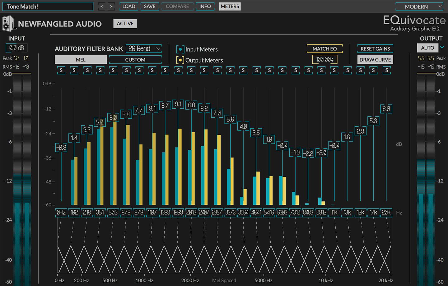
2: If their was a way to add a sound equalizer to the browser it-self. I am an audio/visual technician so having a way to perfect sound quality would be great. I know that you can get an add-on for it but they don't have the accuracy and quality that I would get from having one professionally included in the browser. (P.s. if the equalizer had a live audio feed behind the sliders that would be sick!)
-
A Former User last edited by
@greasygaijin As a professional Audio/Visual technician, i completely agree.
-
A Former User last edited by
Never download this browser, it takes 100 years to load a 113 mB file such as https://www.youtube.com. Don't download it.
-
A Former User last edited by
I just started to use GX for 3-4 days but I have a feedback about the user-experience.
I am a laptop user and when i searching or working on something i am using touch pad gestures.Yes it's have scroll up or down but I can not use the "back" or "forward" gestures which with 2 fingers slide left/right. I can use them on any browser but GX. I am looking forward for it.
Thanks a lot.
-
A Former User last edited by
So i've been using Opera GX on macOS Big Sur and Windows 10 for about 3 weeks now. I like all the features that come with it and I'm a person that really appreciates the gaming news, sidebar & apps, and the workspaces. A lot.
I switched over from Google Chrome mainly for the RAM, GPU, and CPU limiters/monitors, but also for the customizations and workspaces. On Chrome I had 5 windows with around 10 tabs each, all nicely condensed now into 1 window with 4 workspaces (and about 10 tabs each).I think it would be great to include a toggle or two to turn the sidebar and GX corner off for those that don't use those features and find them more of a nuisance than anything.
However, as someone who uses those features, i think it would be really great to add lets say 2 more workspaces to bring up from 4 to 6.I've also been noticing that Opera GX has a harder time running on Big Sur than it does on Windows 10. I don't know if this is an optimization issue or not, but it does worry me that my MacBook Pro is kicking into higher gear to run things like youtube on the browser, whereas on Chrome it doesn't break a sweat. On my Windows partition, Opera GX runs just fine and my MacBook doesn't struggle. However, as nice as it would be to use the Windows side instead, all of my work is done on the macOS side. I know I've mentioned I have so many tabs open all the time at once too, but I also keep the setting turned on to not load those pages actively unless I'm on them or they're actually running something which does help make things run smoother.
I did notice also that on macOS, i don't have any issues with customization of the browser, whereas in Windows 10, some of the settings I change don't actually stick.
And I guess last thing I have on my mind, I am an avid dark-mode user, white screens really hurts my eyes so I'm very glad for the 'force dark mode' feature. My only issue is that some pages don't switch very well, as in it'll force the background of pages dark, but I can't read or see anything because it doesn't compensate for the dark text on sites or pages that don't naturally have a dark-mode option embedded within them. Of course its not always an issue, but there are plenty of times where it is.
Otherwise, i do really enjoy the little things like the ad and tracer blockers built-in so I don't have to look for plug-ins. I really enjoy the background music and sound effects a lot, though it would be cool if there were more SFX options. I plan on trying out the VPN sometime soon to watch foreign media.
-
melidarkness last edited by
Please add button to remove tiles its really annoying, i just want to have nice new tab wallpaper
-
A Former User last edited by
Can we have an option to set different settings for each of our workspaces? Like where if I swap to a separate workspace, I can have a different wallpaper and theme for that specific workspace, as well as have speed dial tiles for that specific workspace? I also noticed that there doesn't seem to be a way to change the icon for the tiles on speed dial, if that could be added as a feature, it would be nice.
-
megamike last edited by
I switched from Chrome and I have been using Opera GX for almost 2 months now. So far I really enjoy the browser and the countless optimizations for gamers. There are a few problems that I have encountered though...
I wish the GX Corner page behaves more like a normal browser tab. I love having news / discounts etc. of various games displayed so I don't want to disable it but I have 3 inconveniences that grind my gears.
- Closing the last tab at the top with the middle mouse button should close Opera GX fully instead of opening the GX Corner. Alternatively, let me please middle mouse button click on the GX Corner symbol to close the browser.
- Dragging the last tab of a browser window leaves behind the GX Corner. Wouldn't it be better if the window either moves along with your drag or fully closes instead of opening a new window?
- Similarly, if you have 2 browser windows open then dragging a tab from one window and dropping it to the tabbar of the other Opera GX window should combine them. Right now it works but sometimes you have to wait with your drop and hover for a bit otherwhise you'll open the tab in a new window. Would it be possible to remove the delay so the drag and drop is instant? This is also annoying combined with the previous point since the old window opens GX Corner instead of closing/moving along.
These are minor inconveniences that I experienced regarding tab movement and the GX Corner and I'd appreciate solutions.
-
A Former User last edited by
I just switched to Opera GX today (loving it btw) and I'd just like to know if it's possible to make it so that the new tab/plus sign button was bigger so we could click it from the top of our screen? It's just a little something I've found convenient on firefox (can just move your mouse to the top without really thinking about if it'll hit the hitbox of the button)
-
evolity last edited by
Same as above - enjoying it so far. I like that it's highly customizable. Seams neat and looks clear and solid.
What I would like is to customize the menu bar - like put tabs on bottom of the search bar and maybe an option to choose if the menu bar is visible or not. It's just the way I'm used to.
And I couldn't find a way to delete the search bar (google) which comes when opening a new tab. I would like this new tab window to be clear - only the wallpaper visible.
And maybe move the refresh/home/bookmarks icons. -
zaph34r last edited by
so far so good, it''s just that when i'm using spotify the music where i "remove'' from playing are still being played.
usually i remove those music from my release radar/discover weekly playlist to prevent being played.
pls fix it, btw i dont use other player, yetalso it's better to have a suspend tab integration and google keep to be integrated. there's already twitch, discord etc
and lastly i do use other extension shows up in sidebar. but i can't order those in sidebar (all other extension is way down). please let us make custom order
-
McSqueezy 0 last edited by
Hello. I just want to leave my suggestion for the workspaces. If there's something playing in workspace 1, and then switch to another one, there should be a little icon that shows something is playing in that workspace (because right now there's nothing like this and if you have many workspaces, you might not remember in which one there's something playing). I hope this will be implemented.
-
luis-arias last edited by
Hey! I love the smoothness of the browser. I was using Edge for a bit and i really miss the browser's ability to edit pdf files on the browser (make anotations or highlight phrases). I would like to have that on opera gx.
-
ciriththalion last edited by
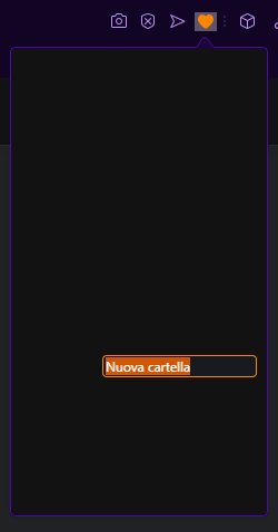
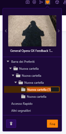
Hello! I Think I've found a little bug that only occurs with the "force dark mode" on:
If you create a new bookmark and try to change its name (or the folder's name, as in the screenshots below), the entire popup becomes full black. I hope this will help!
Tab with dark mode on:
Tab with dark mode off:
-
A Former User last edited by
After seeing this in an ad I decided to try it out after having used chrome and edge for years. Needless to say I have been impressed and my expectations were either met or surpassed. I especially like the instagram integrated feature, the force dark mode for pages and the overall aesthetics. This is probably the best browser I have found. If you could also add the same integration for snapchat as well, that would be very nice.
-
nicolas18 last edited by
Helo! I downloaded Opera GX and I don't regret it. I want to suggest putting something in the "Speed Dial" part. Where I put the sites I use the most, put something like a color or custom image.
-
A Former User last edited by
@leocg everything is good so far the only thing that is bothering me is that in the web player, I cant adjust the volume from the web player so i have to go to Spotify in another tab and adjust it there which defeats the whole purpose of having quick access to Spotify maybe you guys can add some sort of volume manager for tabs if you right click them
 something like this.