Return sync button at start page
-

-
-
A Former User last edited by
@leocg
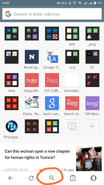
I don't know about your phone, but my browser has shown only search icon not the sync. You can see the screenshot as proof. -
A Former User last edited by
@leocg This is the latest android update of opera mini, version 39+ if recalled correctly.
-
-
A Former User last edited by
@leocg

Why move the icon here? Is not the previous place good? Let's say someone has many speed dials, wouldn't that person has to scroll down the page to find it.
Instead of that, why not return the sync to the previous position. It's convenient,fast,and easy to find. This ui is not friendly. Furthermore, the search button is redundant as you can do search at the address bar, a waste of slot in my opinion. -
-
A Former User last edited by
@leocg I believe we have mutual understanding now. So, may I ask you to forward this issue to the developer and change the ui? Thanks in advance.
-