Title bar removed from latest Opera on Ubu 16.04?
-
jamesisin last edited by
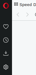
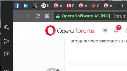
Why not just put a nice red O in the left pane above the other icons? This is essentially what's done on Windows.
-
A Former User last edited by A Former User
There is an "red O menu at the left side, above the other icons" ... if you set the sidebar as pinned

I think this is the default behavior/appearance of opera in all operating systems.
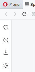
However, I prefer to keep the sidebar unpinned and have this
-
A Former User last edited by A Former User
Try unpinning the sidebar. I have nothing else to suggest.
-
jamesisin last edited by
@jimunderscorep Are you running the latest Opera on Ubuntu 16.04? I am seeing this same behavior on at least three similar systems. This is pretty clearly a bug.
-
A Former User last edited by A Former User
I am running the latest stable opera in openbox (under debian testing x64).
I was a gnome user once, until gnome 2.28 was released, like ~9 years ago, but I stopped using it when it became too dumbed down for me. As the english say, I have not touched gnome 3.x with a ten-foot pole.
I was also an ubuntu user ~11 years ago. -
A Former User last edited by
Being able to shade/rollup windows (mouse wheel on title bar) is a must have !
Without window title bar : we are back to the 1990's... I'm leaving Opera for Firefox waiting the bug to be fixed. -
a-n-w last edited by
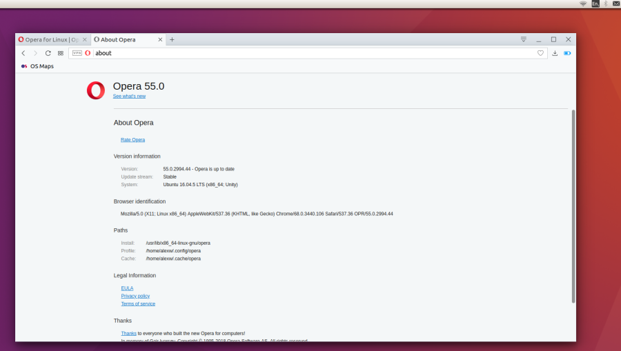
The title bar seems to showing in the Windows style even though it's on Ubuntu. This only started happening recently. Is it a bug or do I need to change some setting?

-
A Former User last edited by
No, it is a well known and reported issue of v55 which has not been fixed yet, despite the 2 or 3 minor updates to v55 since then.
The ugly window decorations also exist in opera beta and developer versions as well, v56 and v57 respectively. -
A Former User last edited by
Why all those software companies put effort into what has no need fixing/changing? Constant UI changes, unnecessary and distracting animations, background videos, oversized icons, massive open space - all things which does not help productivity at all.
-
A Former User last edited by
Because "they know better than you".
Plus, when the changes from one major version to another are almost zero for the average user (e.g. opera 58, compared to 57, ONLY introduced the option to "warn before closing multiple tabs" and nothing more), you realize that something that classifies as "less important stuff" for you is a "major improvement" for the dev.
Altering the csd buttons just for linux will probably mean they will have a different code for them (= the buttons) to maintain for all future releases.I think I will make a thread on "what still bugs me with opera" so I can share my thoughts with everyone else in here...
-
jamesisin last edited by
Eight months after my original post and still no change. No menus. No O menu. Clearly a major bug. Worst published mistake from Opera since I started using it in, what?, 1998? Quite appalling.
-
A Former User last edited by
Yesterday, I remembered that this thing exists
https://github.com/PCMan/gtk3-nocsdIt is supposed to disable csd on apps that support it. And it does work, mainly with gnome apps, but it does not work on opera. Launcing opera like so
gtk3-nocsd operajust launches another instace of opera, with the csd.
This makes me assume opera's csd is as hardcoded as the gtk theme it uses, so there will be no change anytime soon. -
A Former User last edited by
Just to say that they RUINED the browser on Linux with the CSD choice.
I am asking myself how has been possible possible to make such a radical, counterproductive and absolutely wrong choice. It costs about nothing to allow who wants it to show the titlebar.
Why remove it to get an app looking so bad that one wants only to remove it just to not even have the possibility to look at it. -
A Former User last edited by
I am a long-time Opera user, and I have been very much satisfied with this piece of software, that I've been using on Windows. But now as I am moving to Linux on my home machine, I just realized, that the CSD of the Opera window while fits in well with the Windows 10 UI design, it ruins the consistency of the look on the Linux desktop.
I wish the option came back to use the title bar. I love Opera, but just looks so out of place on my Linux desktop
