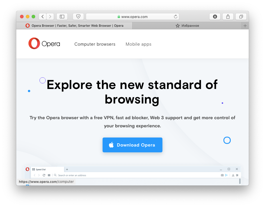
Back in April 2019, Opera developers claimed that removing borders and dividing lines as well as choosing a very bright / very dark color palettes inspired by photography techniques would put the user in control of how they frame the Web. But the browser redesign introduced in Reborn 3 made Opera look a bit out of place among other desktop apps (I refer specifically to macOS here, but a lot of users on this forum have complained about Windows as well).
The main issue here is that the grey window frame (titlebar and sidebar) is actually bluish (compare screenshots attached):
- This is Opera R3 (note the bluish accent of titlebar and compare with the rest of screenshots):

- This was how Opera 58 looked like (nearly perfect, in my opinion):

- This is Firefox (another third-party browser, but note the titlebar colour - it is lighter than Opera 58's, but the tone is the same):

- This is Safari (the most native browser):

What I suggest is to change the bluish grey to normal grey matching the rest of the system (in Opera's application bundle most of interface is PNG images, so it would not be of much difficulty).
And while I provided screenshots, please note the lower left part of each browser window, where the link hover popup is. I think Opera R3's font is too big comparing with other browsers as well as old Opera.
Hope my suggestions would be implemented in future Opera releases!