Hello,
So it's been a couple weeks since Opera had a big UI update, and now there's a 4 pixel thick border around the content inside the window being extremely annoying. I'd like to know how to get rid of it and from what I've been finding online, it doesn't seem to be possible? It feels like the Opera team is trying to make their browser worse on purpose somehow? I don't get who in their right mind thought this would be a good idea. To clarify, this is what I'm talking about (it even hides part of the scrollbar, just why...):

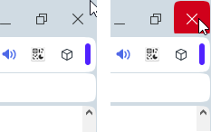
Also, it's not possible to close the window anymore by dragging your mouse to the top right corner of your screen because there's another annoying extra border on top of the window for whatever reason:

That's practically a default design by Microsoft since they released their OS, and to suddenly change a behavior like that for a border is beyond me... There's a reason Microsoft designed windows that way: it's practical.
Similarly, you can no longer resize the windows from the top border:

That's yet again another Windows feature that's been removed because of this border. This whole new UI is absurd and really frustrating for a user like me. Please conform yourselves with the other Windows applications and stop trying to reinvent the wheel.
I could probably fix all those issues with a custom UI, but I'd rather complain here a bit in hopes you guys fix those problems and future users won't have to suffer or drop the browser entirely for something so silly.
Thank you and please have a nice day.