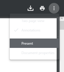
The "More actions" menu is transparent with light grey text making the menu items very difficult to read over a light background. Same problem both in light and dark mode. In Chrome this menu seems to be solid and is easy to read.

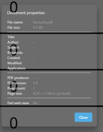
The "Document properties" dialog is transparent and difficult to read only in dark mode. In light mode this dialog has a solid white background. In Chrome this dialog has a solid dark grey background in dark mode.
Dark mode in Opera:
