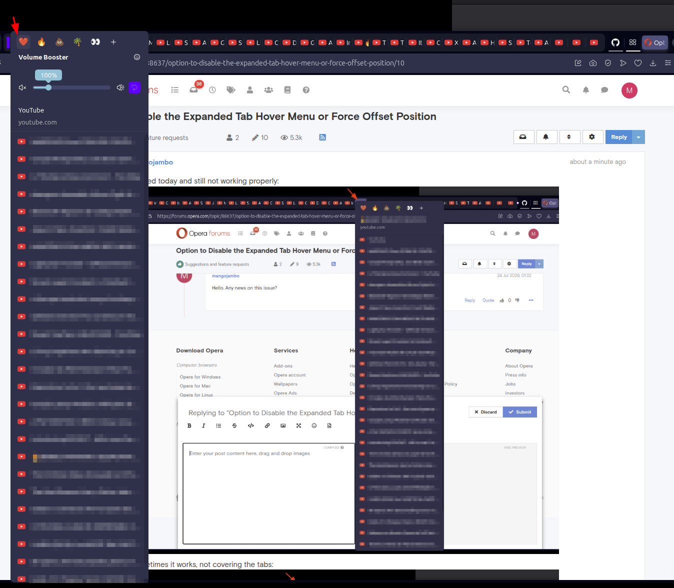
This one was worst one showing the volume slider, covering the tabs and I still can't clock on them:
M
Posts made by mangojambo
-
RE: Option to Disable the Expanded Tab Hover Menu or Force Offset PositionSuggestions and feature requests
-
RE: Option to Disable the Expanded Tab Hover Menu or Force Offset PositionSuggestions and feature requests
I tested today and still not working properly:

Sometimes it works, not covering the tabs:

Sorry for insisting on it, but this is quite annoying.
Best regards.
-
RE: Option to Disable the Expanded Tab Hover Menu or Force Offset PositionSuggestions and feature requests
Hello. Any news on this issue?
-
RE: Option to Disable the Expanded Tab Hover Menu or Force Offset PositionSuggestions and feature requests
@leocg It depends on two things: the number of items in the list and the vertical size of the window. The menu list height is also small have to surpass the window height.
But their is a interesting behavior:- many tabs opened from the same domain;
- mouse over one of the tabs and the menu will cover it;
- but if you move the cursor to other tab from the same domain, the menu adjust it self for the right height, not covering the tabs bar anymore.
-
RE: Option to Disable the Expanded Tab Hover Menu or Force Offset PositionSuggestions and feature requests
Yeah, that’s the problem: when you have a huge number of opened tabs, the behavior isn’t handled correctly. I know it could be considered an edge case, but still an annoying behavior: the menu size gets taller than the proper vertical limit.
-
RE: Option to Disable the Expanded Tab Hover Menu or Force Offset PositionSuggestions and feature requests
Hey Leocg. Thank you for the quick answer.
What would be that Tab Hover Menu? The one that shows the name of the tab and list the other tabs from the same domain?Yes, that is it. Here is the image:
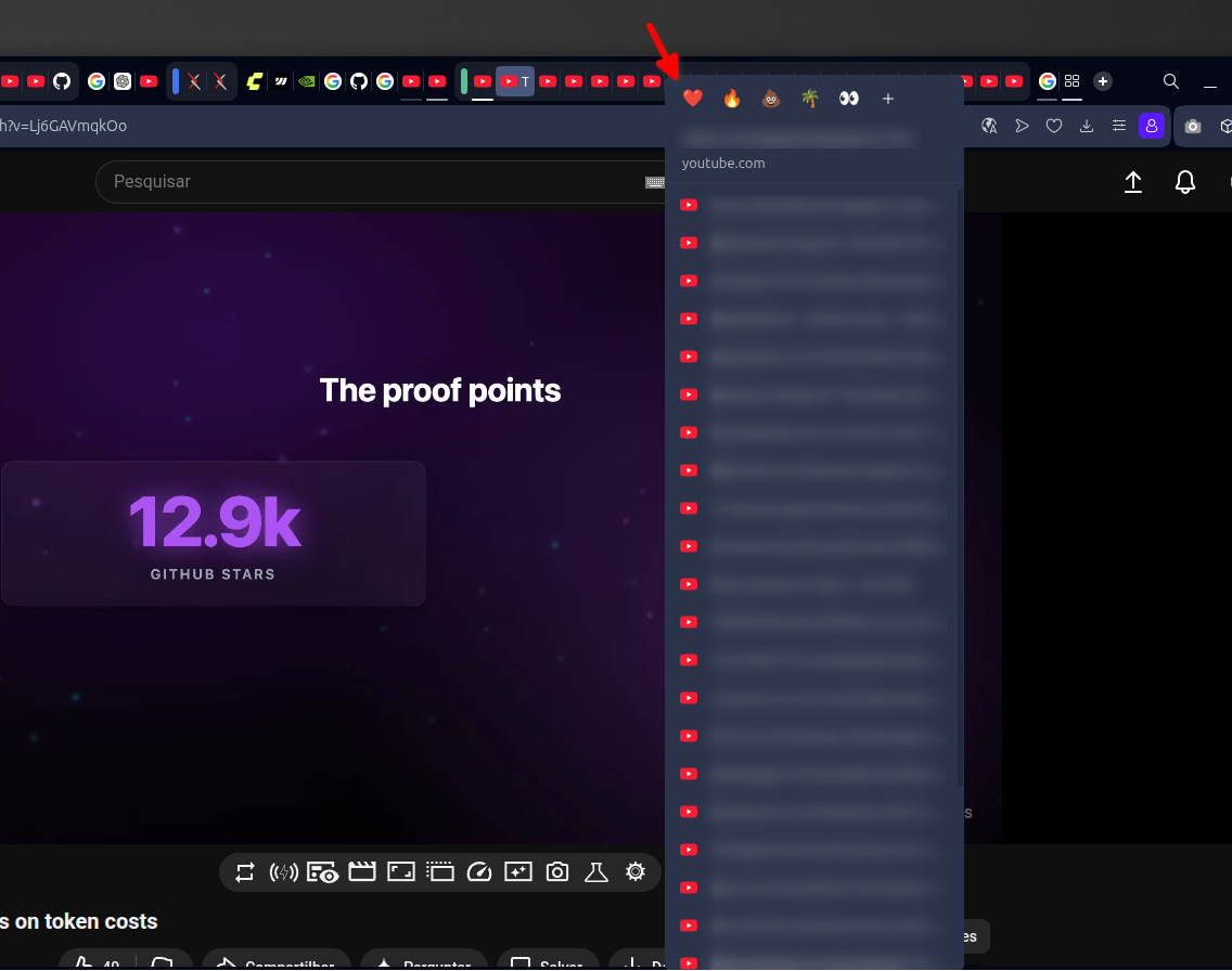
It covers all the tabs. It would be better if it respected the height limit and didn't cover them.
-
Option to Disable the Expanded Tab Hover Menu or Force Offset PositionSuggestions and feature requests
I am proposing a toggle to disable the vertical expanded "Tab Hover Menu" or a UI fix to ensure it never overlaps the tab bar. Currently, when multiple tabs from the same domain are open (especially with media extensions active), the tooltip expands into a long vertical list. As demonstrated in image_68ca12.jpg, this menu renders directly over the tabs, blocking the user from clicking or closing them.
Why this should be implemented:
Eliminating UI Collision: The primary function of a tab bar is navigation. When a hover element (the menu) covers the target (the tab), it creates a fundamental usability failure. A user trying to switch tabs quickly is instead forced to interact with a menu they didn't intend to open.
Productivity for Power Users: Users who keep many tabs open (e.g., developers or researchers) rely on muscle memory. Having a dynamic menu block the "Close" button or the tab itself, as seen in image_68ca12.jpg, causes frequent "misclicks" and frustration.
Visual Logic: Most browser tooltips appear below the point of interaction. Fixing this menu to always anchor below the tab bar, or allowing it to be turned off entirely, restores predictable behavior to the interface.
Investing in this fix will improve the experience for any user managing high-density tab environments and ensure that Opera’s UI remains an aid, not an obstacle, to navigation.
-
Better arranging tabs between windows UXSuggestions and feature requests
Hello. Opera have being my favorite browser for around 10 years. Many features leave the other browsers behind, including UX features, which are among the most important ones. Simple things that make the final user feel it suppose to work as it is, flowing effortlessly. But one main feature still brings a clunky user experience: moving tabs between windows:
- When dragging a tab to another window, the attaching feature feels awkward, clunky, and heavy. The time holding the tab trying to snap at the new window is painful under the UX eye. Worst when trying to do it as the last tab.
One browser that makes it feel so polished is Google Chrome, where the whole movement and auto snap feels so natural.
I would like to humbly ask:
- to the UX designers and developers to review this feature, the time to snap a tab into another Opera window;
- Or, at least, to have an easy way to configure it in the preferences;
- And to fix the snapping at the end of the tab list. This one is the worst behavior so far, gravitating between being hard, aggravating impossible;
I don't want to sound pretentious when advising to check other browsers as references, in that case, Google Chrome. I know many people can take this kind of idea personally, mainly when talking about something so broad as UX decisions. But please, check how easier it feels to do the same features in this other browser for reference.
I hope the whole problem and idea made sense. Feel free to reach me for more information if needed, and I will gladly reply. And thanks in advance to everyone who reads this. Cheers.
Best regards.
Sidney "Mango" Moraes - When dragging a tab to another window, the attaching feature feels awkward, clunky, and heavy. The time holding the tab trying to snap at the new window is painful under the UX eye. Worst when trying to do it as the last tab.
-
RE: opera 66 video popup has a limit in sizing, no controls, etcOpera for computers
Hello, let me explain:
-
Before It would pop out a copy of the video, keeping the original web page playing as well. In UX it was better because sometimes I would like to check some small details in the video and I had to just one click on the tab to open it. The bigger video was there; and after checking things like this I would just click in another tab to keep doing what I was doing without the need to pop the video out again. It was there already;
-
Picture in Picture don't memorize the last position and size for other tabs and it it quite annoying. Only for the current video, which is kind of useless since we only open a video once. To have to move and resize it every time for a new video is kind of annoyingly unnecessary;
-
Some videos, like Twitch.tv, the pop up button appears at the begining of the video and just disapear. I have to reload the page to make it apear again and click it before it is gone;
-
Being able to click in any part of the video to pause it was kind of nice. Like youtube, etc. It's an usual experience. To have to click only in the play/pause button is worst than before. Not the worst thing to be fair, but for the UX I feel it was more fluid before, no constraints, you know?
The good thing about this new version:
- The "Back to Tab" button is more then welcome! I missed it so much before. It works perfectly for this new proposal, but if you guys get my words above in consideration would be great if this button doesn't close the pop up as well, since duplicated video is a feature.
I wrote this because pop out video was the feature killer to make stay in opera instead other browsers. There is a lot of other small things as well, be for my daily basis I use it a lot. My hope is to have at least an option to get the way it was. Thank you for your time.
Cheers
-