This is how tabs were spaced in version 95 (when multiple tabs were open there was a gap between + for new tabs and search button)

This is how it looks now in version 96, the gap has been deleted (and tabs are wider).
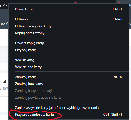
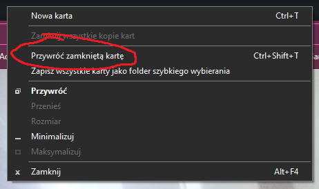
Unfortunately for me (and perhaps others) I used this gap to bring back closed tabs, which is not possible anymore while multiple tabs are open. Instead I have to use the big menu while rightclicking tabs or use cumbersome Ctrl+Shit+T.
I propose to either bring the gap back (maybe smaller but still here) or allow user to right-click the search icon(and maybe the plus button) for the short menu that has the option to reopen closed tab near the top.
This is how it looks while right-clicking tabs:

This is what it looks like then right-clicking on the bar without tabs:

Another possible solution would be to move the button to the top of the big menu but this could annoy other users since they may be used to it being lower so I'm unsure whether it's a viable change.