@francehelders: I agree! Terrible GUI! One step back!
Posts made by giacomorutili
- Blogs
- Blogs
-
RE: Opera 104 StableBlogs
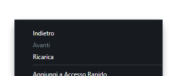
Nice job but... when do you add mica effect and trasparency to the right click menu?
-
RE: [Solved][Request]Option to disable Animation when switching workspacesAppearance
@tuzumkuru Super!!! Thank you!
- Blogs
-
RE: Opera 100.0.4815.54 Stable updateBlogs
@leocg I have used this feature for 2 years... anyway, I'll try to enable the flag
-
RE: Opera 100.0.4815.54 Stable updateBlogs
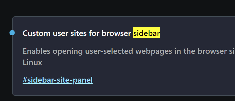
Why is not possible to add website to the left sidebar? I mean, exept for the default shortcuts that are already set in Opera
In the previous release you can add every website you want, infact I had added google keep, google calendar, gmail and other website -
RE: Opera enters the generative AI space with new features in browsers and content appsBlogs
@lucksme: I don't think so. Opera monetizes from Google Search bar
-
RE: Option to "Sync Extensions" in Advanced Sync SettingsSuggestions and feature requests
@phyck why switch to Chrome instead of Edge? Edge is much better right now
- Opera for Windows
-
[Duplicated]Profile picture in browserOpera for Windows
Hi,
I put a picture on my profile but I cannot see in the browser, as you can see

Is it only for me? What's the problem? -
RE: Opera 90 StableBlogs
The right-click menu is still with old W10 GUI and squared corner.

Please, introduce mica effect and rounded corner!
-
RE: Opera 89 StableBlogs
Please, please, fix all the menu for Windows 11
There are 2 GUI problems:
- the menu in the tab bar is still white when dark mode is enabled
- the main page menu hasn't rounded corner
-
Put more Windows 11 GUI elementSuggestions and feature requests
Opera must be more consistent with Windows 11 by adding more integration with the new graphic elements like mica effect and rounded corners for menu
-
RE: Hide top bar when vertical tabsSuggestions and feature requests
@leocg I know, but it could be add as an improvement, or you could install an extension
-
RE: Auto hide left sidebarSuggestions and feature requests
@kerygma I already know that and it's, obviously, preatty cool but I prefer to auto-hide the sidebar as default behaviour and show it when I move the mouse on the left border of the browser windows.
-
Hide top bar when vertical tabsSuggestions and feature requests
Just like Edge: when use vertical tabs let the option to hide the top bar and let visible only the address bar
-
Auto hide left sidebarSuggestions and feature requests
It could preatty useful to have an auto-hide option for the left sidebar, just to maximize the horizontal space in some situations
-
More windows 11 look&feel improvementsSuggestions and feature requests
Hi Opera!
I think that's time to upgrade the GUI with fluent design patterns.
For instance: rounded corner, trasparent menu, input field highlght and so on.Pleeeease

