Why is it like this? Is it just some bug? I truly hope so, because it's god-awful. Whoever came up with this sh*t should be ashamed. 
Any way to revert it for now?
I'm so tired of you guys trying to solve what's not broken.
Do more on the web, with a fast and secure browser!
Download Opera browser with:
Why is it like this? Is it just some bug? I truly hope so, because it's god-awful. Whoever came up with this sh*t should be ashamed. 
Any way to revert it for now?
I'm so tired of you guys trying to solve what's not broken.
Could we at least have the option to fill the whole tab and not have the pointless border around the page? Not only is it ugly with the round corners in my opinion, but the fact that the scroll doesn't work anymore if your cursor is all the way to the left or right is plain annoying.
Also, please return the Speed Dial button to the left of the address bar.
@passenger-chi Windows 10. Had no problems until today, no change was done nor any update to opera that I noticed. It was sudden and not caused by anything I have done as I closed the pc with it being normal and I opened it to the thumbnails being weird and ugly.
I never use the sidebar, or even bookmarks because I really hate having a cluttered UI, the removal of the speed dial button from the address bar is quite stupid.
@jacksandalina Really not a fan of the border either, the round corners also look bad imo, but the scrolling issue is so annoying.
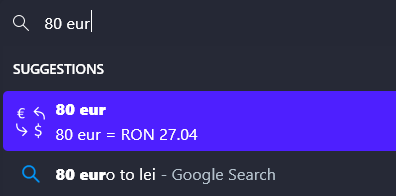
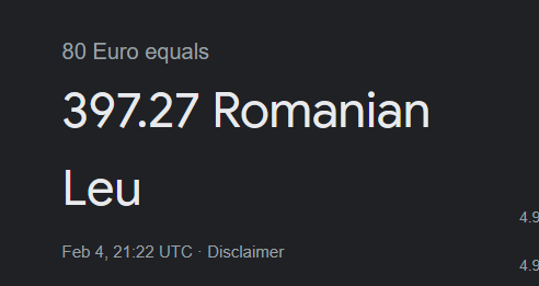
Currency conversion to RON is wrong, extremely so.
Opera conversion:

Google conversion:

Ever since the big update, Twitch live streams stutter and buffer for no reason. It only happens on Opera and only on Twitch from my experience. It's incredibly annoying and I can't figure out anything that would solve the issue.
Please, for the love of god, if you guys insist on having the side border, at least make them non-interactable. I can't even express how annoying they are. It's getting ridiculous how often I click slightly on them and it moves and minimizes the whole window.
This is a new issue, from a recent update, clicking and dragging the window is way too sensible, and a lot of the time I just click on it to get the browser in focus and move the cursor no more than a pixel, and the window will get moved.
Experiencing this as well, couldn't find anything on it, thought I was the only one...
Currency conversion to RON is wrong, extremely so.
Opera conversion:

Google conversion:

Please, for the love of god, if you guys insist on having the side border, at least make them non-interactable. I can't even express how annoying they are. It's getting ridiculous how often I click slightly on them and it moves and minimizes the whole window.
This is a new issue, from a recent update, clicking and dragging the window is way too sensible, and a lot of the time I just click on it to get the browser in focus and move the cursor no more than a pixel, and the window will get moved.
@leocg I must be stupid cause I can't find it for the life of me
Ever since the big update, Twitch live streams stutter and buffer for no reason. It only happens on Opera and only on Twitch from my experience. It's incredibly annoying and I can't figure out anything that would solve the issue.
@jacksandalina Really not a fan of the border either, the round corners also look bad imo, but the scrolling issue is so annoying.
Could we at least have the option to fill the whole tab and not have the pointless border around the page? Not only is it ugly with the round corners in my opinion, but the fact that the scroll doesn't work anymore if your cursor is all the way to the left or right is plain annoying.
Also, please return the Speed Dial button to the left of the address bar.
I never use the sidebar, or even bookmarks because I really hate having a cluttered UI, the removal of the speed dial button from the address bar is quite stupid.
@passenger-chi Windows 10. Had no problems until today, no change was done nor any update to opera that I noticed. It was sudden and not caused by anything I have done as I closed the pc with it being normal and I opened it to the thumbnails being weird and ugly.
Please revert this. I don't know why it seemed like a good idea, but it's so awful.
https://i.imgur.com/1qINbPV.png