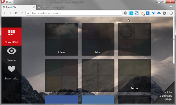
Speed dial folders are way too dark (opaque) in the v27
-
tisme last edited by
This is how 'Speed dial' start page looks in v27, now you can't see icons in the folders (you could in v26):

Also, I don't like the horizontal placement of new 'WebUI bar' -- it wastes too much. Is it possible to to force it be vertical (either left or right, doesn't matter) or switch it off altogether (in view of little usefulness)?
And the last one: how to disable 'Discover' feature, or at least remove any notion of it from the browser. (I do know how to discover things myself.)
-
tisme last edited by
Go into opera://flags and change the setting to use the other speed dial.
Could you please, name exactly "the setting"?
-
lando242 last edited by
Experimental start page. Just type that into the search box, change the setting and you should be good to go.
-
tisme last edited by
No need for 'opera://flags' in this case: there's a button in lower right corner of Start page which switches it. Unfortunately, unexperimental start page looks even more ugly than experimental one (even with v27's opaque folders). It used to be fully OK in v26.
-
capo315 last edited by
Yes, has anyone found a solution to this yet?? The start page looked so much better before, I've had to take all my links out from their folders.