General Opera One Appearance Feedback Topic
-
DanielDerStolle last edited by
This was one of the best browsers. But since months it get even more worse. Down the hill!
Who has had this Design idea? This person should be fired.Why is all so blue-ish/purple?
Why has every field rounded corners?
Why are everywhere such spaces between the fields?
Why are the speed-dial boxes so small?
Why its called Opera One?Why you cant let the browser as it was? Why you change every month the whole look of this browser? Why why why???
There are so many thing under the hood you can change and polish/make it better instead of this you change again the whole design...
Now its time to get to another browser. Opera was my favorite but now its time for the trash with him.
-
spkyluis last edited by
I have been an Opera user since it was shareware, with ads, I have been through all versions and it has always been my main browser. I can understand a facelift, a redesign to make it "modern," showing modularity but where's the customization, making the browser for each user if I can't change a single highlight color?
-
desdash last edited by
Why is there a gap on the right at the tab bar? The speed dial is broken now, no images. If you don't give me the option to get the old appearence i'm uninstalling this awful looking browser.
-
digtyarenko last edited by
This is a complete fiasco.
Firstly, after the update, I saw a welcome window with music, I was freaking out of surprise, why the hell is the browser yelling with a welcome sound?
Secondly, the appearance is disgusting. Starting with rounded corners in the interface of the browser itself, ending with rounded corners on site pages. Why else is this?
While other programs and browsers strive for minimalism, customizability and a simpler interface - Opera introduces Opera One with tab animations, an inappropriate purple color accent, a broken Speed Dial (no pictures), a grouping of tabs that I did not ask for and which is not can not be turned off and just terrible appearance. Shadows under the tabs, seriously? Are we in 2010? I loved Opera and have been using it since 2007, survived its transition to Chromium, but what is happening with it now is very disappointing.
-
DarthModred last edited by
After update fonts for me started to work correctly, now feel much better. I'll keep it on my PC for now and see how you'll repair all bugs/redesign bad moments.
-
A Former User last edited by
@flaviu2 said in General Opera One Appearance Feedback Topic:
Let me exemplify you when your design can annoying and force users to leave this brower.
Suppose you scroll a long page. And accidentally put the mouse in most left side (or right). Suddenly, the scroll, doesn't work. Why ? Because you didn't stretch the view from left to right side of the display. Why ????
This is annoying me so much that i'm considering to stop using Opera. Seriously, why do this? I'm wondering if the developers actually test the software after updating it, i can't believe that such thing passed.
-
A Former User last edited by
it is absolutely disgusting, seriously this rounded edges garbage is the worst trend of all time. I can not continue using this browser. it has gone from visually stunning to gag inducing. words cannot describe how stupid and horrible it is.
-
historymom last edited by
Opera has been my main browser for many years, because of it's flexibility and security. But I will likely have to abandon ship, because of the tiny, low-res fonts and the sacrifice of visible content in favor of vast empty space (Ex: Speed Dial, which is now almost useless). Opera has been steadily losing customization (why, oh, why must the tabs be far away in the top bar? and the sidebar change is just plain dumb) and basic security features (a big, splashy re-vamp, and we still can't dump all data on exit?!). Now that I can't even see what I'm looking for, I am being driven away. I am so disappointed. Opera One should not have been released with such obvious issues, and with so many visible flaws, I worry about the basic functionality/security of the browser. Please restore my confidence in Opera by fixing these major mistakes.
-
historymom last edited by
An addition to my previous gripes: it is stupidly difficult to close a tab, rather than opening a new one. This also is just such poor design there is no excuse for it. It's worth noting that most of the appearance issues folks are raising involve greatly reduced visibility functionality - as if the designers are all 17-yr-olds with perfect vision, and arrogant about it.
-
A Former User last edited by A Former User
But look at how the grey round border enhances the user experience.
Maybe we could color it purple – that would make the browser even better.

-
gustavomolina last edited by
There are a couple of sayings or proverbs that come to mind with this: "common sense is the least common of the senses", and obviously in this matter it was not applied, and the other one that comes to mind is : "If it is not broke, do not fix it". The latter is practically a maxim of good quality computing.
I have been using Opera since it was an Internet suite, practically since the dawn of this browser. In my opinion, its best time was when it was an Internet suite, but unfortunately Opera Software in many aspects tends to resemble what Google is today, in its time the browser was loaded with many functions, as well as services that orbited around it. he who made it second to none. Little by little, but quickly, they were destroying many of those good features and services.
When they made the leap, that is, they left behind the Internet suite concept, for a while I used other browsers. Then I decided to give them another chance, and they barely managed to convince me again (nostalgia). The Vivaldi browser has been knocking on my door for a long time, I was just waiting for a couple of things to improve to change Opera for the latter, but given this drastic change, which visually I don't like at all and is totally uncomfortable (disastrous visual ergonomics ), I think I will definitely open the door for Vivaldi.
-
jessbaltrusch last edited by
is there any way to get the browser back to previous design? I can't handle the way the tabs look or the corners of the screen being rounded. Genuinely gonna stop using this browser if there isn't a way around it.
-
scubadogs1742 last edited by
@amyd32193 It looks like 23 days ago you posted this and no response from Opera?? I guess they don't care about their users.
-
maringuk55 last edited by
Like other people here I just register myself on this site to show my hate to the new UI, this is awful, is ugly, is horrendous. Why would you change something that's working? I even think that maybe another bigger company buy you and you're trying to push us away, I don't find a logical explanation for this you have done. We want the old opera UI back, that's it, just fire the person or team who told you to do this, everyone is changing browser right now...
-
 NotRustyBot last edited by
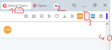
- I don't like the gap
- new tab button is small, and unnecessarily bright, keeps catching my attention (white-mode only issue)
- inconsistent padding
- there is a gap between the edge of the screen and the scrollbar, putting your mouse all the way to the right and dragging it down will not scroll the page.
-
similar to 4. right-clicking in this area targets nothing.
-
the gaps are weird, I don't like the gaps.
-
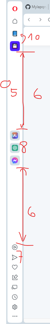
some of these features don't seem to fit in with the others. I think it depends on the user, I personally use flow a lot, and would prefer having it next to the messenger and AI features. I think the same should go for the other Special Functions (Music Player and Crypto Wallet). Depends a lot on how 6. is addressed.
-
this doesn't look right. I'd just remove the darker area.
-
rounded corners. I don't mind them that much, but using rounded corners introduces gaps. I do mind the gaps, the gaps are weird, I don't like gaps. I'd rather have an option to set the window background color set to the same white color as the searchbar and sidebar to at pretend there aren't any gaps. but maybe that's just me.
-
context (wokspace?) swap animation. I'd prefer to disable it entirely, but if not, at at least fix the wonky animation that happens when going in the reverse order (from 3rd to 2nd for example)
-
nco2k last edited by
@notrustybot i agree with everything you said. in addition to that, i hate that the extensions are in the top right corner now. i want my profile to be in the top right corner, like it used to be. also the speed dial / home button is gone, which is really annoying. this whole update is a major disappointment UX-wise.
-
DualBladeHero last edited by
Hey, I'm currently using Opera because I really enjoyed the old user interface it had. However, I've noticed that the latest updates have brought significant changes to the UI, and I must admit that I'm not a fan of the new look. It would be great if there was an option to revert back to the old GUI, as it felt more comfortable and familiar to me. I believe having such flexibility would enhance the overall user experience for those who prefer the previous design. Opera has been a reliable browser for me, and I hope they consider accommodating users' preferences when it comes to the interface.
-
DeaRain last edited by
Please add the ability to disable the display of site icons on the express panel. And return the filling of the tabs with solid colors. Now all the icons are of different quality and different sizes, it's ugly. At the same time, just the text "Reserved" looks cool.

-
choppa last edited by
What a bloody shambles the new update is,or should that be down date,put simple its a disgrace.It should be titled Opera Zero not Opera one
-
marinadze last edited by leocg
In addition to the fact that Opera one has become simply terrible and ugly (all these shortcomings have already been pointed out many times), it is incredibly annoying that it is impossible to disable auto-update, I would have put version 95 or any other with the greatest pleasure, before the browser was ruined, and used Opera further