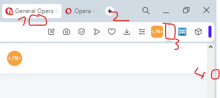
- I don't like the gap
- new tab button is small, and unnecessarily bright, keeps catching my attention (white-mode only issue)
- inconsistent padding
- there is a gap between the edge of the screen and the scrollbar, putting your mouse all the way to the right and dragging it down will not scroll the page.

-
similar to 4. right-clicking in this area targets nothing.
-
the gaps are weird, I don't like the gaps.
-
some of these features don't seem to fit in with the others. I think it depends on the user, I personally use flow a lot, and would prefer having it next to the messenger and AI features. I think the same should go for the other Special Functions (Music Player and Crypto Wallet). Depends a lot on how 6. is addressed.
-
this doesn't look right. I'd just remove the darker area.
-
rounded corners. I don't mind them that much, but using rounded corners introduces gaps. I do mind the gaps, the gaps are weird, I don't like gaps. I'd rather have an option to set the window background color set to the same white color as the searchbar and sidebar to at pretend there aren't any gaps. but maybe that's just me.
-
context (wokspace?) swap animation. I'd prefer to disable it entirely, but if not, at at least fix the wonky animation that happens when going in the reverse order (from 3rd to 2nd for example)