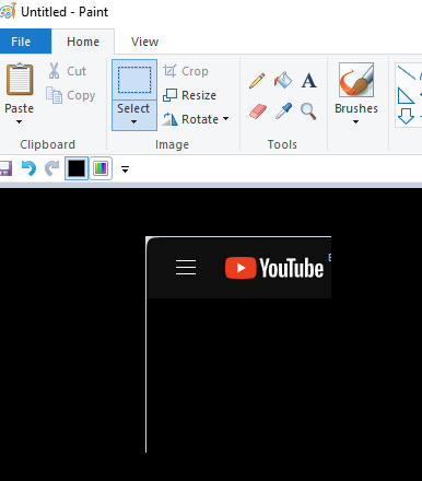
[Suggestion]Please take out the edges surrounding inside the browser
-
Mr-L last edited by
Total approval.
Unfortunately, the new design elements do not contribute at all to a better workflow. On the contrary, space is unnecessarily wasted.At the very least, there should be an option to turn off these design gimmicks.
-
NiceSquirrel342 last edited by
Totally agree, it looks absolutely horrible, especially on dark themed sites.
-
gaim5423 last edited by
I switched to a different browser literally seconds after I realized this. It's completely ridiculous. I'm keeping the browser installed for some days, in case they fix it...
-
gaim5423 last edited by
@tnanman My friend, from my perspective, it's mainly about respecting the user and not simply a UI or aesthetic matter. You don't expect your users to be able (or want) to have millimeter-scale precision and mouse handling abilities, just to navigate a page. And, unfortunately, I realized that many of Opera's small-but-handy functions did not allow me to switch to another browser and I'm still using it, although I have to think first and then use the scrolling bar, thus taking me 1-2 seconds to actually do so... This goes against all GUI design principles.
-
Hesminewho last edited by
@gaim5423 I now just went back to an older Version of Opera without all the new issues. Feels better now

-
LnMooNique last edited by
Yes, please, make the scrolling bar normal again, It's annoying when you try to roll down and you need to aim for it, specially when your cursor is fast.
-
krasen last edited by
@lnmoonique Omg my opera updated and its now opera one and this is the most annoying thing...... also the blue bar when watching youtube....
-
Hesminewho last edited by
@krasen just download and install an older version of opera again and wait until they fix this mess. that's what i did for now

-
venster last edited by
I use opera from opera 8.5, but because this edge, I move to Vivaldi. please move the edge or at least allow scroll page when the mouse is on the edge.
-
righteyereaper last edited by
For some reason I see posts a month old but my browser just updated to Opera One, or at least the new appearance. The only way the border edge isn't noticeable is if the site has a white background. Streaming videos looks disgusting, was this designed for Windows NT/ME or something? Microsoft Edge is trash but there are plenty of browsers to choose from so if this isn't fixed in the next couple months I'm done with Opera.
-
krasen last edited by
@righteyereaper I could not handle it more than 1 hour, I switched to Opera GX... its almost ok there, the UI is differnet too but not retarded.
-
Meand last edited by
Yes! I have to admit , the new version is faster, which is nice. But the user experience is pure hell. Especially opening new tabs and switching between tabs. Rounded borders, unnecessary shadows and floating effect create a chaotic and visually overloaded environment. The opera may be faster, but I'm slower now. Trying to find the right icon in this mess.
-
KNK2008 last edited by
@geebooboo I have the latest version of Opera and it fixed the edge problem for me, so the suffering probably ended


