• Login
    • Search
    • Categories
    • Recent
    • Tags
    • Users
    • Groups
    • Rules
    • Help

    Do more on the web, with a fast and secure browser!

    Download Opera browser with:

    • built-in ad blocker
    • battery saver
    • free VPN
    Download Opera

    Allow more customisability of the toolbar + slight UI change

    Suggestions and feature requests
    1
    1
    367
    Loading More Posts
    • Oldest to Newest
    • Newest to Oldest
    • Most Votes
    Reply
    • Reply as topic
    Log in to reply
    This topic has been deleted. Only users with topic management privileges can see it.
    • ezMatt
      ezMatt last edited by

      This is what I consider the toolbar, if the title is unclear. eeb561d4-67e4-468c-b658-b056a1f138e0-image.png
      On the left, there are back, forward, refresh and new tab buttons.86288e8c-7e99-4847-8493-e429833eda37-image.png
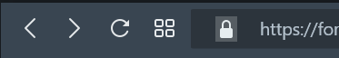
      I almost entirely use keyboard shortcuts to navigate, so these buttons just take up space in my browser and look a bit ugly, especially the new tab button. There should be an option to disable each of these buttons, or at least the new tab button.

      I also personally think that the space between the lock and the URL should be smaller and the selection area for the lock should be larger and rounded.

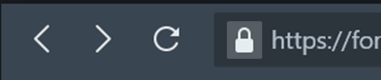
      This is exactly how I would make it look (when lock icon is hovered). e9300bd0-ef0f-49a7-b343-754030ce0969-image.png
      And this is approximately how I like it when lock is not hovered. e89843aa-8511-4b0d-961e-7223a73d0cd2-image.png
      I also think some functionality that hides the lock icon until you hover over the search bar would be quite clean, as usually you don't really need to know about website information so having the icon always present is a bit weird.

      As for the right side of the toolbar, I think the Privacy Protection and the Bookmark buttons should be switched, because filled in icons tend to look the best when they are together. I'm pretty sure most users of opera have privacy protection enabled on more websites than they have bookmarked, so more often than not, it will look better with privacy on the right. If not, maybe let us drag the icons around, or add a toggleable dropdown for them.
      c1fee8a9-ea31-4694-8519-2441e0b06331-image.png should become
      2f586c59-e5c7-4946-8dc4-99778634f258-image.png

      On the far right, I think the user profile picture should be moved to the left of the settings button for consistency's sake. Also for consistency, you should consider redesigning the battery icon so it doesn't have to be coloured to signify battery saver mode. Windows 11 uses a leaf to signify this, but im not sure what would look best.

      Before: 627a8bd2-919b-4c94-bbd5-cb92b1fbb10f-image.png
      After: (missing icon for battery saver mode) 208e2d0b-618c-4dab-b04d-d69c64a7133d-image.png

      Reply Quote 0
        1 Reply Last reply
      • Moved from Opera for computers by  leocg leocg 
      • Locked by  leocg leocg 
      • First post
        Last post

      Computer browsers

      • Opera for Windows
      • Opera for Mac
      • Opera for Linux
      • Opera beta version
      • Opera USB

      Mobile browsers

      • Opera for Android
      • Opera Mini
      • Opera Touch
      • Opera for basic phones

      • Add-ons
      • Opera account
      • Wallpapers
      • Opera Ads

      • Help & support
      • Opera blogs
      • Opera forums
      • Dev.Opera

      • Security
      • Privacy
      • Cookies Policy
      • EULA
      • Terms of Service

      • About Opera
      • Press info
      • Jobs
      • Investors
      • Become a partner
      • Contact us

      Follow Opera

      • Opera - Facebook
      • Opera - Twitter
      • Opera - YouTube
      • Opera - LinkedIn
      • Opera - Instagram

      © Opera Software 1995-