Dark Theme need to be improved !!! in 2018
-
A Former User last edited by
your dark theme suck !
did you ever use it ?opera is good apps but dark theme need to be improved !
when i click on dark theme in the option menu,
i expect "dark" in all page, to browse the web in a dark room,
safer for my eyesi don't ask to you to do all webpage online,
i use an extension to complete dark browsing "dark mode" for the webpage,
i don't expect you to doing better than that.
but if you have time to merge this extension into opera, why not...BUT my point is your dark theme don't do dark in :
-download page
-history page
-bookmark page
-extension page
-setting page
-the menu
-right click menu
-in speed dial the folder are still in white...
-and important too, when i load another page, whatever the page, can be the speed dial or online page, for a second i have a white empty page of loading...
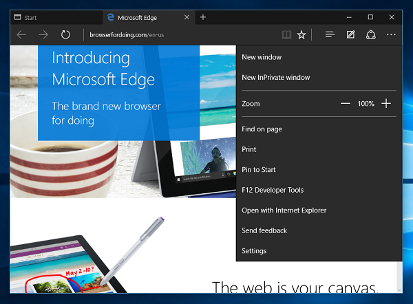
should be a black empty loading page, because it do flash in my eyes, everytime i clicki mean, even microsoft edge have a dark theme doing dark in donwload page, history and more ...
this is important to me and very annoying
please check your dark themethe perfect thing will be to allow users to change the defaults colors of all menu, and page, inside opera
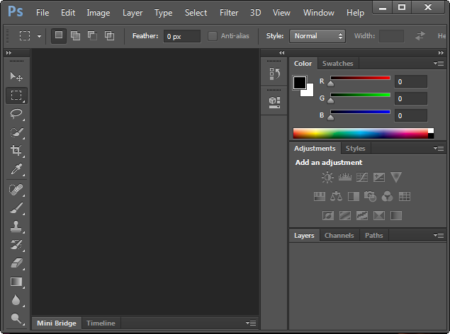
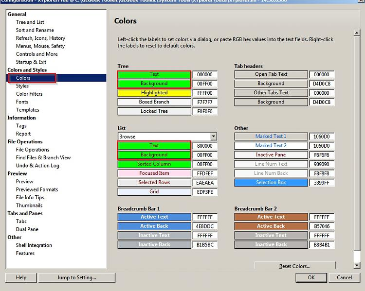
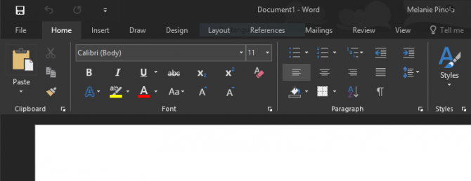
here some ref to help you :


thank you
-
A Former User last edited by
Yes better dark mode UI support onto all the back end settings and extensions and experiments pages. And also the drop down menus and right click context menu as well would complete the dark mode 100%.
-
A Former User last edited by
The dark theme would be much better with lighter text on the dark background. That is the main problem I have with it. The contrast between text and background is too low. Is it such a difficult thing to make the text light when the background is dark?
-
A Former User last edited by
We're about to enter 2019, and dark theme/skin is still the same, no improvement.
-download page
-history page
-bookmark page
-extension page
-setting page
-the menu
-right click menu
-in speed dial the folder are still in white...Remaining items above still mismatch with dark theme which is possible to solve, I think so. Why dev don't really bother to do anything about that?