Improve the bookmarks side panel
-
Submerstep last edited by
First of all, I apologize if I don't express myself correctly, English is not my native language

I don't know if I'm the only one who thinks the default bookmarks side panel, in its current state, is not up to the level of the browser. I'm a fanatic of the bookmarks side panel and every time I open it I notice that it could be so much better, more concise, compact and productive.
To this day I still use the "V7 Bookmarks" extension by @vux777 (If you read this, thank you for your work) because I still find it a much better alternative than the default one.
Starting with the most notable, here I just see a LOT of wasted space:

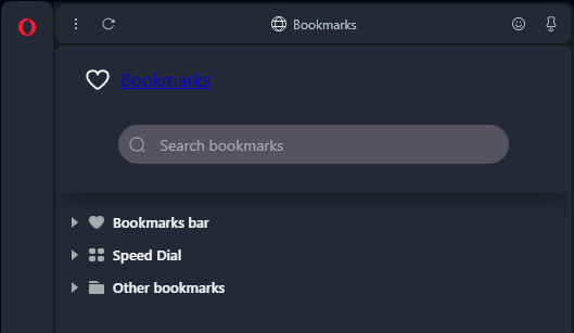
· Why does "♡ Bookmarks" appear above the search bar when at the top it already tells me that I'm in the "Bookmarks" panel? I know that if you click on "♡ Bookmarks" it opens the full bookmarks manager, but at the very bottom there is an option called "Open full Bookmarks view" that does the same thing. It's something that should be eliminated.
· Why is the search bar so big? It could be more compact or even better: in the upper area you could put a search icon and when you click on it, the search bar will be displayed.
Upper area of the panel:
· Remove the three dots icon at least in this panel. These only have the option to "Hide panel", when clicking on the ♡ button on the sidebar does the same.
· Remove the "Do you like this feature?" icon. I don't know why it doesn't disappear after having already given your opinion.
· Remove "pin/unpin" icon. I think it would be more effective if the bookmarks panel was fixed instead of fluctuating between fixed or floating.
Bookmarks area:
· Can't the bookmarks just appear as is without having to be categorized? When I press the ♡ button in the sidebar, what I expect to see are only my favorite bookmarks. The categories "Bookmarks bar", "Speed Dial" and "Other bookmarks" should be removed or, as I indicated earlier with the search bar, icons for each category could be placed at the top.
· There should be a "show/hide" option for Web addresses that appear to the right of each bookmark.
· The space between bookmarks and folders could be more compact, both vertically and horizontally (when there are multiple folders cascaded).
· The option to create separators in the bookmarks panel should be added.
· The "Open full bookmarks view" option could be moved to the top of the panel, in an icon, as I mentioned previously with other options.
I'm not a Photoshop expert but in the following image, more or less (excluding the part about compacting the space between bookmarks and folders), I have captured what I explain in the thread.

If you've made it this far and understood me, thank you

-
hleen last edited by
@Submerstep I fully agree to your proposals!
The panel really need sone refinements. -
Locked by
 leocg
leocg