[Request]Give an option to remove the pointless round corners
-
amirhassan60 last edited by
basically, I like round corners but it is not good for notebook laptops as it covers a lot of necessary spaces.
-
somebody2978 last edited by
I migrated to Chrome until they fix that nasty effect, it's really unbearable on dark pages. And I have been quite pleasantly surprised in relation to performance, consumption and native translator (glorious). I think I'm going to stick with this for a while.
Good job... -
jolang last edited by jolang
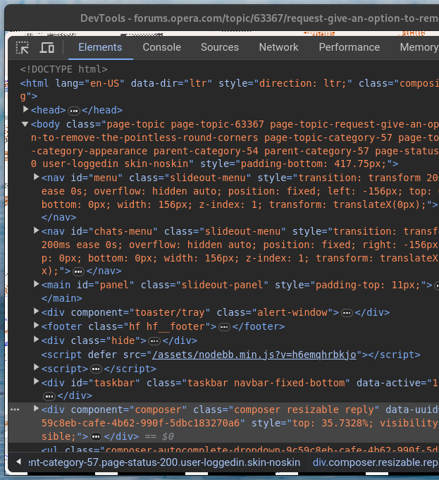
And when I use dev tools in opera it gives that white frame around. See how ugly this is! All for round win11 style corners.
Fedora on X11 if anyone cares.
-
kipperchau Banned last edited by
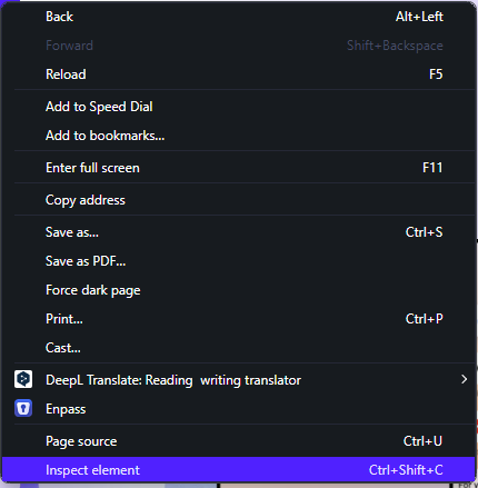
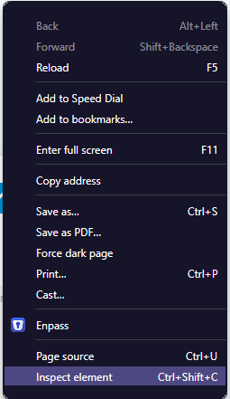
I hate the new dev tools ui and the right-click and opera menu having no padding with the buttons...
The new dev tools is probably Chromium's fault but the menu shall be fixed!!
See difference of the top and the bottom with the old one
New (awful)

Old (good)

-
nikudza last edited by
May I just join this noble society of people who value aesthetics, minimalism and simplicity of straight lines and wisely used space. This rounded corners just ruined Opera's good looks. Please, please give us an option to make Opera straight again!
-
A Former User last edited by
@nikudza Did you only register to tell us, you're migrating?

I don't understand why you're migrating to Brave then. It has its own record of shady decisions. It's hardy configurable and its development is focused on their BAT stuff while user convenience isn't any priority for them.
Good luck with it! -
nikudza last edited by leocg
@celticcross said in [Request]Give an option to remove the pointless round corners:
Did you only register to tell us, you're migrating?
Haha, wasn't originally the plan - I registered (again, because, as I understand, opera forums tend to delete old accounts) to join this topic and draw some developer's attention to the problem, having hope that they care. But then I scrolled over the forum a little, and understood that no one gives two farts in a martini, and that opera will never get back to normal design, or give us choice. It really smells like good old microsoft behavior - "eat what we give you". And it's Opera, browser I fell in love with exactly because it's always been so customizable that gave you ability to almost build your own browser. And now it's just an insult to the eye.
Also, Brave, having some issues on it's own, is at least open source.
And, in the end, what is my last argument as a user? Leave. Maybe that's how they hear me... Doubtfully, though. -
somebody2978 last edited by
@nikudza said in [Request]Give an option to remove the pointless round corners:
@celticcross said in [Request]Give an option to remove the pointless round corners:
Did you only register to tell us, you're migrating?
Haha, wasn't originally the plan - I registered (again, because, as I understand, opera forums tend to delete old accounts) to join this topic and draw some developer's attention to the problem, having hope that they care. But then I scrolled over the forum a little, and understood that no one gives two farts in a martini, and that opera will never get back to normal design, or give us choice. It really smells like good old microsoft behavior - "eat what we give you". And it's Opera, browser I fell in love with exactly because it's always been so customizable that gave you ability to almost build your own browser. And now it's just an insult to the eye.
Also, Brave, having some issues on it's own, is at least open source.
And, in the end, what is my last argument as a user? Leave. Maybe that's how they hear me... Doubtfully, though.Opera was an excellent and fast browser when it used the Presto engine. Since it used to have compatibility problems, it switched to WebKit and its performance became a disaster. I had to migrate to Firefox because browsing with Opera with that new engine was frustrating. I remember that the browser options loaded as if it were a website. If your connection wasn't fast, the browser was hell slow. It was like going from heaven to hell overnight.
Over time, Opera moved to Blink and regained its dignity... but the truth is that it basically became Chrome with more functions, which I personally didn't use or were available through extensions. In my tests I was surprised that Opera consumes more RAM and more CPU with about 20 active extensions compared to Chrome, when the opposite was popularly read. No way, goodbye Opera.
The only thing I miss are the shortcuts on the home screen, but you can install extensions for that. Complementing with bookmarks in Chrome is enough for me.
Otherwise, Chrome is between equal and better. -
koreahuguva last edited by
Yes , the rounded corners are soo ugly , because of it ,i switched to other browser
-
nikudza last edited by
@somebody2978 said in [Request]Give an option to remove the pointless round corners:
Chrome is between equal and better
Chrome will never be better - due to it's functionality and lack of options. But now opera sucks visually so deep - to the point of unusability. In this regard just about any browser is better. Eyes bleed.
-
IconicWarhol last edited by
I really don't understand how someone could think adding round corners to a browser is a good idea... Even full screens are rounded, which is absolutely ridiculous! Please add a feature to remove rounded corners.
-
somebody2978 last edited by
@nikudza said in [Request]Give an option to remove the pointless round corners:
@somebody2978 said in [Request]Give an option to remove the pointless round corners:
Chrome is between equal and better
Chrome will never be better - due to it's functionality and lack of options. But now opera sucks visually so deep - to the point of unusability. In this regard just about any browser is better. Eyes bleed.
It depends on what you call "never." Opera features can be added to Chrome through extensions. But performance is better in Chrome. I experienced it in practice on a PC with limited resources and the Windows 10 task manager confirmed it.
-
nikudza last edited by
@somebody2978, I have an opposite experience - on the same old computer with Win7 and pretty little RAM, system showed "not enough memory" error much more frequent with Chrome than with Opera. And about functionality - 1. from the box there is more, 2. more settings in opera, 3. many little and thought through details that make your life easier (like "copy" option when you select a word with a mouse).
Sometimes chrome lacks basic stuff - I remember there wasn't an option to assign a shortcut to Settings in Chrome, and it was such a pain in the neck, especially in the beginning, when you adjust the browser to your needs and go to settings every five minutes. Haven't used it for a while now, maybe they've fixed it, but I doubt that - wouldn't be Google if they did
-
somebody2978 last edited by
@nikudza said in [Request]Give an option to remove the pointless round corners:
@somebody2978, I have an opposite experience - on the same old computer with Win7 and pretty little RAM, system showed "not enough memory" error much more frequent with Chrome than with Opera. And about functionality - 1. from the box there is more, 2. more settings in opera, 3. many little and thought through details that make your life easier (like "copy" option when you select a word with a mouse).
Sometimes chrome lacks basic stuff - I remember there wasn't an option to assign a shortcut to Settings in Chrome, and it was such a pain in the neck, especially in the beginning, when you adjust the browser to your needs and go to settings every five minutes. Haven't used it for a while now, maybe they've fixed it, but I doubt that - wouldn't be Google if they did
Try "Supermium". I understand that it is faster than Chrome and Opera on Win7, I have not tried it but I have seen tests on YouTube.
-
Locked by
 leocg
leocg