(Request) Customizing Options for Menu
-
thisusername-istaken3 last edited by
I recently changed phones, and on my old phone the Offline pages feature was placed below the Night mode function. This was extremely useful to me as someone who used both functions 24/7 and the placement was perfect for how I used Opera on mobile.
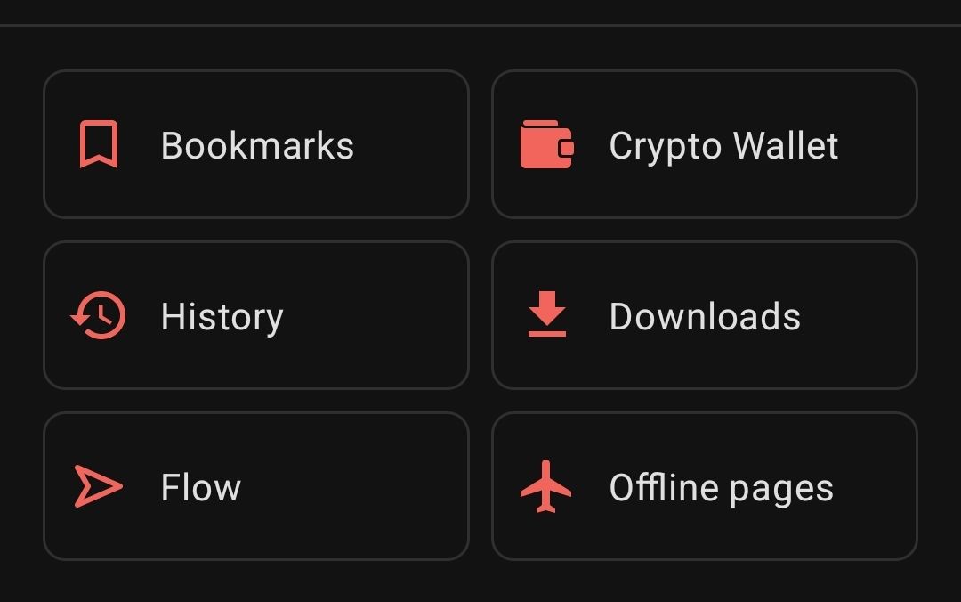
However, on my new phone the order of the items are a bit different than on my previous device. As shown in the image below the Crypto wallet is now where the offline pages were previously for me.

It would be a small change, but it would be extremely useful to be able to move these items around to suit how you use Opera, so that every user would be able to have a functional, personalized, and streamlined experience on Opera.
(Note, I use Opera mobile for Android. I scowered the settings to be able to move the items around but I wouldn't find it. If there is a way to change them please tell me!)
-
Locked by
 leocg
leocg