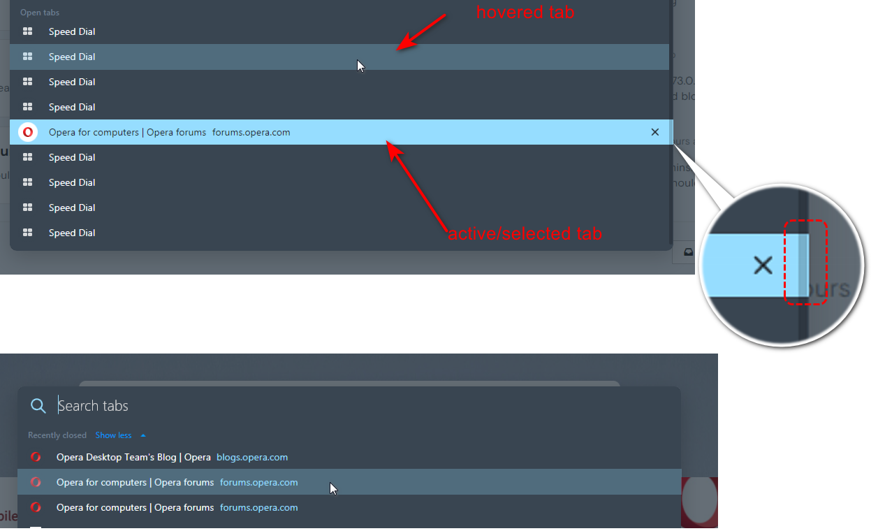
Other colors for active/hovered items on the SearchTabs popup
-
andrew84 last edited by andrew84
When opening the SerchTabs popup an active tab should be the highlighted light blue. When simply hovering tabs some less brighter blue color should be used (the same is with recently closed items). Maybe the same color which is currently used for items on the BABE (I think it will unify the UI).
In TabMenu an active tab was highlighted.*the highlighted box still overlaps scrollbar.

