Dark Theme on Opera 60
-
A Former User last edited by A Former User
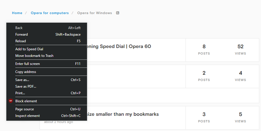
Omg, the black context menu looks terrible on most of the sites that have a light theme
The list of the last downloads looks not so good too.
-
A Former User last edited by
The new context menu looks bad by itself.
Too bright text on too dark background. -
A Former User last edited by A Former User
It's too contrast.
The context menu design looks like a design for visually impaired person.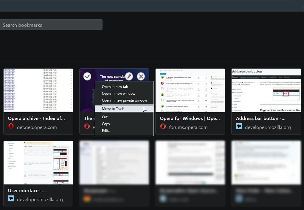
-
A Former User last edited by A Former User
@anonan
IMO, Dark theme in Opera 60 is fantastic. It becomes universally dark and have proper appearance than the old one.For random website in internet, I suggest you use addon (like Dark Mode by dlinbernard) and everything will be neatly dark and have proper look/appearance. You browse light/bright websites in internet and you blame Opera theme because the "Dark theme" looks not good in light website? What's the logic behind that. The Dark theme is supposed to use with addon that displays website in dark mode as well. Peace.
Now the long unfinished elements in Opera UI completed in the new Dark theme.
-download page
-history page
-bookmark page
-extension page
-setting page
-the menu
-right click menu
-in speed dial the folders.
Now Dark theme of Opera 60 is the most proper one. Contrastness or how exactly bright the text is, of course, up to personal taste. But this dark theme is better than previous ones for sure. It's complete and one proper appearance (not some UI dark, some UI bright). I don't have problem with download page/drop-down list and bookmark page in dark tone either. They're awesome now. Everything work well, correctly in my system (not Win10 btw). There could be more improvements in future releases, like menu/text contrastness and design,.. but it's very good now, IMO. And purple private tone in private mode looks cool, too,... a bit resemble Brave though, but no big deal.Thanks Opera UI team, I really appreciate what they did in this release. Nothing can satisfy everyone at once. But for me it's clearly a improvement for Opera Dark theme. Thanks again.
-
agi24cz last edited by agi24cz
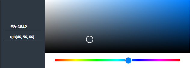
I do not like how the address bar in this new dark theme is actually blue. It doesn't "flow" with the majority of dark websites, this wasn't a problem in 58's dark mode.


-
A Former User last edited by A Former User
As I said, most sites have a light theme. The old dark theme affected the upper part of the browser and Sidebar (Settings too, but this is the rarely used part of the browser). Switching between sites and browser pages (bookmarks, downloads, history) did not cause discomfort. Light context menu is also well suited to the overwhelming number of sites. Dark side panels did not distract attention when viewing light sites.
Now the whole interface has not just a dark theme, but a black theme. And this theme is too contrasting, bright white text on a practically black background. I suppose the designer decided to copy not the best design of the dark themes of Windows 10 Explorer.
A really good implementation of the dark theme is Darcula (Intellij IDEA), why not copy it? Or Steam design (Valve).
Screenshots of sites on a black background of Bookmarks, the black contrast context menu and the list of recent downloads look foreign on ligth themed sites. Switching between sites and browser pages looks like flash light.
At the same time, the colors of the dark themes of Address Bar and Tabs are not combined with the colors of the dark themes of the sites. Why are you using a dark blue-green color?!
By the way, Windows 10 from the beginning has a dark Taskbar with a light theme, just like it used to be in Opera, and it looks good.
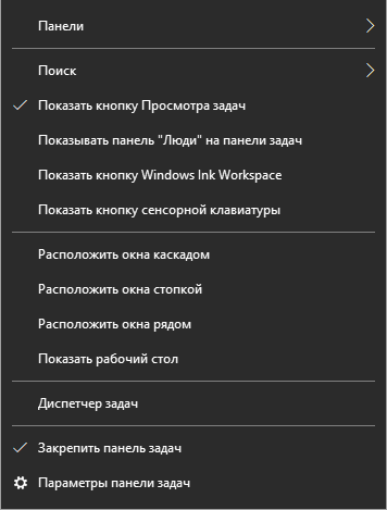
Notice the contrast of the context menu. Opera's context menu is too contrast. The other things too. It is a fact.
Opera context menu:
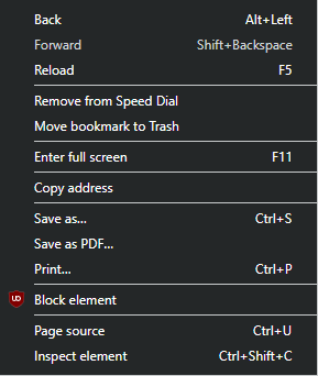
Windows 10 Taskbar context menu:
-
A Former User last edited by A Former User
No wonder they have all sorts of colour issues. I have a similar problem for white theme in Opera 60 on a mac. Dark mode colour on Mac is terrible too
https://forums.opera.com/topic/31764/opera-60-has-odd-browser-chrome-colour-on-macos-mojave/2
-
A Former User last edited by A Former User
Opera UI team goes the right way with dark theme. Below I go on why.
Beside the details (about contrastness, font, shade of gray/dark which is trivial for me, and I don't really bother much to focus on), I think the core of a proper Dark theme (in any browser) is universal appearance. Which means it is supposed to be universally dark, not some part of UI dark, some other parts while/bright. The way they went with mixed dark/bright tone is kind of mistake in development process back then. Even Win10 also has universal dark theme in their newest update where file explorer, apps, etc... got dark tone. It's just the essence of design. You get used to the mixed dark/bright user interface because you got exposed to it for long time, it doesn't mean it's right way to do thing.
All other browser will end up to Dark theme where thing is universal dark (in Firefox even there's a separated css custom package to make every part of FF UI dark in universal way, https://github.com/overdodactyl/ShadowFox, and it got significant amount of users base). Here, we got this thing build-in on official release of Opera, and there're still complains?... I'm fine with what they provide/release.

I can agree about contrastness, shade of gray (whether it is blueish gray/ dark gray or whatnot), etc.. other details because for me they're trivial details. The core thing is universal dark, not partly or unfinished dark theme. Full dark theme is the proper way to go.
-
A Former User last edited by A Former User
@nnq2603 Just look at your screenshot and look at that Opera UI team did. ShadowFox is another good example of a dark theme implementation.
It's OK that the dark theme affects all UI.
But I would prefer an option that makes the dark theme affect only Sidebar*, Address bar and Tabs. The old version of Opera works almost the same way.
This approach makes working with bright sites comfortable.*And allow use Sidebar only on the browsers pages (Speed-dial, Bookmars, etc), like it was in Opera 58. I do not need it on common web pages.
-
A Former User last edited by
@jasonzak said in Dark Theme on Opera 60:
I miss having a dark sidebar and light everything else...
Same here, I loved the contrast. It was the most beautiful browser ever. And they killed it. All that hype for nothing. It's going to be revolutionary, they said.
Instead, they gave us a horrible (re)design, slow speed dial (seriously, why butcher one of the best features? plus, dials are way too small now), not to mention TONS of inconsistencies and really weird decisions. My love for Opera is running on fumes right now. They need to start fixing things, and fast.
Oh, and more direct communication between them and us, the users who are passionate and care about Opera, would be really nice.
-
A Former User last edited by
I don't know if they have done a good job regarding the theory of the design. However I personnaly hate this new dark mode. The distinction between the bluish color of the nav bar and most websites in dark mode is ugly and new bookmarks are awful, black and white square ? really ?!
-
A Former User last edited by
I like this Dark Theme, especially slightly different color of address bar, but the context menu is bad
 It is too contrasting and I would appreciate, if it could be light again.
 -
fatguy1121 last edited by
I'm right there with you, 100% on any monitor the blue looks terrible and the context menus look like trash. Honestly as someone who deploys opera to hundreds of machines, I think the new look is far from professional and not serviceable as a professional recommendation.
In any dark theme it is critical to not use a color, it either needs to be white, black or any shade therein because of their neutrality that will complement or contrast any other content. Blue does not complement any other pages than white, and looks absolutely abhorrent on dark websites. neutral tones, here, not primary colors, you have from 00000 to FFFFFF to work with.
Honestly I cant express how much I dislike the look of the new design, and honestly am seriously considering changing to Firefox on that principle alone.
-
A Former User last edited by
@anonan said in Dark Theme on Opera 60:
Omg, the black context menu looks terrible on most of the sites that have a light theme
The list of the last downloads looks not so good too.
I agree, the context menu should be dark or gray, and not black, it doesn't match the dark browser theme
-
A Former User last edited by
Can Opera reverse the decision to paint this browser white and black, now that Microsoft has released Edge on Mac too it becomes a compelling decision to stick with Opera unless it stays a user preferred one
-
A Former User last edited by
this new dark is just really bad...blue-ish
Can we have a dark grey? or at least some options?

