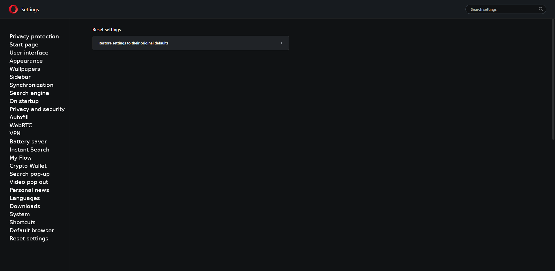
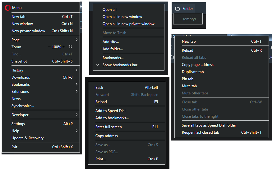
Opera Reborn 3 (for now a version version/developer) introduces several changes. Also a fuller dark mode. Let's face it, the stable version are shortcomings in this respect. So it's good that in the end dark mode will be more accurately done. In addition, its colors have changed a bit - from gray to dark blue. The new color is not bad. But I just do not like some menus because they have a white border. It is simply ugly. They look like they were made for people with defect of vision. Some examples (Opera menu, context menu in bookmarks bar, empy folder in bookmarks bar, context menu in tab, context menu in website):
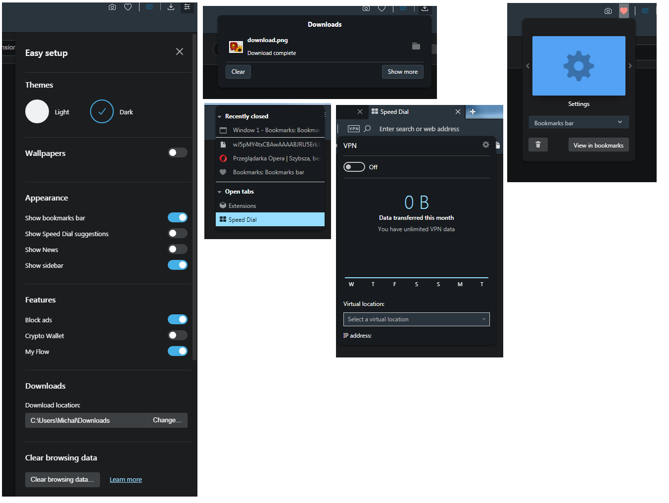
And in the same version (no, I was not wrong, exactly the same version 61.0.3268.0 developer, has elements a little differently created, according to me better) there are elements that do not have this border. It looks neater and does not blend with the rest of the browser. Examples (Easy setup, Downloads menu, Tab menu, VPN menu, Edit bookmarks):
That's why my suggestion is short: removing the white border.
")