Now, on Opera 60, I can not to enable Side bar for only Speed Dial.
I do not need Side bar on every page, only on Speed Dial (and other inner browser's pages (bookmarks, extensions)).
Like it was on Opera 58.
Do more on the web, with a fast and secure browser!
Download Opera browser with:
Opera 60 is the worst browser update ever. The next updates hold this direction.
Now, on Opera 60, I can not to enable Side bar for only Speed Dial.
I do not need Side bar on every page, only on Speed Dial (and other inner browser's pages (bookmarks, extensions)).
Like it was on Opera 58.
New animation of opening new Speed Dial tab speed on Opera 60 is too long. Really.
I want to disable this.
I want to see Speed Dial instantly after opening it. No long animation.
It is Speed Dial, not Slow.
The new popup is terrible designed. And there is no way to turn back the old one with Opera 70.
The unnecessary large size, the inconvenient placement (far away from the button), only 3 rows of the last open tabs, the search bar and open tabs take a lot of space and it absolutely useless for people who do not open a lot of tabs. And it's modal popup, it's breaks the flow of the work with the sites.
Stop do changes for the changes.
Bring back the old menu. I absolulty don't like this modal popup.
Return it back!
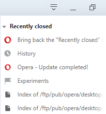
Opera have replaced it with useless "Search for open tabs". It's a search for a word in tab titles.
Really? Who will use it? One from thousands?
Do you think that it the more popular use case than reopening the one of the last of closed tabs?
UPD. Oh, I did not note that there is already the topic of this problem: https://forums.opera.com/topic/39176/bring-back-the-recently-closed-button-on-the-top-bar-on-the-right
I was shocked (really) when I opened a private tab after update to Opera 60.
The new color scheme for the address bar looks weirdly.
With black theme it looks not so bad, but with light not so cool, imho.

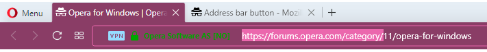
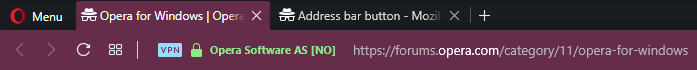

What you think about it?
I would prefer more classic disign.
Please, add a function to disable default Address bar icons (Screenshots and Bookmarks), like "My Flow", "Opera Ads Blocker".
Yes, it's good functions for some people, but not for all.
I do not need Screenshots button, I use a OS's screenshots program that works on whole OS, not only in the web page.
Some people use other Bookmarks extension, and they do not need your Bookmarks icon.
I want to have the clear interface without unneeded icons.
It's interesting thing, that you can add custom default Search Engines in any Chromium browser (Chrome, Vivaldi, Brave), except Opera.
I have the disabled "Show bookmarks bar" option.* Default place for new bookmarks is some folder.
*It is not important because I have no bookmarks in Bookmark bar. Bookmark bar should be hidden anyway.
Now, after the update, when I create a bookmark I see an appearance of Bookmark bar for ~500 ms, and after that Bookmark bar is hidden again. Thus I see the toggling of Bookmark bar (that contains the new bookmark).
The problem is obvious. The new bookmark is created in Bookmark bar and after that it moved to last selected folder with noticeable latency.
The new bookmark should immediately be created in right place like it was before – in the last selected folder. Without the intermediate place.
I want to use third party extension for Downloads, so the embedded extension disturbs me now. Popup intersects other toolbar icons and the icon occupies the place on tool bar.
Add an option to disable your embedded Downloads extension.
For example, a third party extension allows you see the size, quick open file/directory.
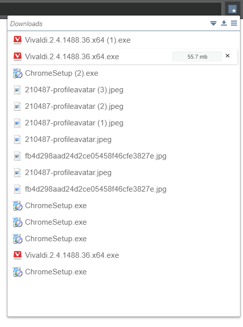
That is, the third party extensions can be better than standard ones. But Opera does not allow to disable the standard extensions. It is disrespect from Opera to its users.
The same is about Bookmarks, Snapshot, Easy Setup icons.
As I said, most sites have a light theme. The old dark theme affected the upper part of the browser and Sidebar (Settings too, but this is the rarely used part of the browser). Switching between sites and browser pages (bookmarks, downloads, history) did not cause discomfort. Light context menu is also well suited to the overwhelming number of sites. Dark side panels did not distract attention when viewing light sites.
Now the whole interface has not just a dark theme, but a black theme. And this theme is too contrasting, bright white text on a practically black background. I suppose the designer decided to copy not the best design of the dark themes of Windows 10 Explorer.
A really good implementation of the dark theme is Darcula (Intellij IDEA), why not copy it? Or Steam design (Valve).
Screenshots of sites on a black background of Bookmarks, the black contrast context menu and the list of recent downloads look foreign on ligth themed sites. Switching between sites and browser pages looks like flash light.
At the same time, the colors of the dark themes of Address Bar and Tabs are not combined with the colors of the dark themes of the sites. Why are you using a dark blue-green color?!
By the way, Windows 10 from the beginning has a dark Taskbar with a light theme, just like it used to be in Opera, and it looks good.
Notice the contrast of the context menu. Opera's context menu is too contrast. The other things too. It is a fact.
Opera context menu:
Windows 10 Taskbar context menu:
It was fixed partially, it was not fixed correctly.
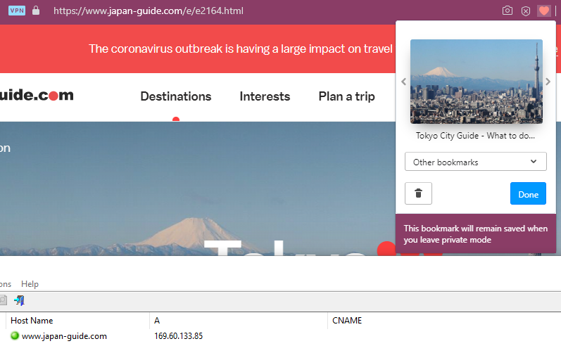
When you bookmark a site (in a private tab), whose favicon you have in the browser cache:
The new bookmark would have the most old favicon (favicon of the first bookmark entry for this site (domain)).
It should take favicon from the last created entry for this domain, not the first one.
Examples:
![]()
![]()
The left bookmarks were created in incognito tabs, and they have the most old favicon that was available in the browser cache.
(And this is cool that the browser stores the old favicon, just use the most recent for new created bookmarks)
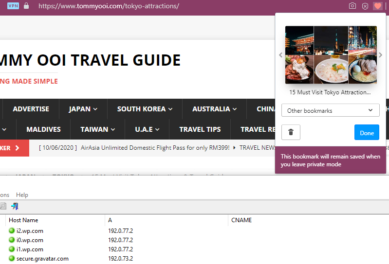
When you bookmark the site, whose favicon you have not in the cache:
The bookmarks has no favicon at all.
The example:
![]()
It is still not fixed.
Making a bookmark in incognito mode creates the bookmark without the favicon.
(when you have no favicon for this site in the cache)
Unbelievable, but it looks fixed. (Only the leak connections)
(v70)
The new popup is terrible designed. And there is no way to turn back the old one with Opera 70.
The unnecessary large size, the inconvenient placement (far away from the button), only 3 rows of the last open tabs, the search bar and open tabs take a lot of space and it absolutely useless for people who do not open a lot of tabs. And it's modal popup, it's breaks the flow of the work with the sites.
Stop do changes for the changes.
Bring back the old menu. I absolulty don't like this modal popup.
@burnout426
Maybe.
But in Opera 69 both bugs are.
The connections for fetching images for the preview of a bookmark that was created in incognito tab with enabled "VPN" bypasses "VPN" – it goes through the non-incognito browser window (there "VPN" is disabled).
There is no favicon for a bookmark that was created in incognito mode. (It's the regression or maybe I tested it wrong last time.)
Here is the example of bookmarks that I have created in incognito mode with enabled "VPN".
(Note: I visited these sites the first time, so there is no cached favicon or DNS query. It's random sites from duckduckgo.com/?q=tokyo+site)
The leak connections:
[1]
[2]
[3]

And missed favicons for these bookmarks (1st and 3nd sites should have the favicon):

Sorry, my previous message is about the latest release version (68), not develop (69).
you still see favicon fetches bypassing the VPN?
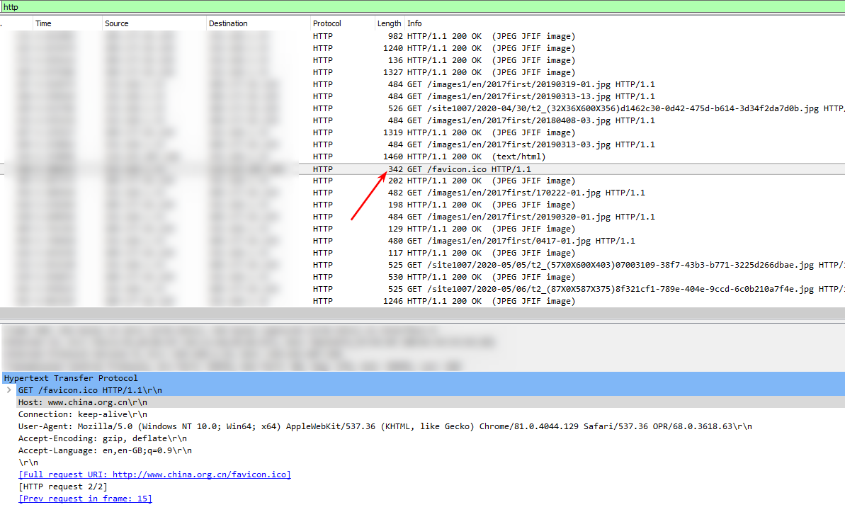
I have never said that. I talked only about previews (It are images for the bookmark, Opera parses the HTML for image URLs (not only img tags) and downloads them), but I have rechecked it, and the favicon is downloanig non through the incognito window too.
Opera 68:
I have created the bookmark in the incognito window with enabled "VPN", but Opera downloaded both the favicon and images for the preview through the default window, that has no enabled "VPN", so I can see HTTP connections to the site in Wireshark:
I did not test it in the Developer version.
Yes, I was right, that fixed the bug with favicons (that were created in the incognito mode). But.
The bug is this topic about is still not fixed.
Return it back!
Opera have replaced it with useless "Search for open tabs". It's a search for a word in tab titles.
Really? Who will use it? One from thousands?
Do you think that it the more popular use case than reopening the one of the last of closed tabs?
UPD. Oh, I did not note that there is already the topic of this problem: https://forums.opera.com/topic/39176/bring-back-the-recently-closed-button-on-the-top-bar-on-the-right
I don't think what it will fix this bug. The problem is not with favicons, but with images (that are used as a bookmark preview) that are loaded through a non incognito window.
It probably may fix this bug with favicons, but I have no desire to test it.
And second problem, when I detach devtools into own windows and then lock back into main window, whole browser crashes. It's impossible to lock devtools window back into main window.
Confirm this bug also.
Not sure, but I have seen this bug before (a bit earlier) 67.0.3575.53 update.
The most annoying thing, all extension was disabled after it happens.