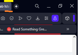
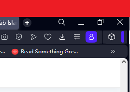
I feel that there could be "compact" theme where these gaps would be deleted, and bars tighten by couple of px?
Also, why there is shrinking option only for addons icon not the whole icon bar? Or to give user the ability to pin whichever icon he choose that he doesn't want to be hidden at a click on this blue separator

This is how much space is being freed

Best posts made by rocendroll
-
RE: General Opera One Tabs, Tab Islands and Workspaces Feedback TopicTab Islands, Tabs and Workspaces
-
RE: General Opera One Feedback TopicGeneral
Guys, I think I can provide substantial support as of the productivity of the browser. New Opera One is great but it needs these small tweaks:
- New tab bar is great, but it has some kind 1px empty space up top with pinned tabs. When I hover my mouse there to change a tab, I click and it gives me nothing. I need to specifically put attention into it, please change it as it was before! Normal tabs works fine - but it should be clear that if something is pinned, I will used it often therefore I need no obstacles
- New player is great, but one - if launched (eg. spotify) it should be visible right away when I hover my mouse to the left side for the side bar to appear from autohide. To change a song I need to. Could you make it so, when the ICON of the player is clicked and turned blue - the player would be pinned to the autohinding sidebar? Therefore I wouldn't need to make additional click do have it in full view? It would work like this, that when I would click player icon again and make it grey (unactivated) it would work as now, just a small song change window when hovering over the icon. It would also solve an issue about the player icon, taken all the way down on the sidebar. It would stay there, and it wouldn't matter to the user.
Basically we need some kind of functionality, to stop searching for player icon, but have full player just on hovering over sidebar somehow. Maybe second icon option to pin it, next to the option to pin it but with window dividing? - Aria needs shortcut change option to Ctrl+Shirt+A as of Aria
- Opera always had one great feature. This appearing small info-window with calculating currencies. This thing needs to be nurtured and advanced with lot of other options and customization, this is your selling point to me.
- We also need some kind fast-opened window to translate things. For example, I need to find what is some word in english. I could hit some shortcut and then window as for Aria would open with fast translator. Normally to find the exact thing, i need to open new tab, type the phrase to look for the word, then google would give it to me, and then close tab. It could be also very beneficial as a feature.
- Smooth scroll feature
- Blocks of news on the black page should have rounded corners.
- I would kill for an integration with Feedly for a main screen news feed. Like with divided screen option.
-
RE: [Suggestion] Please make it possible to hide the spaces above and below tabsTab Islands, Tabs and Workspaces
@akenjik made the same request in linked post, I would add that this blue avatar icon next to the addons icon - should show the actual avatar picture! It would be less visible then maybe, if it has to stay
https://forums.opera.com/post/318906 -
RE: General Opera One Feedback TopicGeneral
You've deleted my thread about my complain so I'll write it here again.
Contexts doesn't save tabs opened in them, when closing the browsing. It doesn't restore them as windows do.
But, you have had to screw up this too, as of now, opera doesn't close all open windows with tabs at once, but separetely, and it doesn't recover them. You need to do it by one from the history menu