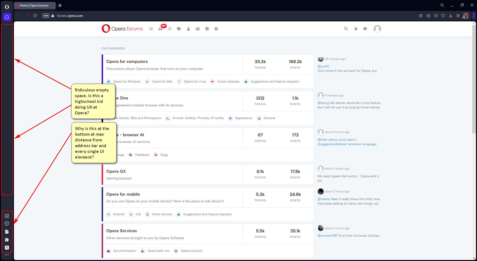
At this point Opera's interpretation of the sidebar has degenerated into a cash grabbing bloatware ad space.
When removing all services from your sidebar except for let's say the opera tools and extensions you end up with a massive empty space with a all the icons crammed into the bottom corner of your screen at a maximum distance from the address bar and other ui elements (both of browser and extensions). For example some extensions allow pinning so they can be used next to the viewport. That pinning would also controlled at the top not the bottom.
Why is the sidebar made up of a non customizable set of sections with fixed positions in static hierarchy defined by Opera within the "Sidebar setup"? Yes you're allowed to add and remove single items within a group but you have no control over the grouped services' positions in your sidebar.
This is a deliberate design choice in order to create a static hierarchy emphasizing potential revenue drivers over productivity tools. Adding/Removing items to the sidebar is already in place after all, so why don't trust your user base in creating a simple custom top-down list of sidebar items?
Unfortunately Opera's lacking a profound strategy and vision for how a fully user customizable sidebar with enhanced support for features could boost the overall perception of their browser as a powerful productivity tool. No, instead they're brute forcing a great feature into an quick revenue generating ad space. I'm not saying it's a bad thing per se, but it turns into one when done this uninspiringly. Can't believe I have to switch to Edge or Sidekick just to have a customizable sidebar where I'm not forced to use a single person's limited imagination of how a items should be grouped and eventually utilized.