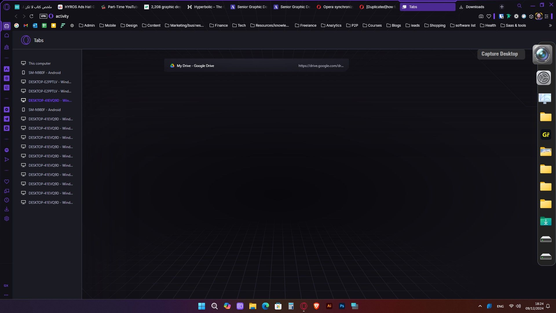
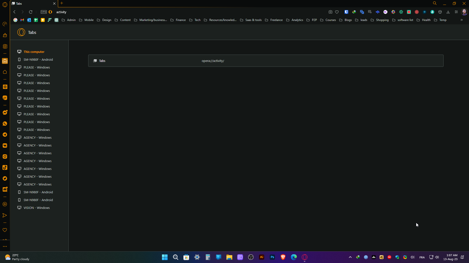
hello , I'm having hard times to get rid of my old computer and previous phone tabs . what i want to see is This Computer and up to date Phone tabs only.
Anyone knows how to clean up up the tabs from other devices ?

Do more on the web, with a fast and secure browser!
Download Opera browser with:
hello , I'm having hard times to get rid of my old computer and previous phone tabs . what i want to see is This Computer and up to date Phone tabs only.
Anyone knows how to clean up up the tabs from other devices ?

hello , i'm having hard times to get rid of my old computer and previous phone tabs . what i want to see is THIS COMPUTER and up to date PHONE tabs only .
thanks if anyone knows how to clean this up.

One of the most annoying things in opera currently is not having a quick way to open new pages in a split second as most other modern browsers do!
The solution could be at least to add a shortcut in the shortcuts menu to open a new page right next to the URL adress bar.
This is a much needed feature that all browsers figured out a way to implement except opera.
it'd be super nice to have an option to Double click on the video pop-out to Play/ Pause it instead of looking for the specific location of the button as it is way less of headache and makes the experience a no brainer.
@leocg yes, or just the pictures i have shared in that thread if possible.
@leocg yes i know and it just makes more sense to have the option on the right location.
I have also posted points from an old topic as single requests so they appear more organized and better indexed. Can you delete this specific post as moderator ? because i couldn't and i want it to be deleted from internet as it contains personal infos. link text
thanks a lot.
In many cases , opera does not pick the website logo in the thumbnail selection menu because it is not present in the webpage. but every website has its own fav-icon present in all its pages so grabbing it would be more convenient.
Also, the speed dial shortcuts / titles plain text isn't visually appealing and distracting at times. a good solution would be to make the websites fav-icon as the default thumbnail.
in points :
Loading the Website Fav-icon (small logo) in the thumbnail selection menu
making the default thumbnail more visually appealing instead of plain text
thanks
thanks.
So here's the problem,
the new added bookmarks get on top of the list (that's how opera Gx works compared to other chromium based browsers which add new bookmarks to the bottom)
this is great actually and clever as well. But
when we have Folders in a list, we probably would like to have them appear on top or to have an option to Pin Them because that's a good way to organize bookmarks of a similar topic and most of the time i prefer ( probably other users too) to have the folders pinned on top to access them more easily.
thanks and hope you take this request in consideration.
@jenjenbrofist i second this request !